Closer to the pub date (next summer) I'll rant and rave about what an amazing book this is, my favorite in ages...But for now, I'll just enjoy this cover that Peter Lutjen came up with.
Wow. Now that art style takes me back to the old 70's book covers. But the neon blue space ships seem out of place. They float over the background, which I think was the intention.
We changed the ships to green. They still pop, but they maintain the color harmony a bit better. I didn't mind the blue, but the editor didn't care for it.
I love this the book...L-O-V-E it! I seriously hope it reaches a good audience.
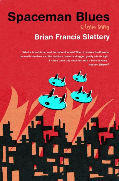

Wow. Now that art style takes me back to the old 70's book covers. But the neon blue space ships seem out of place. They float over the background, which I think was the intention.
ReplyDeleteHey Josh,
ReplyDeleteWe changed the ships to green. They still pop, but they maintain the color harmony a bit better. I didn't mind the blue, but the editor didn't care for it.
I love this the book...L-O-V-E it! I seriously hope it reaches a good audience.
Irene