
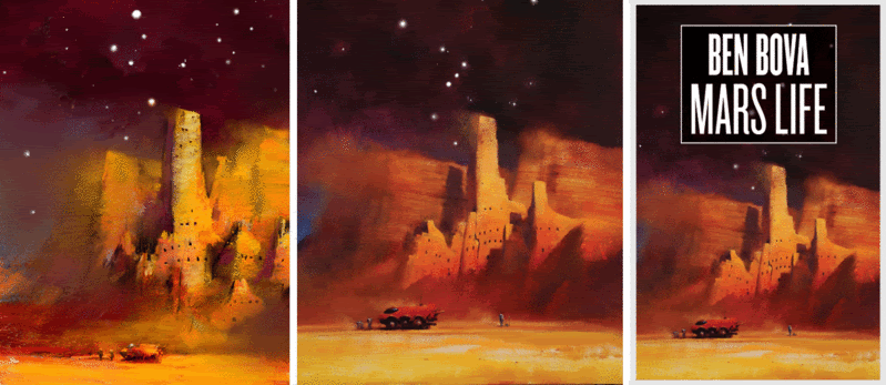
 Sketch, final art, cover.
I recently mentioned how much I love seeing sketches -- I particularly love John Harris'.
Tuesday, September 18, 2007
Two New Covers from John Harris
Subscribe to:
Post Comments (Atom)

Sketch, final art, cover.
I recently mentioned how much I love seeing sketches -- I particularly love John Harris'.
Labels: John Harris, Tor Books

14 comments:
Lovely work.
Were the colors changed and the value range narrowed at your request or by the artist to better suit his own aestetic?
Inquiring minds...
Thanks,
lee moyer
I didn’t ask John to tighten the values, I assume it’s a product of moving from the immediacy of a sketch to the subtlety of a final piece.
But it’s an interesting point, Lee. The more I listen to artists the more I realize how important value is. It seems that color is almost meaningless, if the values are spot-on. You see this a lot in portraiture – skin tones can be surprisingly green, purple, orange etc. If the values are correct you read it as skin tone. I keep meaning to make a blog spot abut this. I should get on it. In terms of a book cover, though, sharp contrasts are hard to lay type over...but we can work around that if we have to.
Cool art and interesting to see the progression, but sorry, you distracted me with the final cover of the first one. Zoe's Tale by John Scalzi? Set in the OMW universe?! When's that coming out??? :-) You tease...it's not mentioned on Tor's site under John Scalzi and isn't listed on Amazon.com.
Sorry, Kendall, but it's a full year away. These are both summer 08 books. The Sales schedule is such that I tend to need to have covers done about a year before pub date. I have some big Marketing meetings coming up this week and next, which is why these are on my radar at this point.
Thanks for the good word.
It took me an eternity to figure out the value thing, but now I see it everywhere (for good or ill).
I look forward to reading more of your thoughts thereon.
-lee
Yup, value is crucial....
I've actually been trying to get into the habit of working up initial designs in grayscale or at least a monochromatic palette (particularly logos and such. Not so much with covers, since the artwork's color palette influences the color scheme of the final layout). That way I make sure the values are spot-on, plus I avoid 'falling in love' with the colors I would otherwise use on early comps (which I tend to do. I then seethe internally with irrational indignation when they have to change). Once I've got my layout where I want it to be value-wise, I start working up color studies.
Oh, and John Harris absolutely rocks. I've said it before, but it bears repeating.
;)
those are some incredibly detailed sketches. what is the medium for those? hard to tell from the .gif
Arkady - I get them as jpegs so I can’t be sure, but I always assumed they were oils. He sometimes does them in charcoal and those are equally beautiful.
i'd love to pick his brain for a few hours. About four will do. Hint, hint ;P
Yay!!!! I was so excited to see not only another INCREDIBLE John Harris cover, but to see that Scalzi is putting out another book in this series. Woo-hoo!!! I've loved all the others.
It's a very nice picture of a starship, but I'd just like to register my objection to the practice of putting random generic space ships on the cover art of science fiction books, as has been done for the entire Old Man's War series so far. It's a practice that's been going on for quite some time, as I recall the cover of Vinge's A Fire Upon the Deep was like that, and many other books. At worst it can be actively misleading (cover art showing a guy in a spacesuit walking to a ship on Orson Scott Card's Treason, a book in which no ships or space suits appeared at all), and even at best it doesn't do one of the main things I feel a cover should do: tell you something specific about the material inside, like what one of the characters looks like or show a frozen glimpse of some event that happens during the story. These covers are just random paintings, and the ships don't even necessarily resemble the ones described in the books!
It really does bother me a lot.
Do you know shadow of legend Gold? I like it..
My brother often go to the internet bar to buy sol gold and play it.
After school, He likes playing games using these buy shadow of legend Gold with his friends.
I do not like to play it. Because I think that it not only costs much money but also spend much time. One day, he give me many cheap shadow of legend Goldand play the game with me.
I came to the bar following him and found shadow of legend Gold moneywas so cheap. After that, I also go to play game with him.
Do you know Rom Gold? I like it.
My brother often go to the internet bar to buy Runes of Magic Gold and play it.
After school, He likes playing games using these Runes of Magic money with his friends.
I do not like to play it. Because I think that it not only costs much money but also spend much time. One day, he give me many buy Rom Goldand play the game with me.
I came to the bar following him and found cheap Runes of Magic Goldwas so cheap. After that, I also go to play game with him.
femme chaussure
chaussure femme
chaussure homme
homme chaussure
chaussure puma homme
chaussure nike homme
chaussure puma femme
Post a Comment