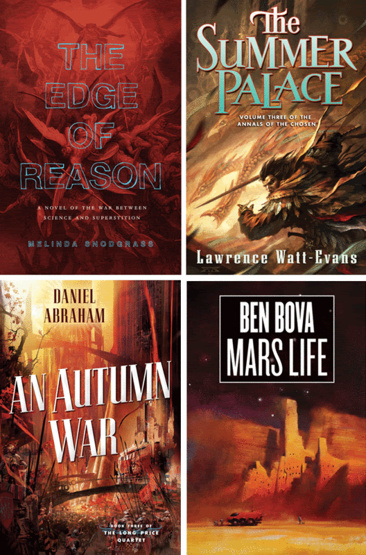
Those are pretty cool although i think the summer palace is out of place with the background image. Is that the font and color for the series? Not sure, but i don't think it fits with the image, 2 different styles, plus the color is a bit off. The autumn war looks nice from afar would like to see it close up.
I also think the fonts should not detract from the background paintings, it might be interesting if a publisher focused on showing off the art and intention of the story through the cover rather than spotlight the title which seems to take up most of the page.(although i know you are trying to sell books, i think this approach is heavy handed.
I'm intrigued by the cover of "Mars Life" & would also be interested in seeing it up close & personal. I'll have to poke around the local bookstore for it.
These images are all bigger when I put them into Photobucket – there is something I’m not getting right about file sizes. Hmmm...
Todd - It all depends on which market the books are going for. Some books can get away (from a Sales POV) with more subtle type designs and other can’t.
Each and every John Harris painting that graces the cover of a Ben Bova book just gets better and better. I have no idea why the idea of reading those books intimidates me, but I hover over them every time I see one in the bookstore.
You commissioned Albrecht Durer? I have to step it up a notch then, but the Vermeer studio doesn't seem to have an email address or phone number. Delft, here I come...
 A lazy post...
Those are pretty cool although i think the summer palace is out of place with the background image. Is that the font and color for the series? Not sure, but i don't think it fits with the image, 2 different styles, plus the color is a bit off. The autumn war looks nice from afar would like to see it close up.
ReplyDeleteI also think the fonts should not detract from the background paintings, it might be interesting if a publisher focused on showing off the art and intention of the story through the cover rather than spotlight the title which seems to take up most of the page.(although i know you are trying to sell books, i think this approach is heavy handed.
ReplyDeleteI'm intrigued by the cover of "Mars Life" & would also be interested in seeing it up close & personal. I'll have to poke around the local bookstore for it.
ReplyDeleteThese images are all bigger when I put them into Photobucket – there is something I’m not getting right about file sizes. Hmmm...
ReplyDeleteTodd - It all depends on which market the books are going for. Some books can get away (from a Sales POV) with more subtle type designs and other can’t.
Irene; It's okay...I'm sure I can find a larger version elsewhere. ;)
ReplyDeleteHi Irene,
ReplyDeleteI know I should probably know, but since I don't could you post who did which covers? That would be swell.
Thanks,
--Drew
Irene - Who were the artists for each of those paintings? Thanks!
ReplyDeleteHoward
Each and every John Harris painting that graces the cover of a Ben Bova book just gets better and better. I have no idea why the idea of reading those books intimidates me, but I hover over them every time I see one in the bookstore.
ReplyDeleteI understand, thanks Irene that makes sense.
ReplyDeleteWere the artist credits edited in, or am I just less blind in the middle of the afternoon? Thanks, either way.
ReplyDeleteYou commissioned Albrecht Durer? I have to step it up a notch then, but the Vermeer studio doesn't seem to have an email address or phone number. Delft, here I come...
ReplyDeleteDrew - you;re not dreaming. I added them in this morning. Thanks for reminding me. I was being a lazy ass.
ReplyDeleteMathew - Thanks for stopping by! Yeah, me and Al go way back. Next up, I want to get that guy that does those nice horse drawings in french caves.