

 Cherie Priest's Boneshaker
Art by Jon Foster.
Design by Jamie Stafford-Hill.
And check out Cherie Priest's website for series, The Clockwork Century.
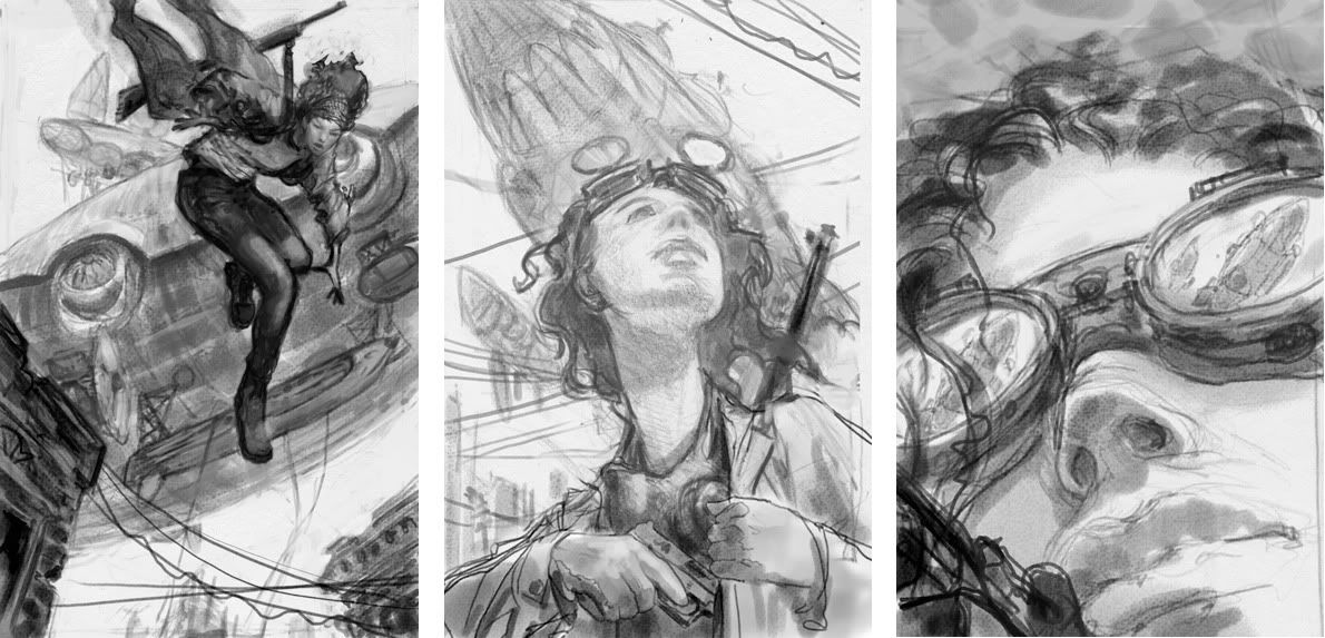
The first sketch was a real contender. It had action and might have more commercial appeal than the others. The second sketch looked a little too young-adult so that was ruled out fairly quickly. (Although it would make for a great YA cover.) The third one seemed slightly riskier than the others but also felt like, if all the pieces fell into place, it would be demand attention on the shelves. I'm very glad it's the direction we took.
 I have to admit, it does seem as though some authors have good cover karma. (Which unfortunately also means the reverse can be true.) I equally love the John Jude Palencar arted, Peter Lutjen designed, covers on Cherie Priest's "Eden More" books.
maybe its just my computer being wacky, but everytime i click on the sketches, it shows me the final cover instead. i want to see the sketches :(
ReplyDeleteme, too!
ReplyDeleteSorry guys - dont know what happened there but I think it's fixed now.
ReplyDeletejust... WOW. thank you thank you thank you.
ReplyDelete"Palencar arted..."
ReplyDelete"Art" as a verb! Jon Foster's art (and JJP's art, too) is so full of action and life that I hope they keep on arting and you keep A.D.ing at such a high level.
I agree - definitely the 3rd sketch - beautiful cover! and I normally don't like covers with just a person on them.
ReplyDeleteBTW - I may have missed this somewhere along the line, but what's the significance of the "a sci-fi essential book? imprint in the lower right-hand corner?
I adore the final cover and I agree, Cherie has outstanding cover karma.
ReplyDeleteJon Foster never ceases to surprise me. Great cover! What are you thinking about when you choose a specific artist for a specific book?
ReplyDeleteI cannot wait to read this...and I cannot to see the lovely work of the cover, etc. up close and personal. Not long now!!!
ReplyDelete