
Friday, November 27, 2009


Tuesday, November 24, 2009
Omar Rayyan

And I'm looking forward to seeing the Alice in Wonderland piece in December as it is part of an Alice exhibit at the Brandywine Museum.
(The Brandywine as in, “bury me under the Andrew Wyeth’s, please.”)
Monday, November 23, 2009
The covers that got away
I got batch of cover designs in today and immediately regretted that the one I liked the best, visually speaking, would never fly for the cover. In this case, with good reason — it looks great but isn’t quite suited for the audience. Luckily, there are others in the batch that also also very good and more appropriate for the book.
Also today, I got sketches in for another book. Here we are clearly we are making the less interesting choice because it more closely resembles familiar territory. The artist is no dummy and will likely reuse the pose on someone else’s very successful book cover. (And I will be jealous!)
This happens a lot in the job. Many times I agree with the final outcome, in some cases I don’t. Below are two older examples of covers that “got away.”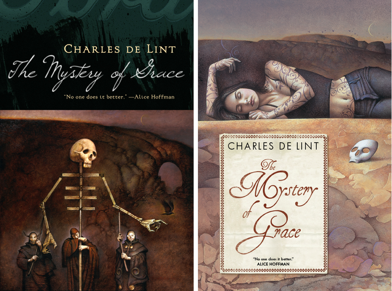
Illustrator John Jude Palencar and designer Peter Lutjen have been the dynamic duo beyond many many Charles de Lint covers. It’s amazing how well their sensibilities work together, even more so when you consider that Charles, Peter, and John have never met.
Since we do have such a long and wonderful history of Palencar covers on de Lint books, there was never a question of what to do — I went back to John, described the book more fully, and gave him a clearer understanding of how we wanted to position it. It was a whole second commission for him — a pricey mistake on my part but, thankfully, not one that I make too often. In the end, the second cover is just as lovely in a different way.
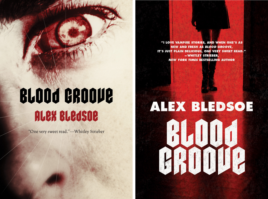
Blood Groove
In this case, it was tough to get the marketing tone right. The initial copy and the title made it sound a bit campy and hipstery. When talking to the editor, the book sounded much more gritty than that, and it sounded much more grisly than the current slew of hot Twilight-y vampires. Designer Jamie Stafford-Hill went to town on the idea of a truly horrific, old school vampire. What you can’t see here is, he even requested a slightly textured varnish to make the cover just a tiny bit pebbly your hand. We did an advance run on the jackets and they looked great. Really great. In the end, though, Sales and Marketing felt that we should try to hit larger audience an go with a “movie-poster” style cover.
Selling more books is good for everybody — everyone from the author, to the bookstore clerks, to the truck drivers moving inventory around — so it’s difficult to say that going more commercial is a bad thing...But truth be told, this was example where I wish we could have stuck with something that was a bit more unique and engaging. While I certainly like the re-do, quite a bit actually, I’ll always wonder which cover really would have performed better.
Sunday, November 22, 2009
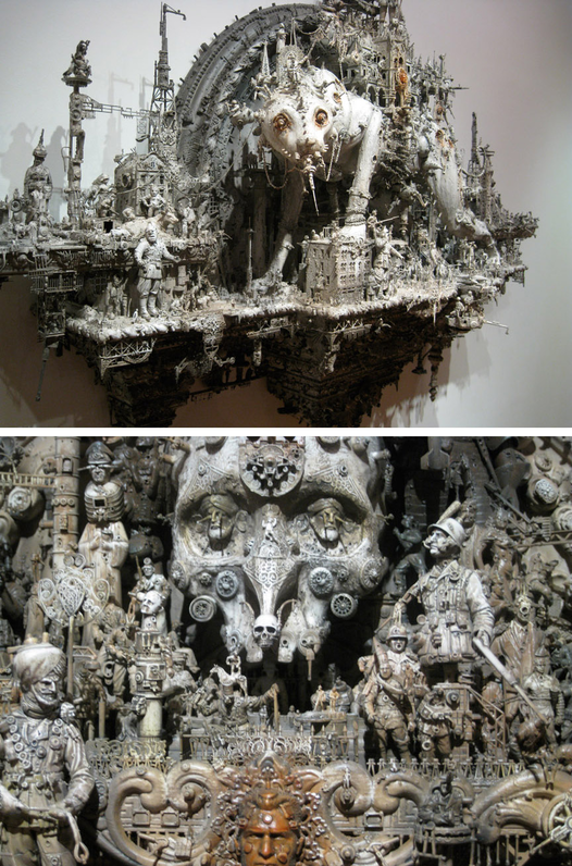
Kris Kuksi exhibit
Beast Anthology
548 West 28th Street, 3rd Floor, NYC
Nov 21 -- Dec 19, 2009
Last night I attended Kris Kuksi's Beast Anthology opening at the Joshua Liner gallery. I had seen pictures of his work over the past year and was anxious to view them in person.
Kuksi takes bits and pieces of action figures, toy soldiers, tank models, and a seemingly endless selection of other figurative found objects and creates scenes that, seen as a whole, are reminiscent Eastern temple wall sculptures. Chaotic on the micro level but ultimately forming organized symmetrical shapes. The soldiers' poses and tanks create a kind of steampunk inspired monstrous momentum -- evoking elements of imperialism and industry. The religious and/or post apocalyptic effect is often enhanced by an "underworld" side to the work.
I'll admit, it's not work that effects me emotionally but if you're looking for a true "Holy shit, that's awesome!" experience, it's well worth the effort to go see them. It is easy to get lost in each one for quite a while. The longer you stare and the closer stand next to them, the more you can reduce yourself to their scale and become overwhelmed by their momentum.
[MY FUZZY PHOTOS HERE]

Thursday, November 19, 2009
Art Out Loud DVD trailer
Trailer for Art Out Loud, Vol 3 from Kate Feirtag on Vimeo.
A little set-up tease for an upcoming DVD of the September 12th's Art Out Loud at the Society of Illustrators with:
James Gurney
Sam Weber
Charles Vess
Donato Giancola
Greg Manchess
Earlier report of the event here. I'll give a heads-up when the DVD is available, of course.
Hmmm..makes me want to start another Art Out Loud.....
Wednesday, November 18, 2009

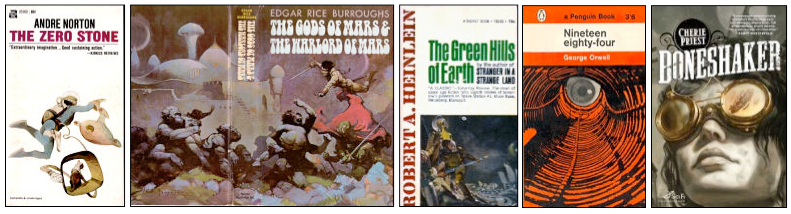
Two awesome cover posts.

Monday, November 16, 2009
The Great Hunt ebook now available. And Kekai Kotaki desktop wallpaper.


Thursday, November 12, 2009
Cassandra Diaz webcomic: My Grandmother's House

Tuesday, November 10, 2009
Kekai Kotaki and The Great Hunt
The second Wheel of Time ebook cover is now released, this one by the amazing Kekai Kotaki. You can read a behind-the-scenes post and see lots of progressions on Tor.com: The Great Hunt ebook cover by Kekai Kotaki.
RELATED: David Grove's ebook cover for The Eye of the Wolrd

Sunday, November 01, 2009
Art that's a lot like hiking
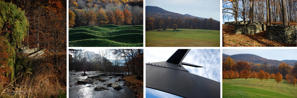
Went for the Maya Lin, and to revisit the Andy Goldworthy, and was reminded how much I love Richard Serra.
Friday, October 30, 2009
Stemapunk Month Wallpapers: Manchess, Foster, Tenery, Frietas

HMS Stubbington, the logo
Thom Tenery
Eric Frietas
Jon Foster
Greg Manchess
Steampunk Month Letterpress Poster

For the full story, go to: Making the Tor.com Steampunk press poster.
More photos here.
And if anyone wants one, the first five people that email me their name and address get a poster. UPDATE: Sorry folks - all gone.
And here we are in action:

Donato demo download from Massive Black
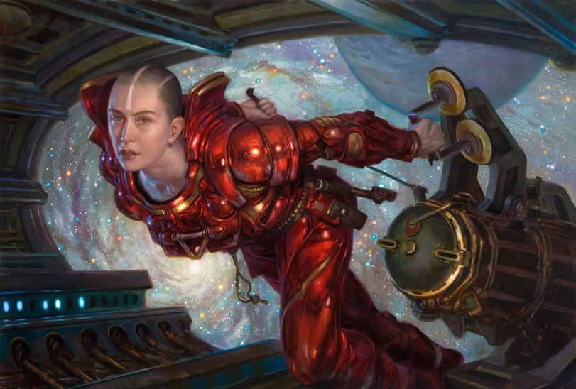
Order it here.
Trailer below.
Apropo t0 nothing, I love this painting -- one of my recent faves from Donato.
[Thanks to Dan Dos Santos for the heads up.]
Wednesday, October 28, 2009
Just in: Idiot's Books still amazing!

For more background, see this post.
Tuesday, October 27, 2009
Vote for Scott Fischer!

If you don't take my word on it, just try getting through take-two on this video without laughing.

Behind the scenes on the Eye of the World ebook cover
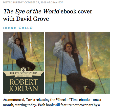
"....It seemed a natural to start the series with a portrait of a young Rand beginning an epic journey, the scope of which he could perhaps sense but not truly grasp. David’s luminescent paint lights Rand from within. In a way, it seems to be a portrait of Rand best seen at this time, when readers know so much about what lies ahead of him..."
The full story here.
Monday, October 26, 2009
Eye of the World ebook now on Amazon

You can now order The Eye of the World ebook
I little behind-the-scenes post on the cover tomorrow.
David Grove, Hall of Fame: a Greg Manchess introduction

For some background on David, below is Greg Manchess' introduction at David's induction into the Illustrators' Hall of Fame, June 2007.
--------------
One could describe my friend David Grove as a reluctant illustrator....but a focused one.
You’d never know it from looking at the work of course. There’s nothing reluctant about any of it...the passages of color, sweeping strokes and soft sharp edges blending in and out with such
control....no one goes into this kind of focus with reservation.
I’ve always gotten the sense that David was a bit of a maverick. Born to parents who were both artists, David decided that he would be a chemical engineer. He won a scholarship to Syracuse from a drawing competition.
But after being there awhile he changed his major to photography. He liked the technical side of things. After college he made enough money in a photography studio to indulge his wanderlust and fled to Europe.
Living in Paris, he lived the cafe lifestyle over there and made some money playing jazz piano. After a time, money running low, he was hired to do some pencil drawings for a Macy’s-style shop in France. He lived on the money he made from that one job for 3 months. Living an
exotic European lifestyle.
He was later convinced to come to England to work at a studio, Artists Partners. This only lasted for a year....he might have remained in England but for the toxic nature of English food. He just could not take one more fish and chips. After all, he was getting older, he was 29....that stuff can kill a man.
He came back to the US and after seeing more of the great works of all the great illustrators living in Westport....he promptly fled to California. Where he found a bit of the Parisian cafe life in San Francisco.
At this point, David was doing all sorts of work for advertisers and publishers. I remember one distinct cover of a book he did about some rebels. The title escapes me but the image is vivid. Four figures in a mean-spirited pose, weapons in hand, one figure was a nun. The nun has nothing to do with the story I’m about to tell...but I’ve never forgotten that cover. Maybe he can tell us about the nun later.
David needed guns for this pose and instead of buying them, his technical side had the bright idea to build them. All he needed was the shapes and light on them to draw convincing weapons. But spray painting them in his apt would never do....so, like any sane man, he took them to the roof of the building.
Now, in those days, the SF Police were rather sensitive to rooftop snipers. But David had a deadline....and his focus was on the work. As he was spray painting a few of the fake guns on the roof, he heard the distinct crackle of a police radio, that seemed awfully close. Maybe down in the street. He kept on spray painting. But he soon had an odd sensation of being watched.
He held up the cardboard gun to check out how the sun was glinting off the steel grey cardboard barrel he was spraying, and as he turned to step back for a better look he noticed the door to the roof, and watched, bewildered, as a huge barrel of a gun slid slowly out of a small window by the door and was pointing directly at David.
Moments later he recalls being set upon by rather large members of SWAT, being thrown down and angrily frisked while all sorts of screaming ensued about how he should not try anything like ‘moving.’
With much frenetic silver-tongue reasons, he finally convinced them that the guns weren’t real. One SWAT member went over and picked up the toilet paper roll, cigarette pack, taped weapon and confirmed it.
He was led down to his apt where he showed them what he was doing and while still explaining this in the stairway, as the police were headed out the front door, he happened to notice that his entire block had been cordoned off and a large crowd of people had gathered to watch the SWAT guys shoot the ‘sniper.’
This doesn’t say much about David’s actual painting but more about his focus. He has a tremendous focus and a dead serious laser guided desire to wrangle a piece of painting into the most lovingly crafted flow of beauty.
So much so, that one time David was rubbing away at his painting, in the days when he used acrylics and inks instead of the guache and acrylics he would later use, to get a nice wash of color just perfect for a portrait head that he was doing for TIME magazine......when suddenly he realized he had rubbed completely through the illustration board he was painting on.
This is focus. This is David’s focus.
When I look at his work, I hear it as well as feel it. His washes and color become lyrical in a musical sense. His work is Beethoven strong....Mozart playful....and Paganini driven. And the light....oh....it is scrumptous, edible...it’s not the way the light falls on an object that he paints, but the light the painting generates within itself. It’s as if you could look at a Grove in the
dark and still see it by it’s own light. (I have a Grove at home...I often use it as a nightlight)
I first met him when I was a student. We got along immediately. I loved his passion about illustrating and getting it right. He was the first real professional illustrator I’d ever met. And when I & a friend brought our portfolios over to his apt one day, I realized that this was the lifestyle I wanted to have as an illustrator myself. He was an American Illustrator with a European lifestyle.
He said goodbye to us that day, wished us luck and said, “just remember...when you get out of
school and into the field, I’ll be your competition.”
Again, David's focus.
It is my great honor to introduce my old friend and colleague for the Society’s highest honor, the Hall of Fame....
TOP PHOTO:
Murray Tinkleman, David Grove, Gary Kelley, Linda Kelley, Terry Brown.


Subscribe to:
Posts (Atom)
