

Richard Solomon, artist rep for Gary Kelley, Mark Summers, Chris Payne, Greg Manchess, Jim Bennet, and many other illustrators considered the best in the business, has started a blog. Sadly, their first entry is about the NYC crane collapse that destroyed their offices.
There was a tremendous amount of artwork lost in the accident, much more tragically, a number of lives were lost. The only saving grace is that it occurred on Saturday, when very few people were in the building. I’ve known Richard and his group for years...had this happened 24 hours earlier, I shudder to think of the loss it would have been.
Friday, March 21, 2008
Richard Solomon Group Blog

Bookmark It
...and then spend a life time studying these guys.
DaniDraws has made a great cheat-sheet on historic and contemporary illustration with his post, 75 Artists You Should Know and Where to Find Them.
Be sure to check out the artists listed in the comments as well.

Thursday, March 20, 2008
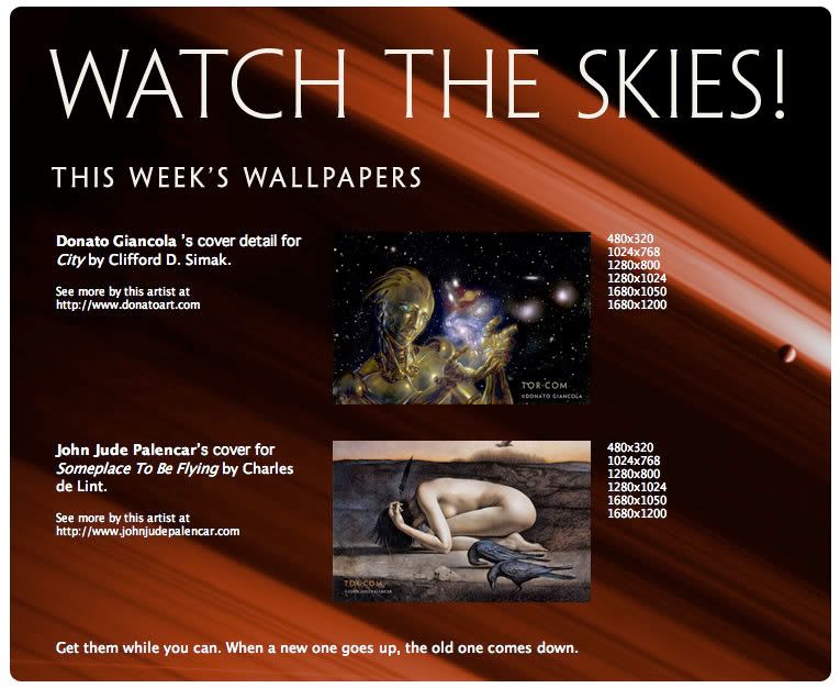
Tor.com Wallpapers

Enjoy.
SF Signal is Talking to Artists
Go see how Todd Lockwood, Dave Seeley, Jeremey Geddes, John Picacio, Donato Giancola, Glenn Orbik, and Bob Eggleton answer the question:
As an illustrator, what was it that drew you to science fiction and fantasy to begin with, and what place do you feel illustration has in the science fiction and fantasy field?
Monday, March 17, 2008
Thumbnails: Sparth

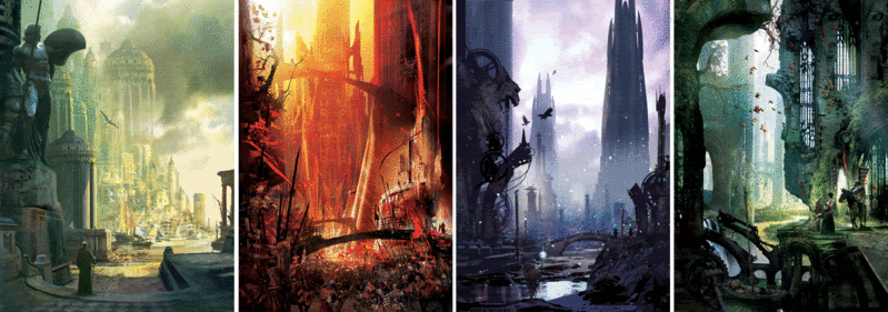
One of the great things about online communities like CGSociety and ConceptArt.org is that they have made it possible for people outside of the gaming and movie industries to access the imagery that help build those worlds. I love all the freedom and spontaneity seen in concept work -- giving impressions of scenes without relying ion too much detail. One of my favorites is Sparth. I love the sense of scale and depth he can create using value and by juxtaposing sharp edges against looser, more abstract, elements.
Sparth website.
Blog, Sparth Construct.
Pre-order (like I have) his upcoming art book, Structura: The Art of Sparth.
Favorite painting you did in the past year?
I think one of the paintings I prefer, and that represent some sort of a milestone for my own progression, is that cover i did for a French novel called Le Monde Enfin by Jean-Pierre Andrevon. [Top image] I often take a look at this cover whenever I need to comfort myself in my ability to produce a balanced image, where details are present but not to the point of drowning the scene into unnecessary complexity.
Dream assignment?
A space opera movie production maybe? Or anything related to the post apocalyptic genre.
How do you balance family and personal time with work?
I tend to prefer doing regular working hours in a company, that allows me to spend time with my kiddos when I get home. In order to fill the rare gaps in my schedule, I sometimes accept "one shot" assignments like book covers, as it's not only fast, but it also gives a lot of pleasure being able to achieve something in just a few days, compared to lengthier projects like games prods or movies.
Do you have a set image in your mind when you first start sketching or do you start out abstractly and let the process of doodling take over?
It is very difficult to give a simple answer on the matter. I'd say that I probably start doodling with a relatively abstract approach in mind, obtain a fine basic sketch very fast, and then stick to it without changing too much of the initial composition. The more you change the initial compo, the riskier it will get, and I still think that the best images are the ones whose composition do not get altered from start to finish. From the moment your initial sketch is strong, that is. Your first intent is often very present in a piece, as much as the rectifications you will eventually make further on.
Things cannot be easily hidden, at least not in my vision. The paradox is that abstraction can be of a tremendous help when it comes to imagining images, But when things are in place, the best is to escape from it and stick to detailing. It's not as easy as it seems, we artists like playing with meaningless shapes and colors a bit too much.
Advice to a young illustrator?
Whenever somebody is giving you an enlightening artistic advice, write it down in a text file, or in a folder where you'll gather all these thoughts and comments in order to read them again and again. Something simple, no fancy subfolder labyrinth thing you'll never go back into.
That's what I do: whenever I find a theory worth trying, or an advice given by a friend, or even an idea popping into my mind while creating, I write it down in my "must not forget about this" list. A bit like a general and opened set of rules or guidelines. Of course, rules are there to be broken, especially in the art field, but some things never change, and are worth putting down on a paper.


Stephan Martiniere's Four Seasons


I've often wished I could walk into a gallery displaying the series (once completed) projected floor-to-ceiling on each wall -- a giant cube of Martiniere seasonal goodliness.
Thursday, March 13, 2008
Tor.com: More on What We are About + Royo and Foster Wallpapers

This week's visual delight....
Tor.com Wallpapers:
Luis Royo, from The Fantastic Art of Luis Royo.
Jon Foster, from Revolution: The Art of Jon Foster.
Tuesday, March 11, 2008
Thumbnails: Nic Klein
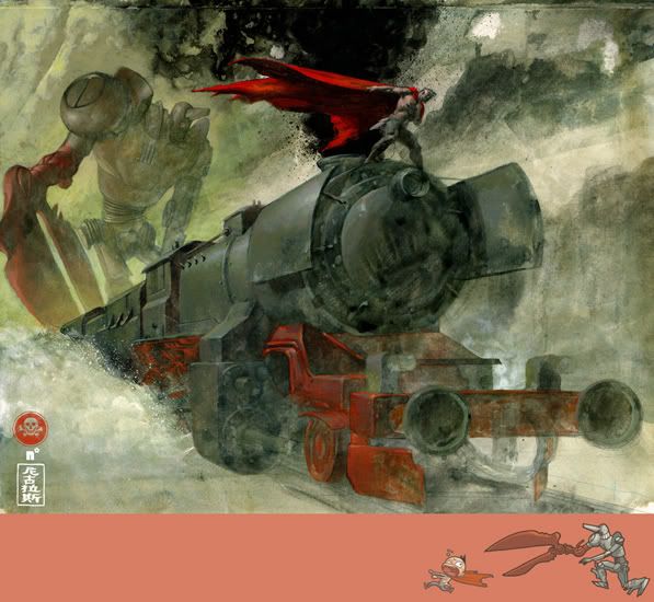
Nic Klein, one of many ConceptArt.org finds for me. I'm killing two birds with one stone here - not only is he someone for my "Thumbnails", he's also on my "Wish List"
Do you have to like the book/comic to be excited about the project?
No. Every Project has potential for something exciting, whether it is the characters, the composition of the piece, or just a technical aspect. In fact being a fan of something and then getting the chance to work on it could even be a bit of bad thing, because you might have such a clear image of the characters or what previous Illustrators might've done with a property that it blocks your own creativity, and thus might turn into a disaster.
What are you working on now?
Right Now I am painting an Comic Issue for Marvel MAX, It is Issue 4 of "Dead of Night:Man-thing". It is the first time for me painting a whole issue so I am excited.
Favorite color?
Pink & Blue (baby blue almost turquoise), I know, weird.
Favorite painting you did in the past year?
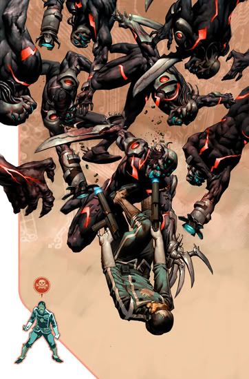
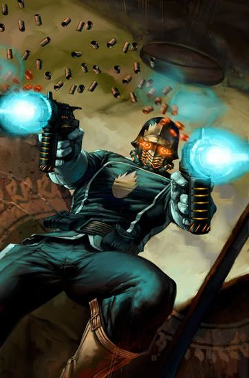
It's a tie between the Spectra Pulse cover for Bantam Dell Publishing and the Starlord#1 [third image] cover for Marvel comics. The Spectra piece for all the stuff that is going on in it, and for the freedom I had in making it. The starlord piece because it was the first Marvel cover I did, and it has a great energy to it.
Do you have a set image in your mind when you first start sketching or do you start out abstractly and let the process of doodling take over?
This is a tricky one. I think there are very few artists that I know that can claim to have the ability to capture exactly what is in their head. I am not one of them, sometimes more sometimes less, but making art or an Illustration is always a process for me. I start out with an idea and elements will be added or taken away as I see fit. Obviously this depends on what the illustration is for and how much freedom I have/or what needs to be communicated with a piece. With personal work I have no one to answer to but myself so this is the most spontaneous work, although some jobs where the Art direction is loose this also applies.

LunaCon
I'll be at LunaCon, up in Rye NY, this weekend -- hanging out with a bunch of artists. I'll be at the panels listed below...or at the bar.
(Oy! Typing this in, I'm only just realizing that I am moderating the Business of Writing panel.)
SATURDAY:
The Art Department: An Interview with Irene Gallo
Donato's revenge on the SI lecture I made him do.
Participants: Irene Gallo, Donato Giancola[M],
1:00 PM
Art in the Information Age
How the digital age is changing the field.
Participants: Irene Gallo, Donato Giancola, Karl Kofoed, Dave Seeley, Diane Weinstein,
4:00 PM
SUNDAY:
Business of Writing
What happens when you sell your book to a publisher?
Participants: Patricia Bray, Jeanne Cavelos, Sean P. Fodera, Irene Gallo[M], Patrick Thomas,
10:00 AM
Virtual Studios
Online art communities.
12:00 PM
Monday, March 10, 2008
Spectrum 15 Contributors
See the lucky (read: hard working) ones that made it into Spectrum15 here.
(Thanks, Dan Dos, for the heads-up.)


Sunday, March 09, 2008
National Museum of Natural History
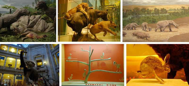
I'm inexplicably fasicinated by mounted (wrongly called "stuffed") animal displays. The AMNH cannot be beat on this, but in DC there was a lot of emphasis given to the movement of the animals. The only thing it was laking was some breathing-room between displays.


Saturday, March 08, 2008

Friday, March 07, 2008
Thursday, March 06, 2008
Facelifts vol.8
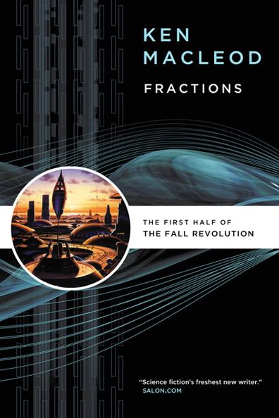
This ominbus edition edition of Ken MacLeod's The Star Faction and The Stone Canal. Design by Peter Lutjen.
Tuesday, March 04, 2008
Ross MacDonald and Liberation
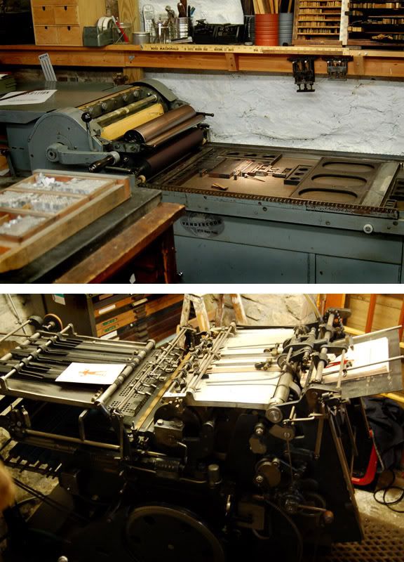
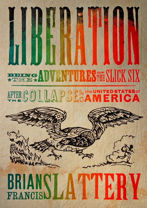
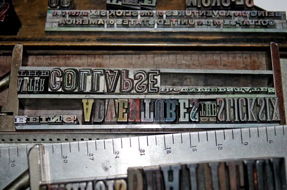
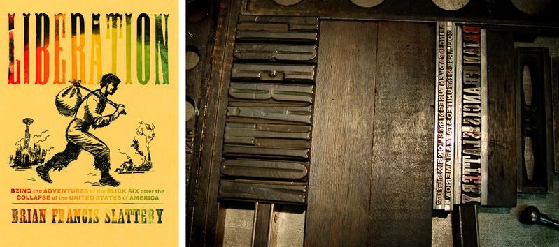
The author had the idea of referencing 19th Century runaway salve posters. Once I heard that, I immediately remembered a great lecture I saw by letterpress artist, Ross MacDonald, years earlier. I’ve always loved his work but knew it would take a long time to find just the right project. After a couple of emails back and forth, I realized that Ross wasn’t just the right aesthetic for the job, he really seemed to get the essence of the book. Below are a series of photos and excerpts of emails from him throughout the process:
“When I'm giving a talk about letterpress -- 'true' letterpress, with actual wood and metal type -- I like to use the phrase 'ditch typography'. In other words, you could literally do it in a muddy ditch if you needed to. If civilization collapses, letterpress printers would still be able to function, and that's the back story I had in mind when I was working on this cover -- to make it look as if it was printed in the time and setting of the book, by someone working in a burnt-out factory using 19th century technology.”
And......
“Although I love a lot of historic periods of printing and design, I'm really inspired by one of the most reviled periods of design - the early 19th century. All of the fonts used on your cover were designed and manufactured before 1854. The two fonts on the bottom (the sans, which was called gothic and the slab serif, or antique) date to before 1820. Although it was not a perfect time (slavery, manifest destiny, votes for white guys only) it is a period when so much innovation was going on in many fields, including printing and type design.
The technology and the typography were really rugged. Americans were building cylinder 'country' presses that could survive travel in the backs of wagons. they were brought into frontier towns, where there were no roads, and could be easily run, operated, and repaired. If something broke, the local blacksmith could fix it. He had to, because it might take months to get spare parts. The presses could be run by either steam power, water power, mule power, or cranked by hand. Often times the printer would crank the flywheel and his wife would feed the press. I remember seeing an ad from the 1870's that boasted that 'a small boy could print over 2000 copies an hour'. Ah, the good old days!”
It's impossible not to enjoy the day at work when others so clearly display their passion for the job.

Monday, March 03, 2008
Richard Powers: Hall of Fame
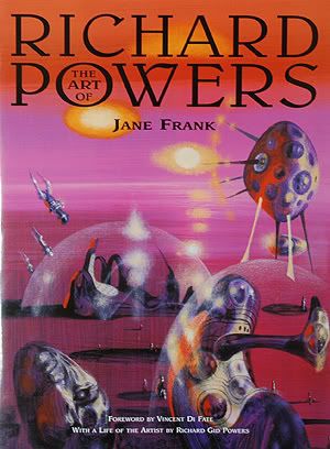
(Hurray to John, who is always quick to point out the importance of past artists on today’s field.)
Here is David Hartwell -- Tor editor, art collector, and long time friend of Powers, with a personal essay.
And here is the Powers Compendium -- a fantastic collection of Powers covers. (But leave plenty of time for browsing it without any thumbnails to help guide your way.)
UPDATE:
Bob Eggleton reminded me of Jane Frank's book, The Art of Richard Powers.
(And hurray to Jane for keeping artists like Powers and John Berkey in the bookstores and in the minds of today's painters and fans.)
Subscribe to:
Posts (Atom)
