
After getting in to work at 4:00PM due to a raging migraine all morning, it was pretty great to see an email titled "Just in case no one has told you you are awesome today." Editor Liz Gorinksi sent me a link to some praise from Cherie Priest. (Four and Twenty Blackbirds, by the way, is an excellent read. I hope to get back to the other two at some point.) Now: Headache gone, back is patted...life aint so bad.
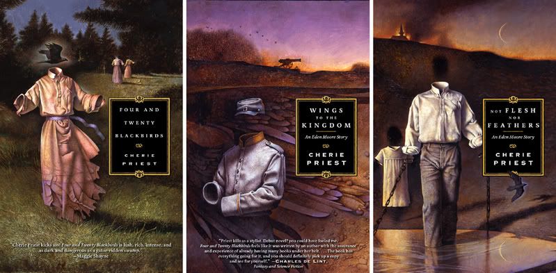
Thanks to John Jude Palencar (who has often told me he particularly likes working on these books) for the artwork and Peter Lutjen for the awesome design.
Wednesday, January 31, 2007
Cherie Preist
Monday, January 29, 2007
Series


 Anyone reading fantasy and science fiction knows that the genre is dominated by series. From my end of the business, series are both a pleasure and a curse. Once you get the look of a series down, its continuation is relatively easy for me -- so many decisions are already made, the type, the artist, the tone. I get a few new details and basically sit back and let the artists work. When a series starts off looking good, it usually sails along nicely, but then, of course, the reverse can be true as well. If you don’t hit the mark on the first go you set up a sizable hurdle for the following books. Unfortunately that means rather conservative decision making up front. While I may want to try out a new artist, I don’t always feel comfortable committing to 3, 6, 12 books with someone that I have never worked with before. Not always, but often enough, I tend to stick to the guys that I already have proven relationships with. This, in turn, often leads leads to scheduling conflicts down the line -- an inevitable alignment of stars and planets will end up with a bunch of one artist’s titles in the same catalog season. I’m glad for the ease of some series, and when they go well I really enjoy seeing the paintings as a collective whole, but I can't help but to wish we had more stand-alone books and different points of view to explore.
I asked a few artists what they felt about working on series titles:
"Series are cool because it gives you a chance to fill out the world you're building in some more detail. I also feel more connected to my character after several portrayals. It can be a shackle when the marketing crew is sure that a particular portrayal is responsible for selling the book. It's best when the AD gives you latitude to be able to show the world from a different view each time. I also think that the tendency to "brand" authors with a single artist can make the biz of illustration tougher. Instead of book assignments, you have series assignments, and that makes the ebb and flow of work more extreme. Your flow is also greatly effected by how prolific your authors are, and that can vary enormously." DAVE SEELEY
"From an artist's standpoint its quite nice. You become familiar with the characters. That means less time worrying about accuracy and more time developing story." DAN DOS SANTOS
“A series is a good thing if you're an artist. You want the books to look good and do well, so you'll get the next one--that's the pragmatic, economic reason--but you're challenged to keep the series fresh, which forces you to think about the approach, to try to see things from different perspectives. Even a series has to have variety and flow. It's a restraint that can help you to grow. It also lets you explore a direction more than once. A series of books can become a collection of paintings, each with a slightly different flavor.” TODD LOCKWOOD
“Series are neither harder nor easier to undertake, as I approach each and every commission as a new start. The goal of each image is to convey a compelling representation of the content of the book, and considering the variations most authors place on the content of their novels, I do not see how it is possible to use the same approach every time. For me, continuity in a series, if there is any, tends to be more formally based than anything related to design.
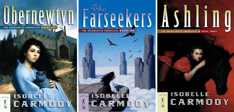
One of my most successful series was for Isobelle Carmody, where the unifying factor was the scale of the figures to their architectural environment, and the passage of time 'through' the images: the beginning of the journey; the journey; and the final recuperation/rejuvenation. Each image stands alone and has very little, in terms of design, to do with the others. As a painter, I look to challenge myself and find new ways to reinterpret similar content without appearing too incestuous within my style.” DONATO GIANCOLA
Shown here are some series that I enjoy seeing as a unified body of work:
John Jude Palencar’s “Eden” novels. I think Wings to the Kingdom is one of my very favorite paintings.
Dan Dos Santos' Alosha Trilogy. Coincidentally, the girl on Yanti is the spitting image of our fabulous paranormal-romance editor Anna Genoese.
Dave Seeley Elizabeth Moon novels from Del Rey.
Donato Giancola and the Tor covers for the Obernewtyn Chronicles
Tristan Elwell and the Starscape editions of the Obertnewtyn Chronicles
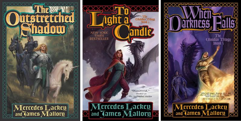
Todd Lockwood and the Obsidian Trilogy
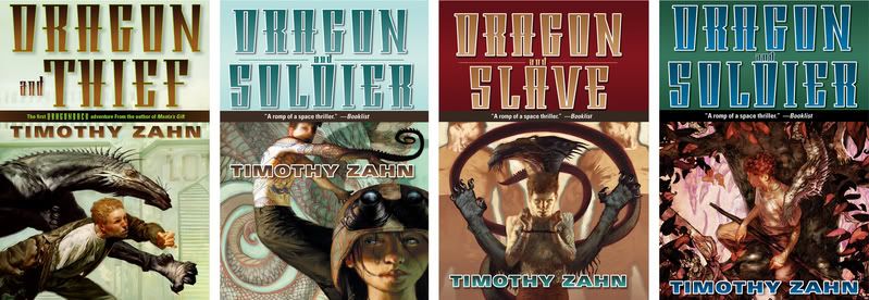
Jon Foster and the Dragonback novels.
Sunday, January 28, 2007
Odd Nerdrum at the Forum
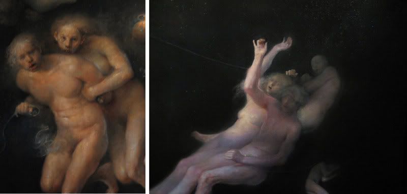
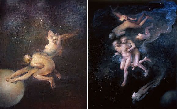 My friend, Mark Korsak, and I went to see the Odd Nerdrum exhibit at the Forum Gallery. The canvas are huge and the paint is masterful...although I didn’t really connect with them until I closed in on the key figures, but when you do connect, it’s a powerful hit. And you could say that the work is strangely...science fictional.
Friday, January 26, 2007
Fresh Paint: Tiffany Prothero
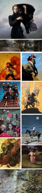
 Tiffany Prothero has an disciplined Golden Age narrative style while mixing in fresh influences. The exciting thing about watching her progress over the past year is that every piece is better than the last, she is able to learn and grow with each new painting. And, although it is of no issue to the work itself, it is damn exciting to see her and other young women rising up in the ranks. In a conversation with a few artists friends, we could only come up with a small handful of women at the top of the sf/f art world. I have no doubt that Tiffany will be in that group in years to come.
Where did you go to school and how do you feel they prepared you for your career, both artistically and in business?
I went to Academy of Art University in San Francisco. They did a pretty decent job at preparing me, but meeting industry professionals is something I didn't get at school.
What has been your biggest challenge post graduation?
Getting work and refining my skill.
What do you feel is your biggest hurdle in getting commissions?
Having a consistent style people can use, bulking up my portfolio, and luck.
Do you feel as though you've had your first break?
Hmmm, maybe. I just received a commission with Realms of Fantasy Magazine. It really just fell in my lap, "Surprise! you have a job, no joke, here you go!" yeah it was luck, haha!
[Note from The Art Department: While luck is helpful, it's always the portfolio that clinches the job.]
Do you have a clear idea where you'd like to be in five years or are you taking each day as it comes?
I would like to paint for science fiction and fantasy book publishers.
Any advice to students still in school?
Try to meet industry professionals, just to get your name out there, and for valuable advice. Send Promos out, and submit to contests like Spectrum, or the Society of Illustrators Annual. Good Luck!
Thursday, January 25, 2007
I Met the Walrus
 Because I suspect that there are at least one or two Beatles fans out there...
Check out this cool, animated short, I Met The Walrus.
Via Drawn!

Wednesday, January 24, 2007
Illustrators 48
 lllustrators 48 is out and it has loads of great work from all of the best contemporary illustrators. I’m proud to say that Tor did very well in this edition, so, I will brag....
IMAGES: TOP TO BOTTOM, LEFT TO RIGHT
Michael Deas got a gold medal for his cover to Richard Matheson’s Earthbound. The painting is drop-dead gorgeous...but when it came time to design the cover, it just seemed to beg to be zoomed in on. I was a bit nervous to show Michael that I cropped out more than half the painting. He didn't seem to mind and, in fact, took a saw to the actual painting. SF/F peoples might not know MIchael by name but everyone has seen his Columbia Pictures painting and a number of portraits he did for postage stamps -- Stephen Vincent Benet , Cary Grant, (both of which I have in small frames on my office door) Audrey Hepburn, Lewis and Clark, and many others. Earthbound also won an award in Spectrum 13.
Craig Mullins did a series of George Alex Effinger books for us last year. I entered the first one, The Exile, and was afraid it might get overlooked since it was digital. The Society has a reputation, wether or not it's deserved, for passing up digital work. Sure enough, it got in. Craig is a rock start in the film industry, I was very grateful we were able to work on these books together. Our Sales force responded really well to this cover. I was surprised, I didn’t think they take much notice of a reprint of an older book but many of them raved about it.
Dan Dos Santos got the first two Christopher Pike Alosha books in, Alosha and Shaktra. This is one of my favorite looking series...and the third book, Yanti, is even cooler looking. Dan used himself as the model for Shaktra and has dubbed the painting, "Portrait of the Artist as a Thirteen Year Old Girl."
Red Nose Studio and the third “Borribles” book, Across the Dark Metropolis. I am such a Red Nose groupie, and he's a dream to work with. I just wish we had more call for his sweet and spooky dolls.
Greg Manchess’ painting for Gene Wolfe’s The Knight. It was fun to do a cover meant to read as an icon. Greg also did a series of black and white drawings for this book and its sequel, The Wizard. It has started off a nice trend in doing that kind of thing more often at Tor.
James Jean’s cover for William Sleator’s Amongst the Dolls. Cute and creepy. The wonderful thing about working with James is that you hand over a project and you never once worry about it -- you just know it’ll be fabulous and on time.
Robert McGinnis for Elmer Kelton’s Six Bits a Day. What can I say, the man is a legend. The first time I saw him at the Society of Illustrators I was trying to avoid an introduction, knowing I’d say something silly or, more likely, not know what to say at all. Turns out, he is extremely unassuming and once one of the other of us mentioned Andrew Wyeth, that was it. We talked for hours about how great Andy is. (Funny, Michael Deas and I have had that exact same conversation.)
John Jude Palencar’s cover for Cherie Priests’ Four and Twenty Blackbirds. This and it’s sequel, Wings to the Kingdom, are some of my very favorites that JJ has done for Tor....and he’s done a lot of great work for us.
Jon Foster has his Skyborn painting in. It’s also used as the cover to his art book Revolution. One of my favorites from Jon. Stupidly I did not buy it when it was displayed at ComicCon. Arnie Fenner was smarter than I and grabbed it. I’m alternately grateful that it went to a friend and seething with jealousy! (I shake my fist westward!)
Donato Giancola's epic painting for Sara Douglass’ Crippled Angel. This monster is, what, eight or nine feet long, and features about two dozen figures? Since I only needed the right hand side of the painting for our book cover he hung the piece unfinished. It was a wonderful and rare opportunity for people to see an artists process on display.
Congrats guys! Thanks for making us look good.
Tuesday, January 23, 2007
Charles Vess in New York: Save the Date
Okay, so this is a bit to early to be mentioning but I'm very excited about it. I will, of course, repost this in at a more useful date.
CHARLES VESS
Part Seen, Part Imagined: An informal visual survey of three predominate threads of the fantastic in the arts: The English Fairy Painters, the American Pulp Tradition, and the Visionary Artist.
May 2nd, 2007
Society of Illustrators, NY
I must confess to being supremely self-serving here. Charles had his laptop out at the Austin World Fantasy and showed a few of us some amazing artwork from a lecture he gave at the Conference for the Fantastic. He covered obscure and well-known fantasists from the 19th Century up through today. I really wanted to hear him give the full lecture so, it was either wait for the stars to align at some convention or convince the Society's lecture series chairman to invite him up. It didn't take much convincing.
Last Man Standing 2 - Final Round
 The final round of the Last Man Standing 2 Thunderdome has been posted on ConceptArt. 271 contenders have been whittled down to just five killer artists. The topic, Charge!. The winner should be announced in about a week.
(What is this thing called Thunderdome, you ask? Click here.)
Shown here is Shelly Wan's entry.
Monday, January 22, 2007
John Berkey and John Harris
 Stainless Steel Droppings has posted a profile, with lots of pretty pictures, on the Johns, Berkey and Harris -- two of the field's very finest artists.
In the summer of 2004 I was privileged to have attended John Berkey's induction into the Illustrators Hall of Fame. I was quite nervous to meet John and didn't manage to say much more than "hi." Vin di Fate read a wonderful appreciation. "[John Berkey's] signature style is one of vigorously applied brushstrokes -- never labored -- that in a series of strategically placed dots and dashes, form images so vivid and so credible that they seem to go beyond photographic reality, and yet the artist's hand is always present. We look at these illustrations and know that they are paintings -- they are not photographs -- and, more importantly, that they are art." The full essay is reprinted in Illustrators 46.
Here is an earlier post I made on John Harris.
Sunday, January 21, 2007
Fresh Paint: Jason Chan
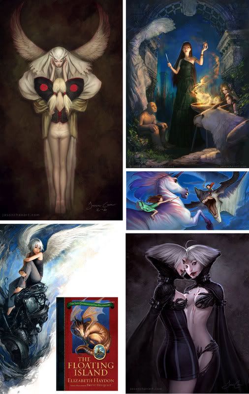 "Fresh Paint" will be a series of micro-interviews that focuses on young artists (wether they are actually young or people coming into illustration later in life) -- specifically to get their take on what it's like to enter into the market today. Like every other industry, the internet has changed the way illustrators work, promote themselves, and communicate with clients and potential clients. I seemed to have entered into the science fiction and fantasy publishing world just as the conventions were losing their hold as "the" place to network and secure jobs. With the internet and genre specific annuals, the pool of artists known to art directors has exploded. It’s invigorating the field while opening up a wealth of opportunities and challenges for artists entering the field today.
Jason Chan graduated from the Academy of Art University in the spring of 2006. He has a digital style that mixes manga with more traditional narrative illustration. Not out of school a solid year yet and he already has a healthy client list. Currently he is working as a concept artist for Massive Black while taking freelance illustration jobs, including the occasional Tor cover, on the side.
What where some of your successful promotional material?
Most of my work both in the beginning and now came from the internet. I started showing my work on the net while I was still in high school and landed an role playing game gig and some poster jobs early on. Finding some of the online artist gathering sites and posting my work there frequently helped to expose my work. I also kept an up-to-date portfolio site up to help sell my skills.
What do you feel is your biggest hurdle in getting commissions?
From my standpoint, it's hard to say. I only know when people want my work - if they don't want it, I never hear about the job to begin with. I guess the real struggle is to make your work look like what people want, but still be something new and original. You have to be unique and appealing, which can be a difficult thing.
Do you have a clear idea where you'd like to be in five years?
I take each day as it comes. Right now I'm working full time as a concept artist at Massive Black and doing freelance work in my spare time. I love what I'm doing right now and I don't plan on changing anything right away. However, I know that I may not always feel this way and might decide to move on to something else in the future. I'm trying not to plan out everything too far right now since I might not feel the same way when the time finally comes.
Any advice to current students?
Remember that school is just the start. When you finish your classes and have learned to draw and paint the way your school has taught you, don't think that you are done developing your technique. Try something different. A big part of success is to be unique, and you can't be unique if you do the same thing as all of your classmates and teachers. Use what you've been taught and do with it what you will.
David Apatoff on Digital Art
David Apatoff at Illustration Art has a wonderful essay on what may be lost with digital art. I flip back and forth. A mental list of my favorite contemporary illustrators is a mix of digital and traditional....in fact, many fo them mix the two within the same work. As someone that loves to experience original paintings, I am sad to see exhibits of print-outs and posters, but as someone that also loves to see wonderful illustration out in the world, digital or traditional doesn’t matter to me.
I realize that, eventually, illustration will move and project and spin like a Bladerunner set.....but I do find it interesting that most of the digital artists I know regret, to some degree, that they are not painting traditionally. Certainly not all, but, many want to return to oils "at some point."To my mind, this does not diminish their digital accomplishments but it does testify to the idea that there is something so deeply personal about being able to stand in front of a hand made object....something that cannot be duplicated by a machine.
Friday, January 19, 2007
Boskone
Earlier I made a post about a Hubert Rogers exhibit in Amherst. I was sorry to miss it...and now it looks like I have a second chance. It will be featured at the Boskone artshow. I was being slow about signing up for Boskone but this will get my butt in gear. I am also looking forward to seeing Gary Lippincott's watercolors.
Wednesday, January 17, 2007
Voices From the Street

 Here's one that is out in the stores now. Deign by Peter Lutjen. The tricky part here was taking a mainstream novel and making it look sf-nal enough to let bookstores shelve it wherever they feel their costumers are most likely to look for it. The thumbnails show some alternates. I still like the first of the alternates best but Sales felt it wasn't striking the science fiction cords hard enough. We are publishing four early Philip K. Dick novels. Peter is at work on Humpty Dumpty in Oakland right now.
Tuesday, January 16, 2007
Hugo Ballot Mix-up
Patrick Nielsen Hayden has pointed out an error to the Hugo ballot, specifically in the art and editor categories. At the risk of resorting to, "Yeah, what he said!", I will admit that Patrick is much smarter, more eloquent, and knowledgeable than I am on, well, most things and simply point you to his post.
The short of it is, it seems likely that the ballot will need to be recalled, fixed, and re-sent. If you are voting, hold off for a bit to see how this gets settled.
This does remind me to say: Artists, make it easy for people to nominate you. Update your websites!
Sunday, January 14, 2007
Animation
Stephan Martiniere tipped me off to this amazing animation from The Balckheart Gang, The Tale of How. This is super cool. It's worth skipping the Youtube link below and watching it directly off the Blackheart site, for better resolution.
That reminded me of another amazing bit of animation that I saw a few years back. Over Time. I watched this thing a dozen times in a row when I first became aware of it.
When I was in school I took two "history of animation" classes at once. One was taught at Copper Union by an experimental animator, Robert Breer, the other was taught at NYU by the more traditional John Canemaker. I had the best time that semester. I never really kept up with animation since then but, with sites like Cartoon Brew and Drawn, I'm starting to slide back into it. If anyone knows some good shorts, link away!
Friday, January 12, 2007
Paperbacks, Bumpy and Shinny

 Tobias Buckell also gives us some kudos. That makes the day go by with a smile.
It's a good excuse to talk about why paperback back books look different then their hardcover littermates. Basically, a tremendous amount of paperback books are not bought in bookstores. They are bought in supermarkets, pharmacies, airports, or, as the ads say, "wherever books are sold." People don't often go to these places to seek out a particular book, they go there to buy toilet paper, aspirin, and to catch a plane. So, we need to grab someone's attention away from their primary task...being toilet paper, aspirin, and death defying air travel. Anything with a bit more glitz has a better chance at this. The type gets bigger, the quotes get more emphatic, and if it's a book we are really trying to push, the type gets, as Toby put it, bumpy and shinny...otherwise known as foiled and embossed. Occasionally we will even do what's called a die-cut. That's when you print two covers, the outer one with a little hole in it to reveal a detail of the inner cover. I find the popularity of die-cuts comes and goes, they are very costly and often get damaged in shipping.
Of course, we will occasionally do a more radical redesign and change all of the artwork. Typically this means we either missed the mark on the hardcover or we feel that the design was fine for a hardcover but simply cannot compete against other paperback books.
I should have been singing the praises of Tor's paperback team, Seth Lerner, Mass Market Art Director, and his assistant (and The Art Department reader/commentator) Pablo Defendini. They do an awesome job. Tor has been producing more and more paperback originals with the start of our paranormal romance line. Their job keeps getting harder and they keep rising the challenge. I'll make a point to show off some paperbacks soon.
Cover art by Todd Lockwood
Monday, January 08, 2007
Thumbnails: Brom

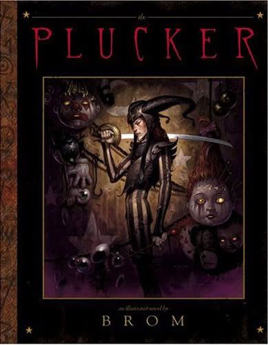 Thumbnails: 30 Second Interviews
Brom's work is often creepy, uncomfortable, and so damn pretty. No matter how dark the subject matter, his paintings are tenderly rendered little gems. (If you get to see the originals, you will see just how much they glow.) Much of his illustartion work has been collected into a number of art books, calendars, and various collectables. Last year, Abrams published his first fully illustrated novel, The Plucker, and he is hard at work on his second novel, The Devil's Rose.
Favorite painting you did in the past year?
The cover for my new illustrated novel, The Devil's Rose. It's an undead gunslinger riding a motorcycle. It just doesn't get much more fun than that!
Dream assignment?
Pretty much any job that I have complete creative control over and am ridiculously overpaid.
Do you remember the first time you knew you wanted to be an artist?
In the womb. This is actually true to some extent, as I cannot remember a time when I did not want to be an artist.
Do you have to like the book to be excited about the project?
No. I only need to like the art description, or be ridiculously overpaid.
First break in the business?
Getting hired onstaff at TSR in the late 80's. This put me in a studio with several top industry pros such as Clyde Caldwell, Jeff Easley, Fred Fields, Robb Ruppel. Being able to learn the basics of the craft from so much experience was a real brake. Also it was very competitive, I believe we pushed each other to do our best work. It was an incredible time of artistic growth for me.
A career highlight?
Having my first artbook Darkwerks published.
What are you working on now?
Last year Abrams published my first illustrated novel The Plucker. A twisted children's book for adults. I am just finishing up my second illustrated novel The Devil's Rose. This one's a western set in Hell and is just full of nasties! It is due to hit the stands this summer. I will be posting updates at www.bromart.com.
Your biggest influences?
Frank Frazetta, of course. I thrived on Richard Corben when I was growing up. Dead people I like: John William Waterhouse, Alfonse Mucha, N.C. Wyeth. And some people find this hard to believe, but Norman Rockwell has always been a favorite -- to me there simply is no better draftsman.
Advice to a young illustrator?
Don't eat paint. It will make you senile and cause you to lose control of your bladder. Beyond that, study the work of artist you like, but work to develop your own look. You will never get far being a second rate anybody, and nothing turns art directors off more than plagiarism (with the possible exception of aggressive flatulence). Second, fill you portfolio with the type of work you want to do. You get work based on what is in your portfolio. You want to paint apples, don't put oranges in your portfolio.
Something I should have mentioned when I made the Spectrum Deadline post:
You publisher/editor/art director types, don't forget that you can enter your covers as well. Coordinate with your artists so that you are not doubling up entries. Each year I submit about 10 covers for Tor and I find that the goodwill that it instills in the community comes back ten fold. The 10 that get to save a few bucks appreciate the gesture and the more covers that get into Spectrum, the more artists want to work for us. Not to mention that, when artists see that the kind of work they do for Tor can have a life after the cover, the more they are willing to sink their teeth a little deeper into our projects.
Good luck to all that enter!
Click here for an entry form.
Saturday, January 06, 2007
Beth Cavener Stichter
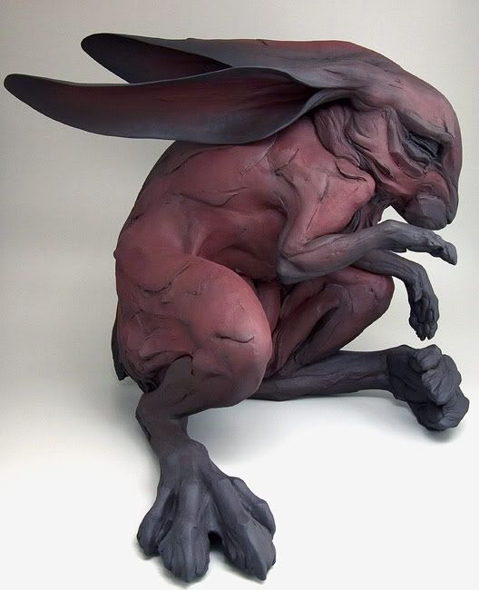
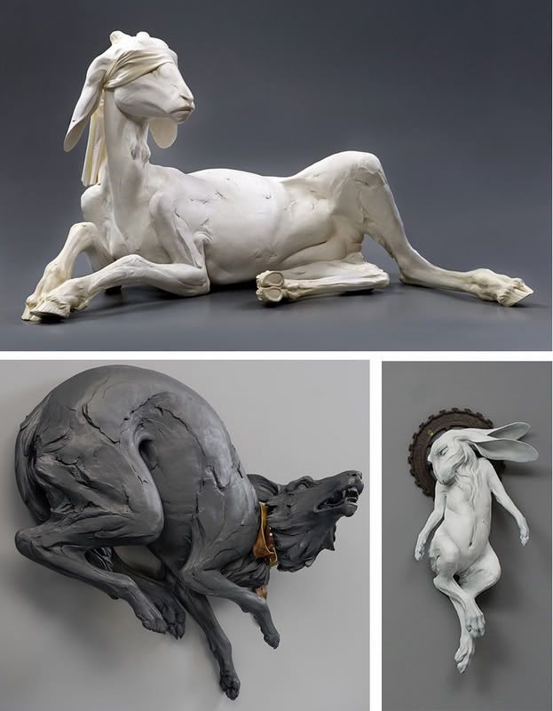 This has been a week of great art. I ran out at lunch yesterday to see a sculpture exhibit by Beth Cavener Stichter...and boy did I love it. Their intent is powerful and I love the painterly quality of the surface. Like the Walton Ford paintings mentioned below, the sheer beauty of the work underlines the emotional toll. "The sculptures I create focus on human psychology, stripped of context and rationalization, and articulated through animal and human forms On the surface, these figures are simply feral and domestic individuals suspended in a moment of tension. Beneath the surface they embody the impacts of aggression, territorial desires, isolation, and pack mentality."
Wednesday, January 03, 2007
Walton Ford, Carl Akeley, and Ron Mueck
 I went to see the
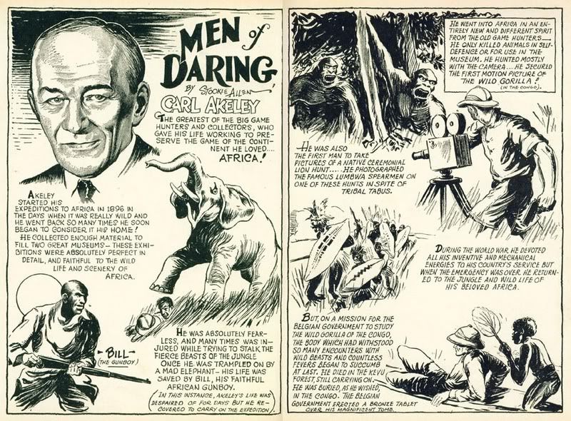
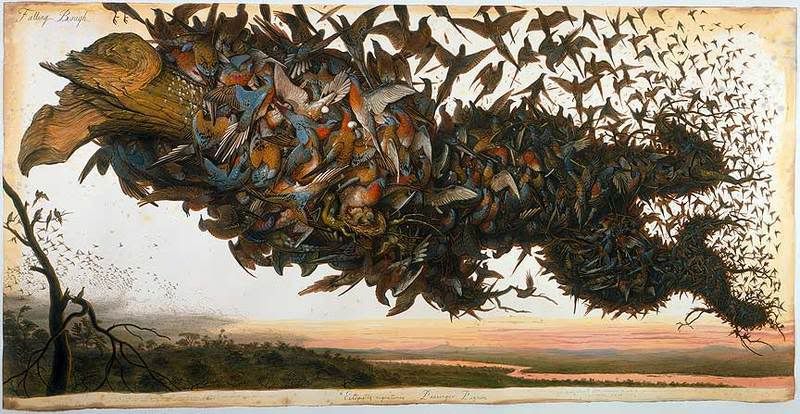
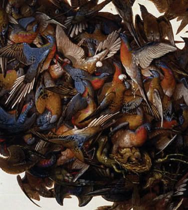
 Walton Ford exhibit, Tigers of Wrath, at the Brooklyn Museum yesterday. Fantastic! Ford creates gigantic watercolor paintings, often life-sized or larger, in the style of James Audubon with layers of subtext woven into them -- colonialism, destruction of natural resources, vanity, etc. I had wanted to see the show for some time but I got even more excited after speaking with Ted and Betsy Lewin at the Society. We quickly got around to talking about the Museum of Natural History and Carl Akeley. The Lewins told me that one of the Ford paintings was a tribute to Akeley and that meant that I had to run over as soon as I could.
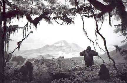
Carl Akeley is considered the father of modern taxidermy. He revolutionized the craft by expertly sculpting the musculature of the animals rather than limply stuffing the skins with straw. The American Museum of Natural History’s Hall of African Mammals was his vision and he died creating it. I’ve had a black and white photograph of the mountain gorilla group hanging on my office door for ages. The diorama not only depicts the landscape those gorillas lived and died in, it is also the place where Akeley was buried.
And when I say "the place", I mean that literally. One of the many things I love about those dioramas is that they are not representations of typical landscapes, they are exact replicas of a real place. Once a spot was chosen, every tree was caste and molded, plants were taken, grasses, dirt, reference paintings were done on site. Each diorama is a specific place at a specific time. When you see them (and the Hall of North American Mammals is no less stunning) you are looking at some of the finest landscape painting and animal sculpture possible, not to mention lighting design.
I love all the contradictions that the museum offers. Each of those specimens were shot and gutted (even the cute lil’ baby ones) and yet Akeley established the first park in Africa to protect the wildlife. The museum is a contemporary working science lab (the galleries take up a very small percentage of the buildings) even as it epitomizes a nineteenth century “great white hunter” esthetic. I also love that you can see exhibition design that has not been touched since the 50’s next to some fabulous contemporary design. (The only halls that I ever found ugly, the Hall of Human Biology are, thankfully, under renovation.)
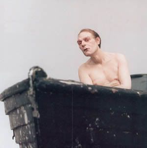
Another exhibit we saw at the Brooklyn Museum was Ron Mueck’s hyper realistic sculptures of human bodies that have been enlarged or shrunk. I have to admit, before seeing the exhibit I wasn’t thinking too much of it...but in person, this show is amazing. The scale shifts, and flawless craft, jar you into reexamining the figure and quietly gasping at their humanity. These "people” are awkward, lonely, and fascinating.
Both shows, and the Natural History dioramas, rely on a mastery of their medium in order to be so effecting. (Very refreshing when so much contemporary art eschews technical ability.) Any flaw in the craft would have been a distraction from their artistic message. These exhibits can be visited over and over again... they are not intellectual puzzles to be “gotten” they are to be felt and experienced.
------
Lest you think this post is devoid of a science fiction connection, just a few minutes ago I learned j that James Tiptree Jr. went on expedition with Carl Akeley when she was six years old, or least that's what Wikipedia says.
------
IMAGES:
Walton Ford’s "Falling Bough" and detail. These paintings are often seven feet long or more. (There was even a life sized elephant painting.) Remarkable for watercolor. While the surface isn’t as deep and lush as a Charles Santore or Genady Spirin painting, the drawing and the value is spot on. What you lose in the looseness you more than make up for in the sheer presence of the work.
Various shots from the Museum of Natural History on a very busy New Years Day. I've been there a hundred times and still only leave when I'm kicked out. If you go, bring binoculars. It's a great way to rediscover the paintings.
A short bio, comic strip style, of Akeley that I found while looking for the the gorilla group photo below.
Photographer Hiroshi Sugimoto began his career with a series of photos of the dioramas in the 1970s. Here is the mountain gorilla group, depicting the burial ground of Carl Akeley.
Ron Mueck's sculptures “Man in a Boat” and the artist with "Dead Father." Since the whole point of these sculptures is the scale, you must see them in person. If given the chance, you won't regret the effort.
Illoz
![]()
A new portfolio website is born. Weighted toward editorial work at the moment, but some great people are there. And, you get a sneak preview of Nancy Stahl's seriously lovely 2007 Christmas stamps.
Tuesday, January 02, 2007
Thumbnails: John Harris


 Thumbnails: 30 Second Interviews
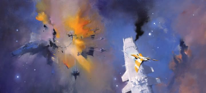
John Harris has been one of my personal favorites ever since I began work at Tor. I love his work for many of the same reasons I love Martiniere's -- they resonate a sense of awe and scope, a kind of "big picture" science fiction. His futures seem simultaneously possible and dream-like. The paintings are never labored, they invite the viewer to participate in them, to contemplate the future and its repercussions in their own mind. His art book, Mass, is a must have.
Favorite painting you did in the past year?
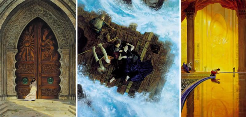
A Jack Vance cover for Bookspan and the cover for The Last Colony. [Bottom image.]
Dream assignment?
Lost Worlds in space.
Do you remember the first time you knew you wanted to be an artist?
I remember when I was six or seven I had chickenpox. I was kept in bed for an age and, getting bored, I started decorating the wall beside my bed with a stubby pencil. I suddenly discovered the magic of marks and how they could make worlds appear in my head. The wonder of it survived my mother's wrath and remains with me to this day.
A career highlight?
In 1985 NASA invited me to watch a launch of the space shuttle and paint a picture for their collection, and which now is part of the Smithsonian collection. [Top image.]
Subscribe to:
Posts (Atom)
