
I got batch of cover designs in today and immediately regretted that the one I liked the best, visually speaking, would never fly for the cover. In this case, with good reason — it looks great but isn’t quite suited for the audience. Luckily, there are others in the batch that also also very good and more appropriate for the book.
Also today, I got sketches in for another book. Here we are clearly we are making the less interesting choice because it more closely resembles familiar territory. The artist is no dummy and will likely reuse the pose on someone else’s very successful book cover. (And I will be jealous!)
This happens a lot in the job. Many times I agree with the final outcome, in some cases I don’t. Below are two older examples of covers that “got away.”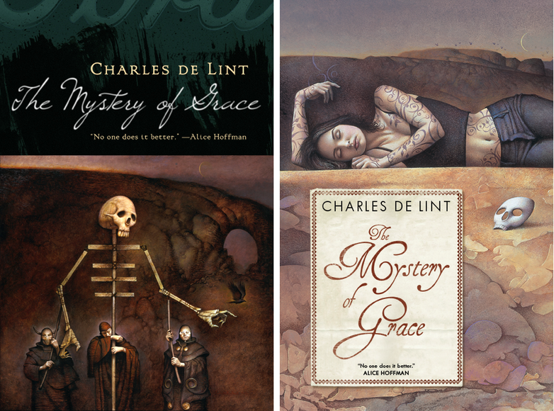 The Mystery of Grace
Illustrator John Jude Palencar and designer Peter Lutjen have been the dynamic duo beyond many many Charles de Lint covers. It’s amazing how well their sensibilities work together, even more so when you consider that Charles, Peter, and John have never met. When Mystery of Grace came up, when we knew a general outline of the story. John Jude sent in a series of sketches and I was blinded by how much I loved this puppeteer drawing. It makes for a great painting, and even a great cover, but when the author and editor brought up the fact that it was much too dark for the book, it was hard too fight it. It certainly is macabre. This is not the artist’s fault. If I had been thinking more clearly, I would have asked for other sketches. In this case we got as far as printing Advance Reading Copies with the puppet cover before we were able to about-face and start over. (I’m told you can find those advance reading copies on eBay every now and then.)
Since we do have such a long and wonderful history of Palencar covers on de Lint books, there was never a question of what to do — I went back to John, described the book more fully, and gave him a clearer understanding of how we wanted to position it. It was a whole second commission for him — a pricey mistake on my part but, thankfully, not one that I make too often. In the end, the second cover is just as lovely in a different way.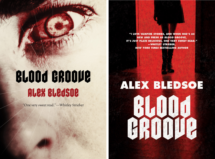
Blood Groove
In this case, it was tough to get the marketing tone right. The initial copy and the title made it sound a bit campy and hipstery. When talking to the editor, the book sounded much more gritty than that, and it sounded much more grisly than the current slew of hot Twilight-y vampires. Designer Jamie Stafford-Hill went to town on the idea of a truly horrific, old school vampire. What you can’t see here is, he even requested a slightly textured varnish to make the cover just a tiny bit pebbly your hand. We did an advance run on the jackets and they looked great. Really great. In the end, though, Sales and Marketing felt that we should try to hit larger audience an go with a “movie-poster” style cover.
Selling more books is good for everybody — everyone from the author, to the bookstore clerks, to the truck drivers moving inventory around — so it’s difficult to say that going more commercial is a bad thing...But truth be told, this was example where I wish we could have stuck with something that was a bit more unique and engaging. While I certainly like the re-do, quite a bit actually, I’ll always wonder which cover really would have performed better.
Monday, November 23, 2009
The covers that got away
Subscribe to:
Post Comments (Atom)

7 comments:
I find the influence sales and marketing have on the design process fascinating. From my experience with covers for a children's book series I found it initially very frustrating that my more imaginative ideas were being squashed by sales and marketing. Well, that's how it felt at the time. I riled against the idea that a 'marketing' guy would know more about illustration and design than me. But overtime it dawned on me that they don't necessarily know more about illustrating but they do know what sells. In the world of commercial illustration you just can't be ignorant to the factors that make a books sell, and like it or not, the sales and marketing crew know their stuff!
I remember seeing these in person at your office over there at Tor. These simply blew me away. At least it gave you an excuse to get your hands on two JJP pieces for a short while ;)
Andy - Exactly! I can almost think back on my early years at Tor as my professional teens -- when I was _so sure_ that I was right and "they" didn't get it. So dumb of me not to realize that everyone involved wants a successful product _and_ to do some work they are proud of along the way. And much more often than not, hen they push me things turn out the better for it.
Eric - yeah! Can;t say I complained about _that_ part. And the great thing about this internet age, a painting like that can still be seen outside of it's initial purpose. It also got into the Society of Illustrators and Spectrum annuals...so it seems to be having it's own, nice, life.
I really enjoyed reading this post, and mirror Andy Smith's comment. Gleaning some insight into what makes a good or marketable cover is thoroughly interesting and helpful to me as an illustrator. :) I hope to hear more!
I was at Palencar's panel at Illuxcon and he mentioned this situation when showing the puppet image. I do have to say that I like the second cover much better, and it does seem to fit with the other covers he's done for Charles deLint books, which often seem to feature mysterious women in one situation or another. (The covers, not always the books.)
The marketing choice worked, though, because I'll definitely be keeping an eye out for that book on the shelves. ;) The cover alone is enough to intrigue me.
Great Post! I really enjoyed seeing the proposed covers versus the finals and appreciated some insight into how that kind of process can play out. I hope to one day have an opportunity to do some book covers and this is great food for thought here.
I also really enjoy the design on the Blood Groove "movie poster" version. Where it doesn't grip you as tight as the flaming vampire eye it pushes nearly all the focus on the title block and author name, drawing further recall of the title and not necessarily just the image.
I could see someone discussing the book and recalling the title easier whereas I could see the contrary with the vampire eye cover. With that cover I could see someone recalling in this fashion, " yah you know the book with the crazy eye on the cover ... what was it called again... oh anyways you know."
I enjoy both but feel the second version gives more to the title. Thanks for sharing these.
Corey
Thank you for putting this up, Irene. It's so rare that we as readers or other illustrators get to see the stages which don't see the bookstore shelf, so to speak.
I'm glad that the JJP piece is enjoying its own nice "life", though I always get vaguely sad when a less "risky" cover is passed over for shelf appeal. I know it's good for sales, but it's just me.
Hope the artists don't make you sad by providing sketches that're cool but don't work so well for marketing. : )
Post a Comment