

Friday, November 27, 2009
Tuesday, November 24, 2009
Omar Rayyan
 Public service announcement of the day, check out Studio Rayyan's blog. Holy cow, do I love these.
And I'm looking forward to seeing the Alice in Wonderland piece in December as it is part of an Alice exhibit at the Brandywine Museum.
(The Brandywine as in, “bury me under the Andrew Wyeth’s, please.”)
Monday, November 23, 2009
The covers that got away
I got batch of cover designs in today and immediately regretted that the one I liked the best, visually speaking, would never fly for the cover. In this case, with good reason — it looks great but isn’t quite suited for the audience. Luckily, there are others in the batch that also also very good and more appropriate for the book.
Also today, I got sketches in for another book. Here we are clearly we are making the less interesting choice because it more closely resembles familiar territory. The artist is no dummy and will likely reuse the pose on someone else’s very successful book cover. (And I will be jealous!)
This happens a lot in the job. Many times I agree with the final outcome, in some cases I don’t. Below are two older examples of covers that “got away.”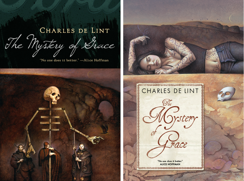 The Mystery of Grace
Illustrator John Jude Palencar and designer Peter Lutjen have been the dynamic duo beyond many many Charles de Lint covers. It’s amazing how well their sensibilities work together, even more so when you consider that Charles, Peter, and John have never met. When Mystery of Grace came up, when we knew a general outline of the story. John Jude sent in a series of sketches and I was blinded by how much I loved this puppeteer drawing. It makes for a great painting, and even a great cover, but when the author and editor brought up the fact that it was much too dark for the book, it was hard too fight it. It certainly is macabre. This is not the artist’s fault. If I had been thinking more clearly, I would have asked for other sketches. In this case we got as far as printing Advance Reading Copies with the puppet cover before we were able to about-face and start over. (I’m told you can find those advance reading copies on eBay every now and then.)
Since we do have such a long and wonderful history of Palencar covers on de Lint books, there was never a question of what to do — I went back to John, described the book more fully, and gave him a clearer understanding of how we wanted to position it. It was a whole second commission for him — a pricey mistake on my part but, thankfully, not one that I make too often. In the end, the second cover is just as lovely in a different way.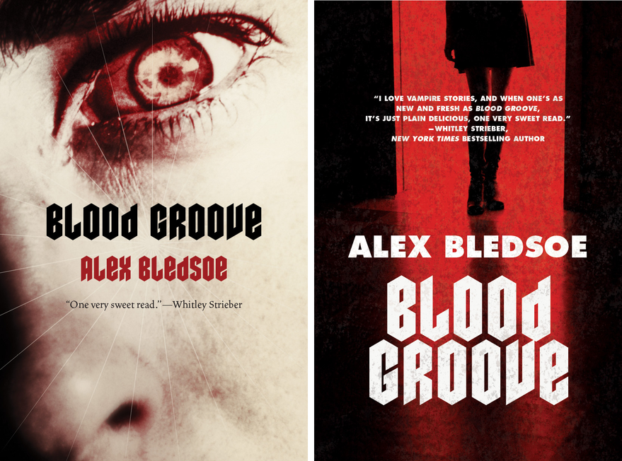
Blood Groove
In this case, it was tough to get the marketing tone right. The initial copy and the title made it sound a bit campy and hipstery. When talking to the editor, the book sounded much more gritty than that, and it sounded much more grisly than the current slew of hot Twilight-y vampires. Designer Jamie Stafford-Hill went to town on the idea of a truly horrific, old school vampire. What you can’t see here is, he even requested a slightly textured varnish to make the cover just a tiny bit pebbly your hand. We did an advance run on the jackets and they looked great. Really great. In the end, though, Sales and Marketing felt that we should try to hit larger audience an go with a “movie-poster” style cover.
Selling more books is good for everybody — everyone from the author, to the bookstore clerks, to the truck drivers moving inventory around — so it’s difficult to say that going more commercial is a bad thing...But truth be told, this was example where I wish we could have stuck with something that was a bit more unique and engaging. While I certainly like the re-do, quite a bit actually, I’ll always wonder which cover really would have performed better.
Sunday, November 22, 2009
Kris Kuksi exhibit
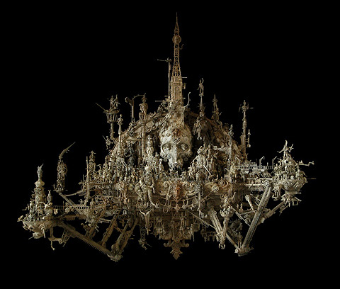
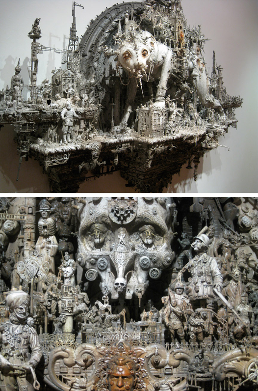 Kris Kuksi
Beast Anthology
548 West 28th Street, 3rd Floor, NYC
Nov 21 -- Dec 19, 2009
Last night I attended Kris Kuksi's Beast Anthology opening at the Joshua Liner gallery. I had seen pictures of his work over the past year and was anxious to view them in person.
Kuksi takes bits and pieces of action figures, toy soldiers, tank models, and a seemingly endless selection of other figurative found objects and creates scenes that, seen as a whole, are reminiscent Eastern temple wall sculptures. Chaotic on the micro level but ultimately forming organized symmetrical shapes. The soldiers' poses and tanks create a kind of steampunk inspired monstrous momentum -- evoking elements of imperialism and industry. The religious and/or post apocalyptic effect is often enhanced by an "underworld" side to the work.
I'll admit, it's not work that effects me emotionally but if you're looking for a true "Holy shit, that's awesome!" experience, it's well worth the effort to go see them. It is easy to get lost in each one for quite a while. The longer you stare and the closer stand next to them, the more you can reduce yourself to their scale and become overwhelmed by their momentum.
[MY FUZZY PHOTOS HERE]
Thursday, November 19, 2009
Art Out Loud DVD trailer
Trailer for Art Out Loud, Vol 3 from Kate Feirtag on Vimeo.
A little set-up tease for an upcoming DVD of the September 12th's Art Out Loud at the Society of Illustrators with:
James Gurney
Sam Weber
Charles Vess
Donato Giancola
Greg Manchess
Earlier report of the event here. I'll give a heads-up when the DVD is available, of course.
Hmmm..makes me want to start another Art Out Loud.....
Wednesday, November 18, 2009

Two awesome cover posts.

Monday, November 16, 2009
The Great Hunt ebook now available. And Kekai Kotaki desktop wallpaper.

 Tor.com is giving away Kekai's Great Hunt wallpaper as a means of announcing the ebook release of The Great Hunt
, now available.
Thursday, November 12, 2009
Cassandra Diaz webcomic: My Grandmother's House
 A while ago I mentioned that Sam Weber turned me on to Cassandra Diaz's work. I now have the pleasure of publishing her comic My Grandmother's House -- an ethereal, dreamy moment -- on Tor.com. Check it out. I'm still blown away that she's just out of school.
Tuesday, November 10, 2009
Kekai Kotaki and The Great Hunt

The second Wheel of Time ebook cover is now released, this one by the amazing Kekai Kotaki. You can read a behind-the-scenes post and see lots of progressions on Tor.com: The Great Hunt ebook cover by Kekai Kotaki.
RELATED: David Grove's ebook cover for The Eye of the Wolrd
Sunday, November 01, 2009
Art that's a lot like hiking
 Storm King Art Center is always magical.
Went for the Maya Lin, and to revisit the Andy Goldworthy, and was reminded how much I love Richard Serra.
Subscribe to:
Posts (Atom)
