Monday, August 31, 2009

Brom on The Child Thief


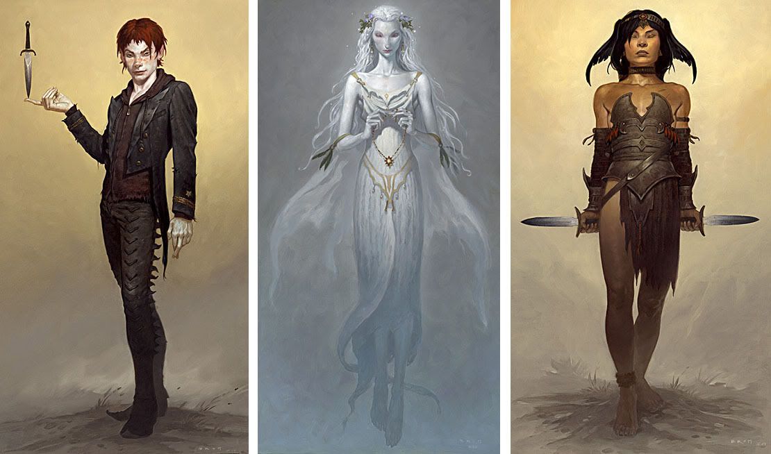
Anyone reading The Art Department is likely to know Brom's dark and often disconcertingly beautiful paintings fairly well. Over the past few years Brom has turned his efforts to writing novels, with the highly illustrated Plucker and The Devil's Rose.

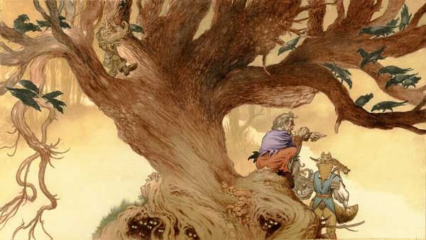
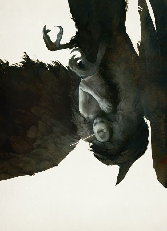
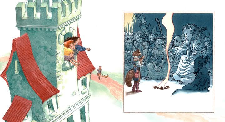
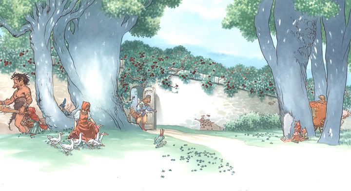
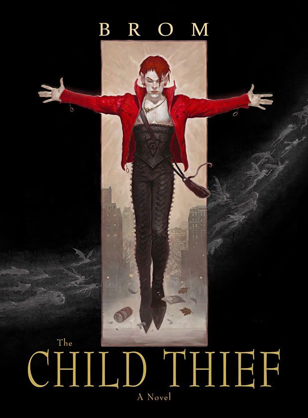
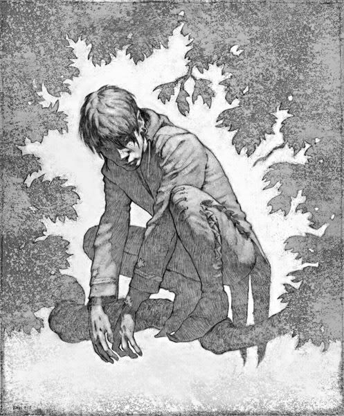
His third novel, The Child Thief, is just out from Eos. It is a beautiful over-sized book with a number of color and black and white illustrations and is a decidedly not-for-kids continuation of Peter Pan.

"In the dusk of that early autumn day the child thief peered out from the shadows and falling leaves to watch the children play. The children scaled the giant green turtle, slid down the bright yellow slide, laughed, yelled, teased and chased one another round and round. But the child thief wasn't interested in these happy faces. He wasn't looking to steal just any child. He was particular. He was looking for the sad face, the loner…a lost child. And the older the better, preferably a child of thirteen or fourteen, for older children were stronger, had better stamina, tended to stay alive longer."

When did you begin writing? Where you always thinking of stories to tell while developing as a painter?

I've always told stories, either with pictures or with words. As a child I loved making little books, y'know -- paper, words, drawings, stapler and pesto you have book! It's pretty much the same now -- paper, words, paintings, computer and presto you have book.

Is there a way in which you found writing and painting surprisingly similar?

I'm a very visual person, so the processes are similar in that they both come from the picture part of my brain. The difference is that writing is like watching a movie and I'm playing all the parts. Painting is taking a single frame from that movie and trying to make the strongest image I can imagine.

Was it difficult to convince a publisher that an artist could write well?

The ideas come easy to me, and I love the act of writing, but just like painting, I had to work very hard to develop my craft to a point where it was publishable. What was more difficult, at least in the beginning, was convincing a publisher that it was okay to put pictures and words together in an adult novel. The publishing market can be very conservative at times and in many publishing houses pictures books are for children only.

What is it about Peter Pan that drew you to this story?

Simply reading the original story (not the water-downed Disney version). I was amazed what a dark and disturbing tale it really is. Here's a quote from the original Peter Pan: “The boys on the island vary, of course, in numbers, according as they get killed and so on; and when they seem to be growing up, which is against the rules, Peter thins them out; but at this time there were six of them, counting the twins as two.”

Thins them out? Huh? What does that mean? Does Peter kill them, like culling a herd? Does he send them away somewhere? If so, where? Or does Peter just put them in such peril that the crop is in need of constant replenishing?

That one paragraph forever changed my perception of Peter Pan from that of a high-spirited rascal to something far more sinister. “Thins them out,” the words kept repeating in my head. How many children had Peter stolen, how many had died, how many had been thinned out? Peter himself said, “To die will be an awfully big adventure.” Once I pondered these unsettling elements I began to wonder what this children’s book would be like if the veil of Barrie’s lyrical prose were peeled back, if the violence and savagery were presented in grim stark reality. How would children really react to being kidnapped and thrust into such a situation? How hard would it be for them to fall under the spell of a charismatic sociopath, to shuck off the morality of civilization and become cold-blooded killers? And these thoughts were the seeds for The Child Thief.

The black and white drawings are (besides being drop-dead gorgeous) reminiscent of intaglio prints. Was this a style you developed for this story, and if so why? Or is this a natural outgrowth of you painting style?

Painting comes very naturally to me, line work does not. In painting it is all about losing the line, to work in tone, to have your shadows hold your image. So I am very pleased that you like the drawings because in many ways they were a lot more work than the paintings.

What’s next? Are you working on another book?

I'm finally getting around to putting together a new art book. This will be a collection of my early paintings as well as new work. Hopefully it will be ready in about a year.

Friday, August 28, 2009

Makers, sorta

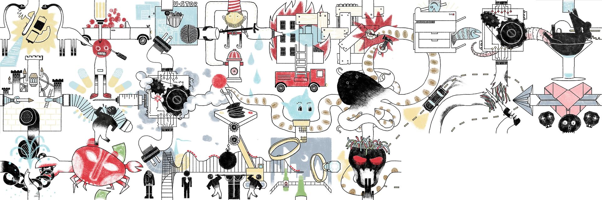
If you haven't read Cory Doctorow's Makersand you just look at the Idiots' Books illustration tiles for its serialization on Tor.com (24 episodes out of 81 so far) it goes like this:

Once upon a time there were two dinosaurs. And lots of people that went off to build something. Until it burnt down. They rebuilt it but there was a rat in the mix! (Isn't there always.) They were very industrious and good at multitasking until...Sabotage! And love. And maybe a little crabbiness. The usual ups and downs and ideological wars -- punk rock keepin' it real Vs. Helvetica men in ties. But with marriage in the air and death on the horizon.....
After seeing sketches for the first few tiles, we let Idiots' Books run with the project without sticking our noses in...which means it's as much of a surprise (and delight) to me each week as it is to anyone else. I am very excited to let a few more weeks go by so I can read more of their translation.

RELATED POSTs:
Idiots Books are awesome and the Makers tile game -- in which you can reconfigure the story in many, many ways.

Thursday, August 27, 2009

Animation on Tor.com "Red Rabbit" and "8848"

Red Rabbit: Embrace your oddity. (8 minutes)

8848: A young man remembering his father. (5.23 minutes)

For more animation: Saturday Morning Cartoon Index

Wednesday, August 26, 2009

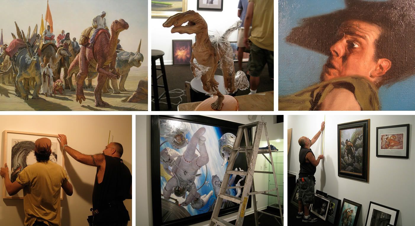
Spectrum Exhibition 2 hanging.

Apologies for the crappy pictures. I only had my point-and-shoot camera which only sorta/kinda/sometimes likes to focus. (You'd think it would appreciate trips to the beach, but it really doesn't seem to.) Anyway...

Some pictures at the Society, hanging the Spectrum Exhibition 2.

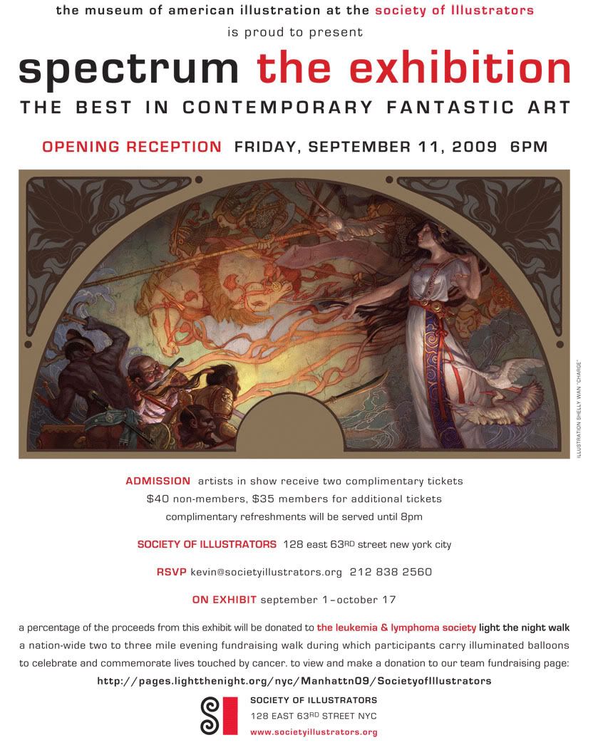
The second Spectrum Exhibition is poised to open at the Museum of American Illustration at the Society of Illustrators. Selection from Spectrum annuals 12-15 will be on display from September 1st - October 17. Opening reception September 11th. Paintings from John Howe, Julie Bell, Boris Vallejo, Leo and Diane Dillon, Phil Hale, Charles Vess, Donato, John Jude Palencar, Kinuko Craft,Michael Whelan, Brom, Rick Bery, Greg Manchess, Rebecca Guay, Sam Weber, Brad Holland, Yuko Shimizu, Stephan Martiniere, Tony Deterlizzi, and many others will be on display.

Leukemia Society fundraiser in memory of Dave Stevens.

In honor of Dave Stevens, the Society of Illustrators and Spectrum have come together to help raise funds for the Leukemia and Lymphoma Society. A portion of the proceeds from the Spectrum Exhibition will be donated to the Society's "Light the Night Walk" team.

To join our team or donate money, please visit: Society's Light the Night Walk Team.

(You do not have to live in New York to participate in the walk. Click on “find local walks” to find the event nearest you.)

Funds raised through Light the Night Walk support the work of hundreds of the world’s leading researchers in their fight for better therapies and cures for leukemia, lymphoma, and myeloma.

"[Dave Stevens] was enormously talented, an artist whose Rocketeer series reminded everyone how good comics could be, a creator whose work literally sparkled with personality....I don't think I ever knew him quite as well as he probably knew me (and I believe many of his friends would say the same thing), but I do know that I miss him." -- Arnie Fenner, co-founder of Spectrum, co-editor of Brush with Passion: The Art and Life of Dave Stevens

Props from Lines and Colors

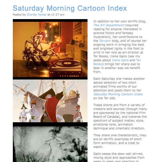
It's been a good week for back-pats. One of my (and many others) favorite art blogs, Lines and Colors, has written a blush-worthy post on Tor.com's Saturday Morning Cartoons.

"These shorts are from a variety of creators and sources (though many are sponsored by the national Film Board of Canada), and traverse the spectrum of subject matter, style, emotional tone, animation technique and cinematic direction.

They share one characteristic, they are all terrific examples of short form animation, and a treat to watch."

Although my involvement in Tor.com runs pretty deep and is always rewarding, the Saturday Morning Cartoons are a little extra special to me. It's my own quiet corner of site and has allowed me to indulge in a love of something that is completely unrelated to work. (Something I should do more of.) I am extra proud that Lines and Colors has highlighted it.

And a call for help/inspiration. If you have any animation suggestions, please mention them here. I've discovered a lot of great movies from you guys.

And, and, a shout-out to a few of the great sources I have been filching from:
National Film Board of Canada
Vague memories from a History of Animation class with John Canemaker.
Cartoon Brew
Tickle Booth
Drawn
Gobelins
+ a whole lot of internet hopscotch

Animation on Tor.com

La Marche des Sans-Nom: Beautifully designed and choreographed anti-war piece. (5.30 minutes)

Dynamo: Keeping the world balanced, Rube Goldberg style. (6 Minutes)

Tuesday, August 25, 2009

Props from Annalee Newitz

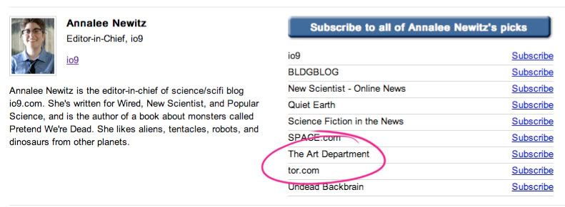
Woohoo! This made my week. Google's Power Reader asked tech&web gurus to name their must-read sites. Annalee Newitz, of io9 and the coolest geek of all, has named The Art Department and Tor.com. I am all smiles...and suddenly thinking I need to write something insightful. Shoot.

Cassandra Diaz

Sam Weber just sent me a link to this young comic book artist and illustrator: Cassandra Diaz. My latest art-crush, these are so ethereal and beautiful.

Monday, August 24, 2009

Jon Foster: Boneshaker and sketches

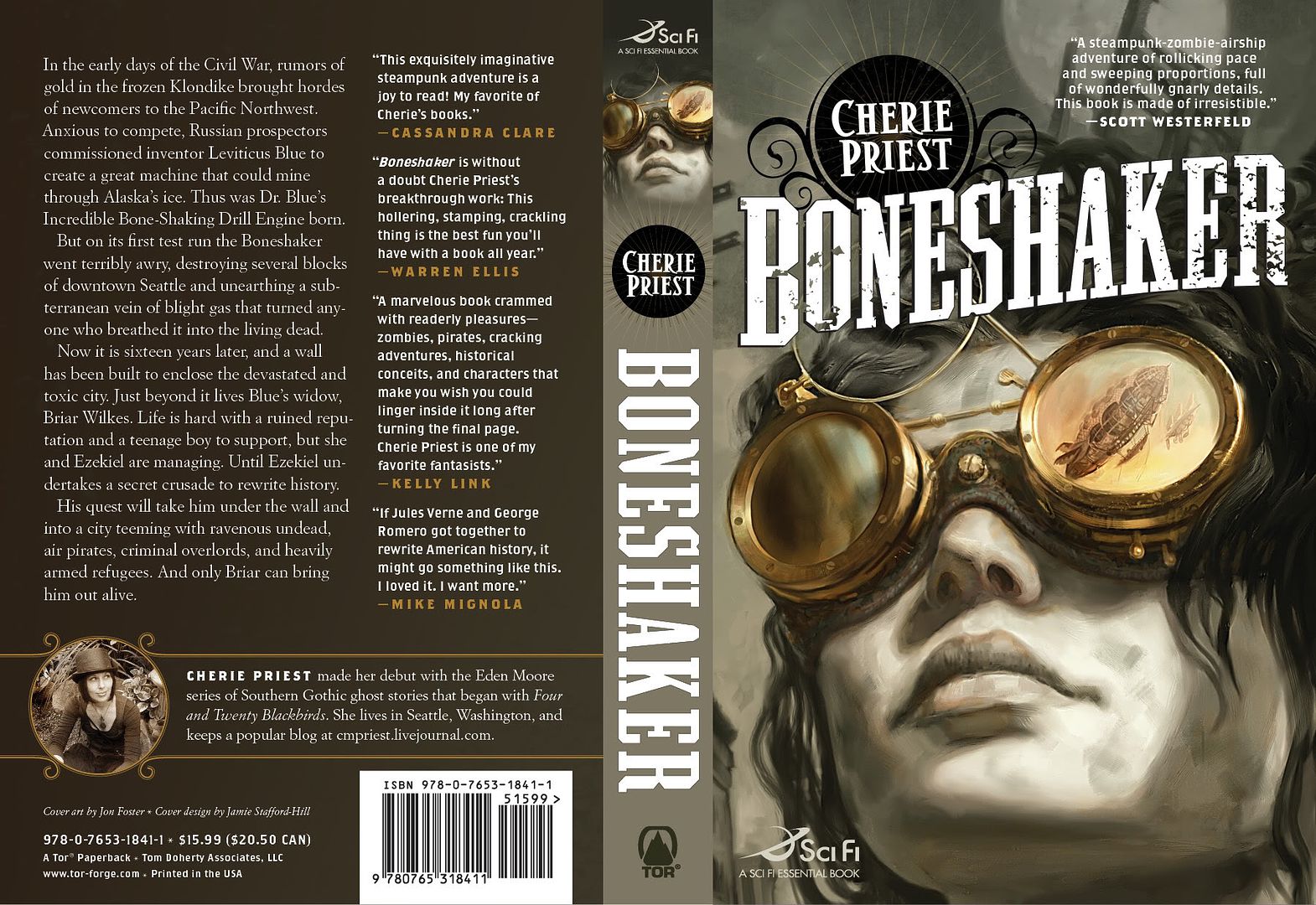
Cherie Priest's Boneshaker comes out at the end of September and it's getting a lot of buzz. I always double-like when one of my favorite covers accompanies a book that all the cool kids are raving about.

Art by Jon Foster.
Design by Jamie Stafford-Hill.
And check out Cherie Priest's website for series, The Clockwork Century.

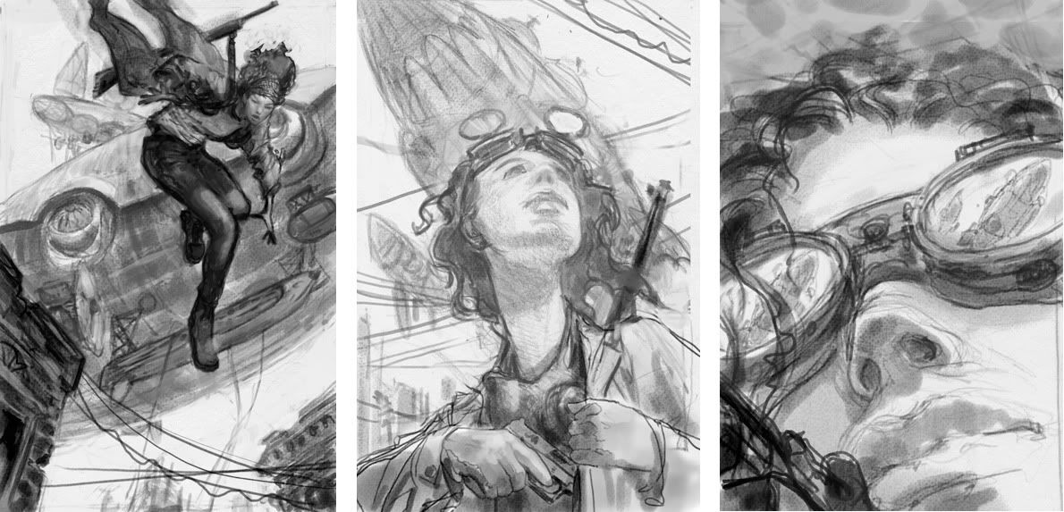
The first sketch was a real contender. It had action and might have more commercial appeal than the others. The second sketch looked a little too young-adult so that was ruled out fairly quickly. (Although it would make for a great YA cover.) The third one seemed slightly riskier than the others but also felt like, if all the pieces fell into place, it would be demand attention on the shelves. I'm very glad it's the direction we took.

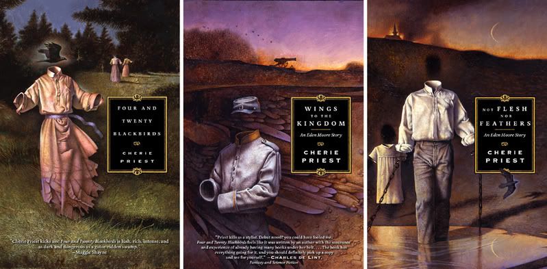
I have to admit, it does seem as though some authors have good cover karma. (Which unfortunately also means the reverse can be true.) I equally love the John Jude Palencar arted, Peter Lutjen designed, covers on Cherie Priest's "Eden More" books.

Sunday, August 23, 2009

Tor.com animation

Too much traveling has let me fall behind on these animation notices. Saturday Morning Cartoons have, however, been continuing on. I'll post daily updates until I catch up.


Das Rad and Accro

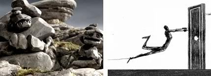
Das Rad: “Apparently, rocks are having conversations all around us, but they talk very, very slowly.” Rocks Hew and Kew watch the evolution of human civilization...and complain about lichen. This is a particularly cool movie. (Thanks to Kurt Huggins for the heads up!)

Accro: I love the drawing in this. These guys tirelessly keep trying, but they never quite get there.

Saturday, August 22, 2009

Peter de Seve is a bloggin'

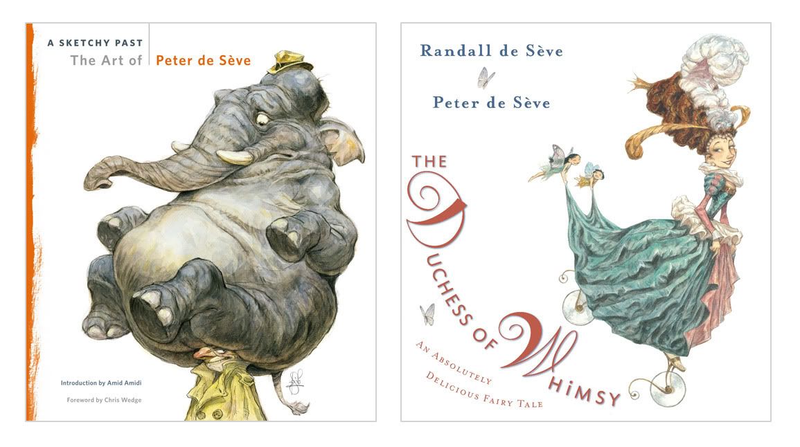
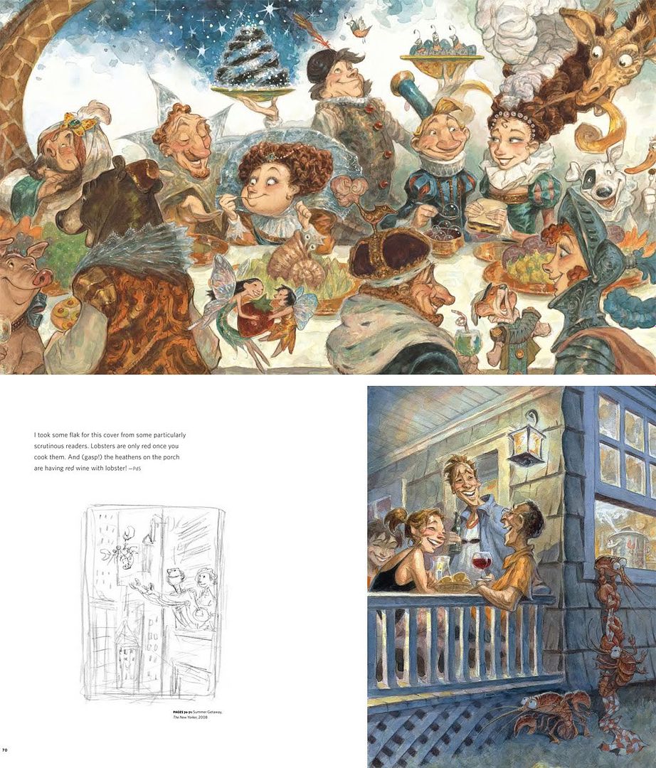
Peter de Seve has started a blog. This is a good news -- few people have the easy charm that Peter has, either in person or on the page. He's started off by showing some Ice Age sketches and talking about two upcoming books:

A Sketchy Past, the Art of Peter de Seve -- "I've come to think of A Sketchy Past, only half jokingly, as the "End of Part One" of my artistic life. Fifty years is a long time for one chapter, but perhaps, if I can put all of this work behind me, I'll be more open to bigger and more challenging artistic opportunities in the next fifty years. On the other hand, I might just curl up in a ball with a bottle in my fist and pore over the book every night, wondering whether I'll ever be able to draw again."

And a children's book collaboration between Peter and his writer wife Randall, The Duchess of Whimsy -- "a quirky love story about the Earl of Norm, a very plain and simple man who adores the Duchess of Whimsy, a beautiful and eccentric royal who has no patience for the ordinary."

(Also be the first to know -- Peter will be hosting a "Blue Sky / Ice Age" panel at the Society of Illustrators next month. Details very soon.)

Sunday, August 16, 2009

World Con. Artistic spheres of influence. And the future of book covers.

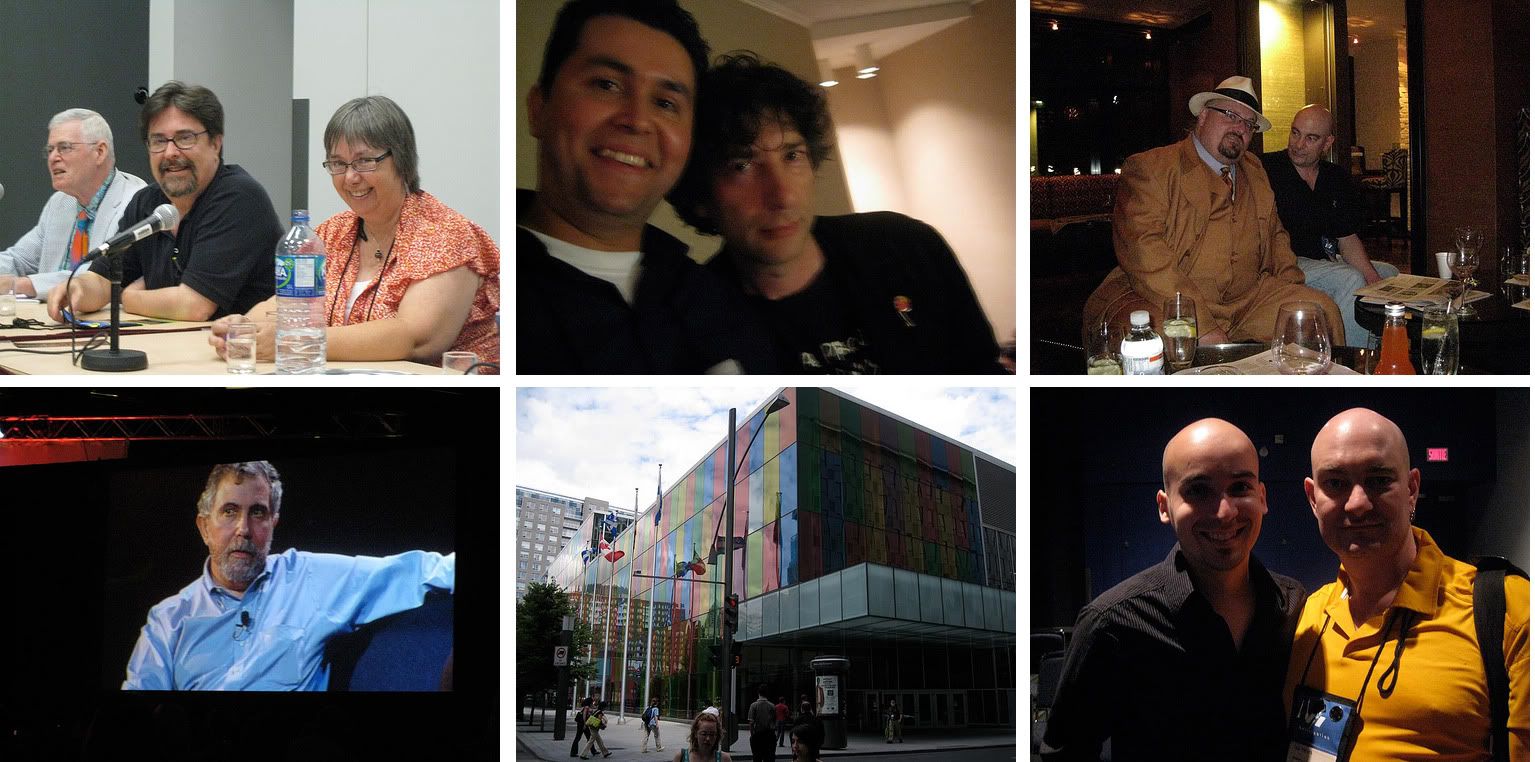
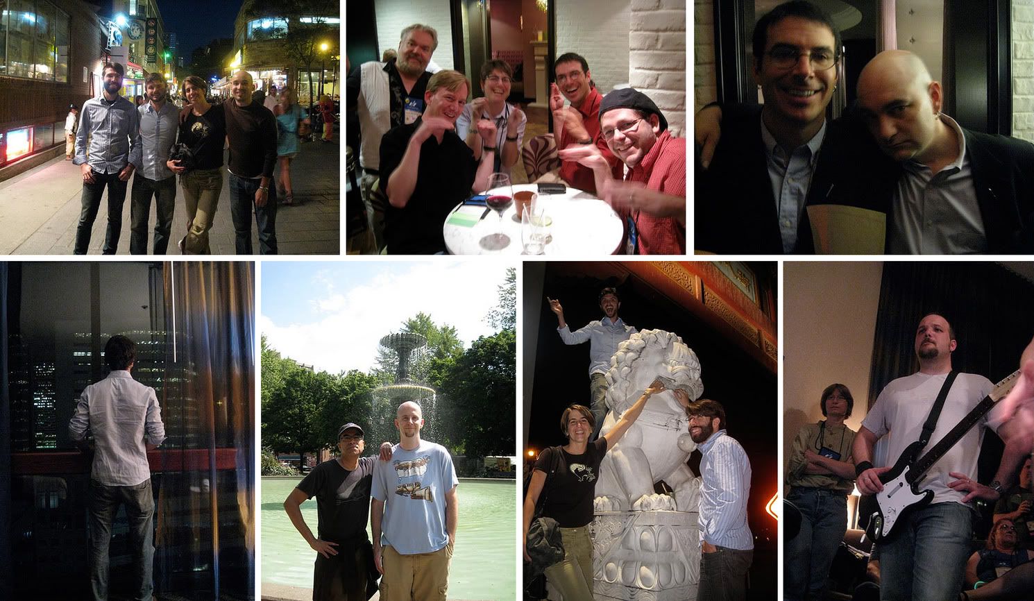
FLICKR SET HERE.

World Con came and went in a near-sleepless blur, but a fun blur to be sure.

It was great to see Tom Doherty in the spotlight, Neil Gaiman created a wake of excitement everywhere he went, and David Hartwell wore his infamous ties and jackets with extra pride. I was sorry not to see a Pro Artist Guest of Honor (but excited to hear Boris Vallejo will be the guest in Reno, 2011.)

I landed in Montreal early Thursday. The Intercontinental Hotel ("The IC", as the cool kids were calling it) was very, very nice...enough so that leaving it Thursday morning was almost difficult. (You know, like the Buffy episode when Dawn forces everyone to stay at home.)

Eventually I got into the convention center, with a little help from Doselle Young, in time to watch the "History of Tor" panel with Tom Doherty, Beth Meacham, Patrick Neilsen Hayden, and David Hartwell. In that group I am a newbie, which is funny since I've been at Tor nearly half its lifetime. (Says a lot about Tom that so many have stayed for decades.) Tom spoke a bit about his life in books pre -Tor (including selling the Lord of the Rings) and the founding of Tor. Our editorial gang talked about life in the start-up days when the office was six people in a room. Conversation turned to the current daily life at Tor -- dealing with slush piles, marketing, etc. There are some video clips here. Whenever I’m asked about the best part of my job I always say it’s the people I work with, both in and outside of the office, because that is the truth.

John Picacio and his panel suggestions. Artistic spheres of influence. And the future of cover art:

It's always a pleasure to catch up with John Picacio. He talked about raising the awareness of artists in the field. The thing to love about John, he never complains about something without offering suggestions and soliciting ideas. He had some concrete talks with various SF media folks and spearheaded what was arguably to the two best art panels I've ever been been to. Unfortunately being a panelist means it’s impossible to take notes but roughly:

"Vanguard Artists" panel: This came from his debate with Adam Roberts on whether SF art is overly conservative. John came prepared with a number of slides from artists (both young and not-so) that create works outside of the pre-raphaelite traditional so popular in fantasy illustration. Rest assured, there is an astonishing amount of exciting and vibrant work out there. Even without having seen what John brought before it was being shown on the panel, we could not have planed it better. Each artist was someone that either Dan Dos Santos, John, or I had some direct experience with and we had a blast talking about them. I hope the audience did as well.


Whether or not these artists will ever be recognized by Hugo voters is not really much of a concern to me. A good book cover can be on the edge of the curve of what is commercially effective but its first purpose is to connect to readers and sell a book. That said, my main point of the hour was that I believe the spheres of influences are reducing radically. There is more stylistic variety on the bookshelves now than ever before. When Michael Whelan came along publishers spent the next 15-20 years wanting their books to look like Whelan. Then Donato came along and publishers spent 10 years trying to echo Donato. In there you have the Hale/Berry influence leading into Jon Foster and others. Stephan Martiniere's covers laid down a precedence for concept art style illustration. James Jean rapidly became an influence on the industry and I’m already seeing Sam Weber infused work. With the expansion of SF into the mainstream plus the access to so many artists from various fields throughout the world, the time any one style can completely dominate is collapsing much quicker than it ever did.

The other panel John organized was “Where is the book cover going in an eBook future.” Between Pablo Defendini, Lou Anders, Karen Haber, John, and I we all agreed there will be book covers as we currently know them for a while yet. Still, we are very aware of increasing print sales through internet stores and the rise of eBooks. These books will always require marketing images, although the formatting may contribute to stylistic changes.

The demise of illustration to sell music when the CD market hit, and shrunk, record covers was brought up. I agree the formatting played a integral role but looking at the mainstream aesthetic in books covers throughout that same time period also shows a dramatic movement from illustration to photography. I think sf/f is becoming more encompassing of various styles, including photographic, but it is part of an aesthetic growth not just prevalence of viewing books online.

It is exciting to think about how "value added" eBooks can expand the visual material offered in a book -- background sketches, character designs, etc. But I wonder to what degree publishers will be willing, or able, to pay for this material. I'm often asked why there isn't more interior art in books outside of the young adult market. It's something we can do occasionally, but generally speaking it's expensive without having a clear sales benefit in the adult market. On the other hand our own online magazine, Tor.com, has lead to many more commissions from Tor than in the past. And if "DVD-extras" style eBooks come into vogue and create a richer environments for readers, then perhaps there will be some exciting projects for artists in the future.

The Hugos and Chesleys:

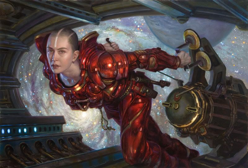
Donato won the Hugo! Well deserved. Fellow nominee, Dan Dos Santos, accepted for him -- Dan was gracious and looked damn sharp being so. (BTW, props to Dave Howell for one of the nicest looking Hugos I've seen.)

I have not confirmed this but it is rumoured that Donato wants to bow out of consideration from now on. I applaud his desire to see the Hugo awarded to others but I hope that he does not do so in this fashion. While ultimately the Hugo award has a much greater impact on an author's career than an artist's, it does serve as a spotlight for the rest of the field to recognize its artists. I want that spotlight to shine on as strong a field as possible. Currently that includes Donato.

In fact, I, for one, was very happy to be beat by Lou Anders this year at the Chesley awards. The work being done by Lou at Pyr, Jeremy Lassen at Night Shade, the folks at Orbit is fantastic. We all push each other to do better and any reminder not be complacent is welcome. So, congrats to Lou! (My only regret is he got one of the new shiny light-up Chesleys. Curses!) A full list of Chesley winners and links on SF Signal.

What else happened?

Lots of hanging out and talking.

Tor threw a crazy crowded party. Guests included Neil Gaiman and Nobel prize laureate Paul Krugman. Can it get cooler than that? Seriously.

Rock Band obssesives banded and rocked at the Tor.com party the following day.

I had a great meeting with Brandon Sanderson about some upcoming projects.

There was the odd realization that I see some NY friends more when we are hundreds, if not thousands, of miles away from New York. And promises to rectify that.

Chinatown with the artboys, Dan Dos Santos, Dave Palumbo, and Marc Sheff.

Everyone clamoured to be in Dave Palumbo’s next Living Dead zombie cover for John Joseph Adams. (Dave, I think you can leverage that into a whole lot of free drinks next time.) You can see my one and only stint as a cover girl The Living Dead. (And yes, my mother has this cover pinned to the refrigerator with a bright shinny magnet.)

The new Hugo logo was unveiled at he Hugo ceremony. Neil Gaiman, Geri Sullivan, Chip Kidd and I were asked to jury a contest to pick the logo. There were nearly 400 entries. Choosing was tough but I believe we arrived at something that is simple and elegant, something that will clearly mark a book as a Hugo winner without blending into, or distracting from, the the cover itself. I hope the committee decides to showcase some of the runner-ups, there were a number of fine designs on the shortlist. Congrats to Jeremy Kratz.

Dan Dos Santos and I stumbled into the backstage of the masquerade. Two words: Klingon Batman. Cheryl Morgan showed us a around and answered a million questions. I regret not having seen some of the costumes in action, especially the multi-person ones, but being surrounded by all the nervous energy while the contestants awaited the judges’ results use a unique treat. (Thank you, Cheryl, for inviting us in.)

And.....

Nirvana was played on an accordion.

Marc Sheff climbed a Foo dog statue.

Rob Bland nearly climbed a large wire hand.

After discovering all of Night Shade's inventory was lost for the weekend, Jeremy Lassen climbed on his table top and try to sell himself.

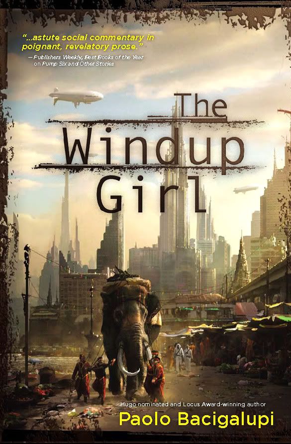
Eventually Night Shade’s books were found and sold out. There was a tremendous amount of buzz for Paolo Bacigalupi’s The Windup Girl.

Speaking of Paolo, he and Annalee Newitz managed to scare off bar company with their ideas on cloning (or was it genetic engineering?)

All in all, a typical World Con. Between this and Comic Con, it's time to remind myself what eight hours of sleep feels like. And its time for me to get back to work. For reals.

Saturday, August 15, 2009

Art Out Loud 6: Demos with James Gurney, Charles Vess, Sam Weber, Donato, and Greg Manchess


It's been too long since the last Art Out Loud painting demo, making us doubly excited to announce Art Out Loud 6.

Five artists will be painting and answering questions simultaneously within the Society of Illustrators' Hall of Fame gallery. If you get there early, the Spectrum exhibit will be on display in the main gallery from noon - 4:00.

The line up is awesome with a great array of painting styles. These guys are not just the top artists in the field but they are also incredibly giving and eager to share what they have earned over the years. Stop by and bug them with all the questions you can think of.

James Gurney
Sam Weber
Charles Vess
Donato Giancola
Greg Manchess

Art Out Loud 6
Saturday September 12th
1:00 -- 5:00pm
Society of Illustrators
128 East 63rd Street, NY NY
$10 students, $20 members, $25 non-members
Refreshments included
RSVP kevin@societyillustrators.org / 212 838 2560

Warning: Space is very limited and tickets are cheap. Buy tickets in advance, all previous Art Out Louds have sold out.

[Write-up of previous Art Out Loud: Jim Bennet, Gary Kelley, and Greg Manchess]

Friday, August 14, 2009

Charles Vess at work on Neil Gaiman's Instructions

Sometime you just have to love opening email. This morning I got a note from Charles Vess showing off a few new paintings for his next children's book, Neil Gaiman's Instructions. He's also posted some sketches and final paintings on his blog, Greenmanpress.com. Like their previous collaboration, Blueberry Girl, Instructions based on one of a Neil's poems -- this one about how to survive a fairytale...which isn't surprisingly different than how to survive life.

Charles gave me a sneak peak at the project about a month ago and I've been excited to see it develope. I know he's working like a bandit to get it done on a rush deadline but you'd never know it from the quality of the artwork. These are simply amazing.

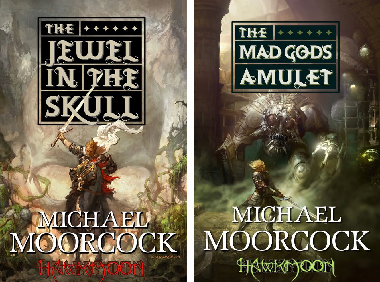
Vance Kovacs and Michael Moorcock's Hawkmoon

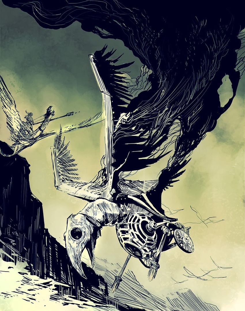
Vance Kovacs is doing the covers plus interiors drawings for Tor's upcoming editions of Michael Moorcock's Hawkmoon series. Here are the covers for the first two plus an interior. Although the printed book will be in black and white, eBook editions will eventually (soon) b ein color so, we opted for limited color on these.

Vance has been a great guy to work with -- very excited about the project. I can't wait to see what he does with the second half of the series.

Thursday, August 13, 2009

Kurt Huggins and Zelda Devon begin King of an Endless Sky

Yay! We are big fans of Kurt and Zelda. Their first comic for Tor.com, The Dreaded Question, was a huge success. Today begins an ongoing weekly strip that is "is part Antoine de Saint-Exupéry, part Windsor McCay, and part, um... gerbils." Check back every Thursday for a new installment of King of an Endless Sky.

Wednesday, August 12, 2009

Spectrum Exhibition Opening Reception

I'll wrote more about this soon but for those in the area that want to go, tickets are sure to go fast.

Go to the Society of Illustrators site for tickets and details.

Faceout Books features The Affinity Bridge design

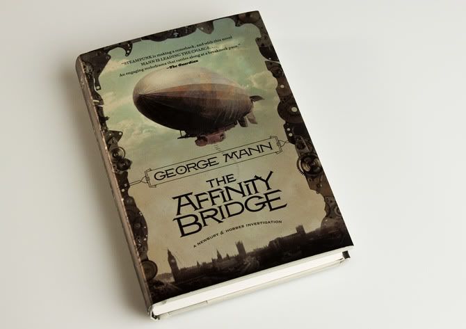
Design blog Faceout Books has posted a feature on George Mann's Steampunk novel The Affinity Bridge. Along with statements from designer Jamie Stafford-Hill, illustrator Viktor Koen, and me, they show sketches, period type samples, and photos of the jacket that are surprisingly effective at showing the effect of the metallic paper stock.


"The production on this book really compliments the great illustration and the beautiful typography. This book jumped off the table at me at the book store. I had to pick it up. Thanks to Jamie, Irene and Viktor for their participation." -- Charles Brock

We are hard at work on Affinity's sequel, The Osiris Ritual. I'll show that off as soon as we can.

Wednesday, August 05, 2009

Greg Manchess on Sidebar

I tweeted this but to make it formal:

Greg Manchess was interviewed on Sidebar. Check out the podcast here.

Tuesday, August 04, 2009

Uh-oh...Scott Bakal is drawing aliens...

And he's threatening to draw more. Go tell him how cute these are and make him do so.