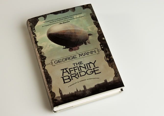
 Design blog Faceout Books has posted a feature on George Mann's Steampunk novel The Affinity Bridge
. Along with statements from designer Jamie Stafford-Hill, illustrator Viktor Koen, and me, they show sketches, period type samples, and photos of the jacket that are surprisingly effective at showing the effect of the metallic paper stock.
"The production on this book really compliments the great illustration and the beautiful typography. This book jumped off the table at me at the book store. I had to pick it up. Thanks to Jamie, Irene and Viktor for their participation." -- Charles Brock
We are hard at work on Affinity's sequel, The Osiris Ritual. I'll show that off as soon as we can.


4 comments:
Gorgeous Book! I might have to pick this up just for its beautiful design and type. I assume all the Newspapers, broadsides, & technical publications shown on the blog post were just inspiration for the jacket. Were there any interior illustrations?
-Dom
I read this book 2-3 weeks ago - wonderful wonderful!
And the cover is truly gorgeous!
Good job!
Hey Dom - the newspapers and such was Jamie's research. the book itself is not illustrated.
(too bad, though, huh! It would be fun to do that kind of thing.)
Thanks CES!
Irene, was this book a one-chot only, or can we hope for more in the series or in its world?
Christine
West Seattle
p.s. looks like you survived SDCC followed immediatly by World Con - now all you need is some sleep
Post a Comment