
 Here’s a recent favorite of mine, S. M. Stirling’s The Sky People, due out in November. This is a book that benefitted from me being able to read, and pass on, a nicely detailed explanation of the world in which it and it’s sequel take place in. The story posits a serious scientific reason (within the confines of an SF story, of course) that Venus and Mars has evolved to be the Venus and Mars of the pulps - one a teaming jungle with primitive humans, dinos, and prehistoric mammals walking about, the other as a dusty dying planet with ancient dying civilizations.
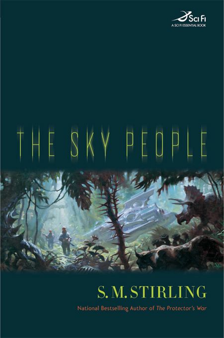
  I think Greg Manchess’ painting goes a long way to be pulpy-and-not, which is just the right tone. (But, boy, was it tempting to go over the top with this.) For the design, I just wanted to stay out of the way of the art. We kept the art in a panel since it helped to tone down the pulp aspect a bit further without hiding what a fun world the book would take place in. I am very excited to see what Greg will do with the sequel set on Mars.
I asked Greg to say a word or two on this project:
When I was a kid I spent countless hours staring at the art on science fiction book covers. I couldn't wait for the “space race” to get beyond the moon so we could do some real traveling to the outer limits. The Sky People gave me the chance to capture one of those far-flung frontiers I used to daydream about.
To get a better feel for the cover painting I was inspired by Vincent DiFate's book, Infinite Worlds, and went immediately to studying shots of steamy jungles. It was fun making up bizarre flora and placing a crippled spaceship amongst it. I have this thing for seeing stranded astronauts in unending landscapes and getting that feeling of dread that comes with the struggle to survive. I've painted spaceships that are crashed on the horizon while we see the hapless spaceman living in a camp of broken ship parts. Much like the stranded seafaring travelers of long past.
The movie, “Robinson Crusoe On Mars” fascinated me as a kid. All alone in a barren landscape. And now the second book in this series is coming up and it's about Mars! My inner child is about to eat dessert.

5 comments:
I heard about this book at last year's Westercon and have been frothing after it ever since. Great painting, and like you, I can't wait to see what Greg does with the Mars title - Jeff
I wrote up a thoughtful response to this yesterday, but the in-tar-webs ate it. *sigh*
Anyhow, Manchess’ work is great. I love his choice of colors. Judging from his web site, he's already a fan of the old pulp magazine art style, and was a brilliant choice for an artist for the painting.
Also, the composition is a bit different from the paintings on his web site. The style is oddly similar to the Hudson River school, which I think is great, given the subject material. If he was trying for that effect, it worked well. If not, happy coincidence.
The one downer about the book's cover (not the art) is the blurred font for the title. I'm not seeing how it contributes to the theme of the book, and the blank space above it is not helping me get a feel for the story either. I hope I'm not upsetting anyone who put hours into the jacket design. It's not awful, it's just not what I think fits the story.
I think it might be nice to get some small sense of what goes on with jacket design for a book.
I just grabbed 3 hardcovers off my bedroom shelves. I've got Jim Butcher's "Dead Beat" (ROC) Terry Pratchett's "Going Postal" (Harper Collins. Those lucky bastards) and Steve Brust's "Lord Of Castle Black" (Tor).
Looking at the Butcher, the artwork was clearly done up to allow space at the bottom and the top for the author's name at the top and the title at the bottom. The font is a nice, blocky sans-serif that if I were more of a typeface geek, I'd recognize. Oh, and it's in silver foil. great contrast against the black.
The Pratchett has a totally different integrated concept, with the title as part of the artwork. It is incredibly gorgeous, and one of the bestest covers ever. Pratchett's name is done in a different font and color than the title, but the bright yellow manages to integrate well with the colors in the artwork and stand out well enough to be noticed.
The Brust cover is dominated by the artwork. The title and Steve's name only get noticed because they're in bright blue outlined by yellow, and yellow outlined by bright blue. I love the artwork, but do not much love the contrasting colors of the text. Still, they are necessary to stand out against the artwork.
Obviously, lots of work went into all of these. But what was the process? I'd love to hear about it, if you have anything you want to share.
If I may be bold, perhaps a blog entry on the subject?
that's amazing , thank you for that post.
Another masterpiece by Greg "The Man" Manchess :D
Hi Josh,
I will try to make post about design. Oddly, I think I'm probably more articulate about illustration than design...but I'll try to do that within a month or so.
As for the blur on Sky People...I kept going back and forth with it. When it prints, the bur is much less noticeable. I kinda liked it...but it might be an insecurity about the type being so simple. As for the band, that I do feel strongly about. I like that it's more of a cinematic view. I also think that the space above and below is a nice reveal...a window that you want to crawl through. It also reclaims the seriousness of the book versus the pulp aspects.
As for the Brust - That type was simply a pick up from the series started a long time ago.
Dead Beat has that nice Chris McGrath art...I bet the designer just wanted to stay out of the way if it. Not always, but very often, SF = sans serif type. I guess because in eth future everything will be streamlined. ;-)
Post a Comment