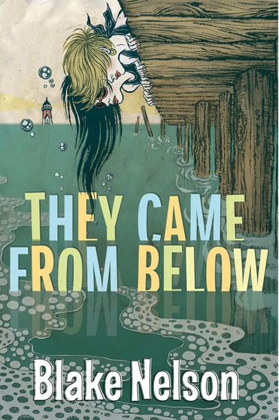
Because it looks cool...

 Two high school girls are on vacation and looking for boyfriends...instead they find sea creatures that look like Brad Pit.
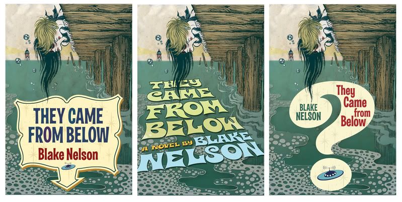
Yuko Shimizu did the drawing. As you can see here, Yuko is amazing. Peter "no less amazing" Lutjen did the type layout. The top one is the final. I was very tempted to go with some of the other versions, but in the end I think the added elements compete with the art too much -- you are either looking at the art or the type, but not both together. The simpler type does a better job at complimenting the art and making a cohesive package.
This book will release next summer. Only a few bookstores have seen it at this point but, so far, they are raving about it. Each season there is a cover that I love but I assume that others wont pay much attention to...And every now and then I'm wrong. A few seasons ago that cover was When Gravity Fails. I was very surprised how well our Sales force responded to that cover...even though it was one of my favorites.
Thursday, October 26, 2006
It Came From Below
Labels: Peter Lutjen, Tor Books, Yuko Shimizu
Subscribe to:
Post Comments (Atom)


2 comments:
great stuff here, glad i found your blog. keep it coming.
Hm. I think I prefer the middle one of the smaller images which were presumably passed over. I agree about the similicity, but I like the 1950's movie poster style the slanted text implies. Of course, it's possible the target audience won't get that sense of nostalgia that I do.
Post a Comment