
 Jon Foster's art book, Revolution, will hit the streets any day now. I am listed as an editor but, really, the Fenner's were being very generous with that credit. (Although I am over-the-moon with pride at being so associated with Jon!) Below is the afterward that I wrote for the book.
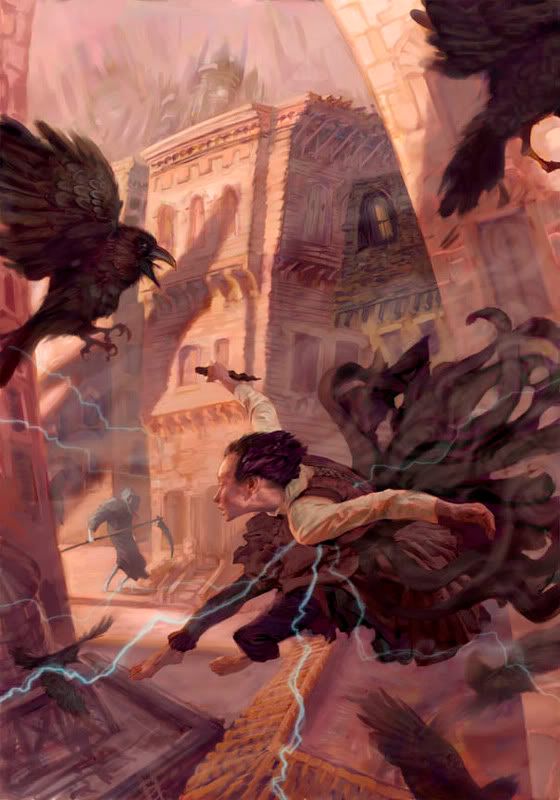
The painting to the left is not in the book but it is the latest cover Jon has done for Tor. It's for the paperback edition of Mistborn.
I first met Jon Foster at the 1999 World Fantasy convention in Providence, Rhode Island. I was fairly new to the field but I believed everyone around me when they said that it was the best art show of any convention in the past twenty-five years. The show was phenomenal...I mean, Leo and Diane Dillon were the guests of honor! And yet, amongst that, my most vivid memory of the convention was coming upon a four foot tall painting of a sad-but-sweet robot. His tough, bright red, metal body twisting toward me with big blue eyes and one giant tear -- I just wanted to hold the big guy and let him know everything was going to be alright.
I remember that moment because Jon's work, above all else else, packs an emotional wallop that so few artists are able to achieve. From content, to composition, down to the application of the paint, Jon makes you feel what is going on in his worlds...and his worlds are never one dimensional. The delightful paintings often have a underpinning of sadness, the sad paintings are often subverted with a dash of humor, the horrifying images are somehow beautiful...and the loving paintings often have just a bit of rust -- and some dings and scratches -- that makes the characters all the more loveable for their flaws.
I can hardly believe that it's only been seven years since that convention. In the years since, he has delivered some of the most innovative and emotionally captivating covers that Tor has published. When working with him it becomes quickly apparent that each project is deeply personal to him: they are not just jobs. Being around Jon is delightful: he is always gracious and quick to laugh but he harbors a large dose of bittersweet sadness that never lets him be satisfied with where his work is. In an industry that requires an artist to stick to one established style, he seems unable, or unwilling, to remain that still. It is his strength of character that allows him explore these vulnerabilities and has lead him to keep evolving and pushing himself deeper with -- and into -- his work.
I am grateful for this opportunity to stop and take stock in the accomplishments that Jon has achieved over the first half of his career. In this volume we have been able to catch an artist that is truly in transformation. His substantial body of work has touched the lives of so many people and influenced a whole new generation of artists -- and yet, knowing Jon, I feel that we have only begun to glimpse where he will take us next.

8 comments:
I loved the hardback cover...well, I also love your preview of the paperback...but this begs the question, why use new art for this book? Rather, why do some books use the same art for the hardback & paperback, while others get new art (esp. from the same artist)?
(Apologies if you've talked about this before and I missed it; I searched and didn't see an obvious post about this, but I'm a poor searcher.)
Thanks!
Thank you for showing this, I had seen his work but was unfamiliar with his published art books. Amazon.com is a lovely thing =D
I love Jon's work. Thanks for spreading the word. I've always wondered though, did he study with Phil Hale? Their work, especially Jon's earlier work, is very similar.
Dale
Kendal - In this case, we loved the hardcover art but we were worried that it would be hard to make out at the smaller paperback size. Since we felt we got the right tone across the first time, we decided to go back to Jon and see if he'd be up for revisiting it. (It also helped that I knew he really loved the book.)
You are right that it is unusual to go back to the same artist for new cover. More typically, if we are changing the cover for mass market, we are doing so to get a completely different feel on the book. Sometimes it's because we failed to get the hardcover the right audience, other times it's just the nature of paperback publishing versus hardcover publishing.
Most paperbacks are _not_ bought in bookstores, they are bought on impulse in drug stores, airports, supermarkets, etc. Because of that, the feeling is that you have to "STOP THE SHOPPING CART!" Things need to pop more, more foil and emboss, etc. Hardcovers are often bought in bookstores were people take their time and browse more...plus you have a lot more room to do more subtle things with.
Dale - Jon did study with Phil and Rick Berry. His early work shows that influence but I think Jon is very much his own artist. Phil was hugely influential to the entire science fiction and fantasy field, you could argue _the_ most influential in 20 years. He started an avalanche of exciting work from the many artists that have been inspired by him and then added their own voice to the conversation.
Thanks, Irenee - I thought of a few possible reasons, but of course not the one you mentioned for this case. Interesting stuff!
BTW I love Jon Foster; I'm looking forward to picking up Revolution. :-)
There is a discussion going on in the Time Waster's Guide forum if you want more opinions on this artwork.
http://www.timewastersguide.com/forum/index.php?topic=5009.0
And another here:
http://conceptart.org/forums/showthread.php?t=82342
Lingerie Wholesale Lingerie China Leather/PVC Lingerie Christmas Costume Christmas Lingerie Sexy Lingerie Wholesale Halloween Costume Wholesale Underwear Lingerie Manufacturer Sexy Uniform
Post a Comment