
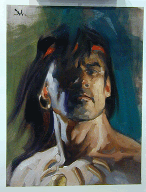
Thumbnails: 30 Second Interviews
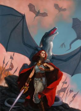
Bruce Jensen has been creating covers for science fiction books since the mid 80s. Even though he came into the field during an age of hyper-realistic "scene" illustration, Bruce's work was more abstract and conceptual. His current work harkens back to the great illustrators of the 60s -- Paul Lehr, Richard Powers, etc -- while maintaining a fresh and contemporary sensibility. Bruce has also worked as an artist for 60 Minutes, creating the backdrop graphics for news stories.
What is your favorite painting within the last year?
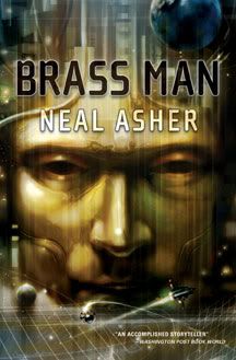
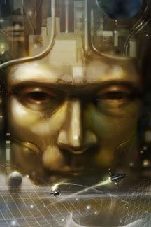
Neal Asher’s Brass Man. Or perhaps this (below) which is really a study for a series of paintings I hope to get started on soon, an alien menagerie.
A career highlight?
The cover assignment for Do Andriods Dream of Electric Sheep. I’m a huge fan of Philip K. Dick’s work, and Bladerunner is a favorite film of mine, despite it’s loose adaptation of Do Andriods Dream. Getting the chance to offer up my own interpretation when Del Rey Books decided to drop the film related artwork was a dream assignment. It just so happened that it was due on my birthday too.
Dream assignment?
Does anyone want to repackage all the P. K. Dick books?
What are you working on now?
Slan Hunter, the now completed (by Kevin J. Anderson) sequel to A. E. van Vogt’s landmark novel Slan.
Monday, July 31, 2006
Thumbnails: Bruce Jensen
Friday, July 28, 2006
John Jude Palencar
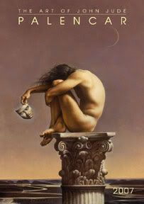
John Jude Palencar has another calendar coming up. Yeah! John will be the Guest of Honor at this year's World Fantasy Convention in Austin, Texas. For anyone that has not seen John's work in person, this will be a real treat.
Wednesday, July 26, 2006
Art Out Loud: Painting Demos
Daniel Dos Santos and I have been hosting as series of painting demos held at the Society of Illustrators called Art Out Loud. Or next two events are scheduled for this Fall. 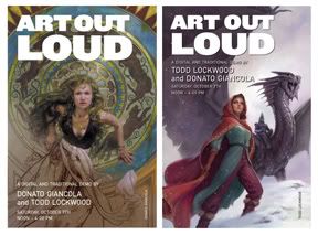
Two fantasy/science fiction artists with similar sensibilities yet very different mediums. Oil painter Donato Giancola and digital painter Todd Lockwood
Saturday, October 7th • Noon - 4:00
$25.00 students & SoI Members • $35.00 non-members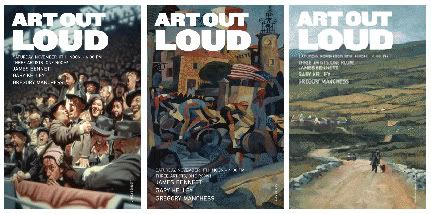
Three Hamilton King Award-winners, each with a very distinctive style from one another. Jame Bennett, Gary Kelley, Greg Manchess
Saturday, November 11th • Noon - 4:00
$25.00 students & SoI Members • $35.00 non-members
Both events will be held at:
Society of Illustrators
128 East 63rd Street, New York, NY 10021
For tickets contact: 212.838.2560 • info@societyillustrators.org
Space is limited - past events have sold out!
Scott Fischer Never Grows Up
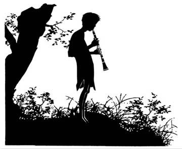
Scott M. Fischer created over 40 beautiful ink drawings for the US edition of the only authorized sequel to J. M. Barrie's Peter Pan, Peter Pan in Scarlet by Geraldine McCaughrean. Why silhouettes? Scott said, "They were the perfect solution. They have a timeless look that will not be out of place with the first books and, more importantly, they leave a lot up to the imagination of the reader -- with an icon like Peter Pan, that's a great thing. Silhouettes are also a nod to Arthur Rackham, the coolest Pan illustrator of all! His Cinderella book was a true inspiration to me."
The book is due out October 5th from Simon and Schuster. I'm looking forward to posting more images once the book is released.
Tuesday, July 25, 2006
Comic Con: Sunday
The final day of Comic Con was full of a lot of last minute shopping and the sudden realization that, despite having spent five days there, you still hadn’t seen everything.
All in all, it was a great convention. It is always inspiring to be around people that are so passionate about what they do. It was wonderful to meet up with friends and colleagues that I only see once a year and to meet new artists coming into the field. I definitely came away with a few names that I’ll be keeping my eye on.
A number of us spent the final evening playing the most intense game of Pictionary. I must say, it was a little intimidating to be the only non-artist playing with the likes of George Pratt, Donato Giancola, Stephan Martiniere, Greg Manchess, and others. Luckily, thirty second drawings done with your wrong hand and eyes closed look pretty much the same no matter who draws them.
Martiniere’s “Speaking with Forked Tongue”
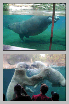
A little off-topic: I decided to take off Monday to decompress a bit before returning home and diving straight back into work. The San Diego Zoo is as amazing as its reputation claims. I’ve never seen a creature as graceful as this 6,000 pound hippo in water.
Saturday, July 22, 2006
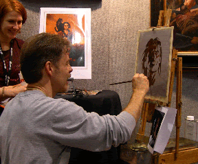
Comic Con: Saturday
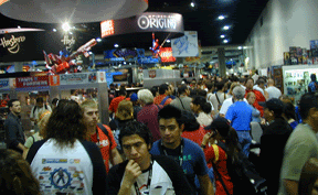
Saturday! I made the mistake of trying to cross the floor...it took about an hour. But...
I learned that Stephan Martiniere has a 2007 calendar out, Futurescapes. I’m proud to say that six of the twelve months are Tor book covers.
Brom told me that he is hard at work on a new novel. He was not at liberty to reveal the title but, like The Plucker, it will be lavishly illustrated. 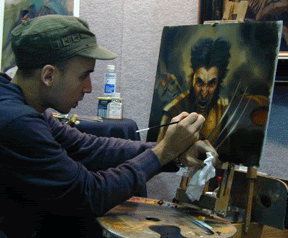
Dan Dos Santos' painting demo.
Friday, July 21, 2006
Comic Con: Friday
Greg Manchess did a well attended demo. Greg is exhibiting his Conan paintings from the Wandering Star/Del Rey edition of The Conquering Sword of Conan. The book features over 60 paintings. The Art Department will show an in depth step-by-step of one of Greg’s paintings in a few weeks.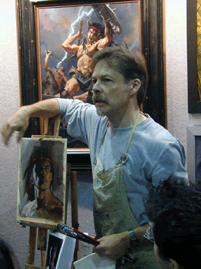
More people spotting: James Jean talking to Arnie Fenner. 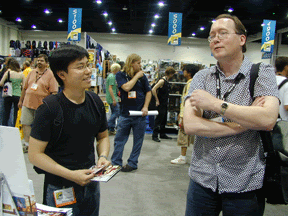
Comic Con: Thursday continued
The artists seem to be doing well. I see lots of “sold” signs on paintings. The crowds have been steady...but promise to be better (or worse, depending on your point of view) on Friday and Saturday.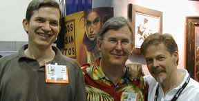
It was a pleasure to meet David Apatoff. David runs one of my favorite illustration blogs, Illustration Art. He seems to be as gracious as his site implies he would be. We talked a bit with Charles Vess and Greg Manchess. Charles seems very excited about the upcoming film version of Stardust. He seems pleased that the film makers have remained true to the spirit of the book. Greg will be doing a demo on Friday -- more on that latter.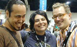
I ran into Theo Black, Holly Black, and Tony Diterlizzi, of Spiderwick fame.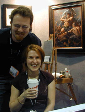
ConceptArt freinds: Arkady “AmishCommy” Roytman and Tiffany “poise” Prothero.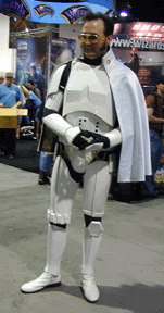
What convetionis complete without Elvis Trooper.
Thursday, July 20, 2006
Comic Con: Thursday
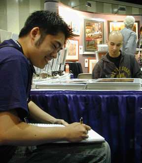
Jason Chan drawing in front of Dan Dos Santos’ booth. You may not know Jason’s name now, but you will soon. He’s just out of school and already doing amazing work...including some covers for Starscape. (I’ll get those posted soon.) 
Razorbill was giving away advance copies of Black Tattoo. It’s sporting a beautiful John Jude Palencar painting. The marketing info on the back says that the final jacket will fold out into a poster. I’m very much looking forward to seeing that.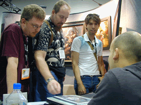
Dave Palumbo (in white) showing his portfolio to collectors.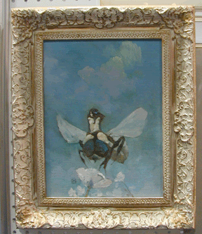
Illustration House has a great collection of work on display, including this nice Jeff Jones painting.
Comic Con: Wednesday
Today went as expected -- a lot of rushing around and last minute set-up...and a lot of tired and travel weary artists. I spent most of the time just saying quick hellos to everyone.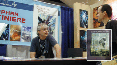
The best news I heard was that Stephan Martiniere will have an art book out in December, Quantumscapes. He says that this one will cover his movie, gaming, and book cover art. (Quantum Dreams, his first book, is a beautiful collection of cover work.) I’ve often stated that Stephan is one of the most exciting artist working in the field today.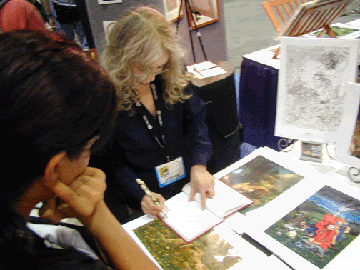
Kinuko Craft drawing in a fan’s sketchbook.
Wednesday, July 19, 2006
Comic Con: Prologue
 Here’s the “before” shot. I spent most of the day traveling across the country but I was able to poke my head in and watch a few early birds setting up. I’m sure tomorrow’s set-up will be bedlam. The preview night is tomorrow. It’s well worth getting in early for that. Within a day, this place will be jammed packed, elbow to elbow!
Monday, July 17, 2006
"How do I get my work in front of an art director?"
In an earlier post, I was asked, "What's the best way to get your work in front of an art director?" This is a question that I get at just about every convention and school lecture. I wish I had a concise answer but I’m afraid that the truth is annoyingly vague.
Much of my time at work and after hours is spent thinking about who should do what covers. If I make the right match between artist and book, then the months ahead of me are smooth sailing. If I make the wrong match...it can be months of wrestling with the artist, killing a budget on a book by having to create a second cover, or, worst of all, letting a book go out into the world to limp along with an inappropriate cover.
Note, inappropriate does not mean that the cover is bad...it just means that it is not the right cover for that particular book. There are plenty of covers that are not my favorites but they are right for that book, just as there are plenty of beautiful covers that may not suit a particular book.
ANNUALS
These are hugely important to me -- mostly Spectrum and the Society of Illustrators. I keep stacks of them at my feet, within arm’s reach. I flip through them all the time -- to find new artists, to remind me of artists that I've wanted to work with but haven't yet, and to remind myself to look up new work from people I already know. (Keep website updated!) Annuals are juried, cleanly designed, neatly bound, and have all the contact information I need. Can't beat all that. The trouble for the artist is that they do not have control over whether they get into them or not.
BOOKSTORES & MAGAZINES
I spend tons of time in bookstores. I flip open every book if I can’t tell artist by their style. I'm always curious who’s out there and who’s new. I also subscribe to Realms of Fantasy and Communication Arts. "Realms" not only uses lots of illustration throughout but they also have a feature on an artist in each issue.
NETWORKING
I go to four or five conventions a year. Sometimes I'll find new talent there or I get to watch a young artist’s abilities grow throughout the years. I find it really helps the process when you actually get to meet the people you work with. Not essential by any means, but it's nice when there is some kind of connection. For the same reason, I go to all the Society of Illustrators openings.
PROMOCARDS
I get tons of these every day. To be honest, most do end up in the garbage — they are either inappropriate for what we publish or they are not of the quality that we need. I do, however, keep files on the ones that I like.
PORTFOLIO DROP-OFFS
Since websites and good quality home printers have taken over, I don't see many portfolios delivered to our office. However, we still get them from time to time, and we still look through them. Be sure include promo cards that the AD can keep. (Do not include original paintings.)
RECOMMENDATIONS
Talking to other artists or art directors will tip me off to people I have not worked with. Illustrators are a great lot, they always seem quick to point out other artists that they admire without feeling threatened.
AGENTS
They can help get your foot in the door but they are, by no means, necessary. There are a number of agents that I very much enjoy working with. Whenever they call, I'll look at what they have to show. But then easily half the people I work with don't have agents. Here you are better off talking to other artists to see if this is something you want to pursue.
SOUCRE BOOKS
These are costly and I'm not sure how effective they are for book cover
work. I do enjoy going through them but I tend to clip out the pages I like
and then trash the rest. (The annuals stay in tact.) However, I've heard that source books are good for getting some higher paying advertising jobs.
ONLINE COMMUNITIES
Increasingly, online communities have been a great place to discover artists. I most enjoy Drawn! and Concept Art.
Unfortunately, none of the above will work by itself. I usually come across someone's work and think, "interesting." Maybe six months later I'll see that artist in Spectrum....six months later I might see them at ComicCon...and six months after that I get a book that I haven't a clue what to do with and then suddenly I remember, "Wasn't there some new artist whose work looked rather interesting?" Then I go dig through all my resources and and decide whether it's a good match or not.
I picked a few random artists and tried to remember how I heard of them. (Hopefully they wont mind me sharing.) Some are new to me, others I've worked with for years. This is all very simplified. In all cases I looked up a ton of work once I thought I had a particular project that they might be right for.
Jon Foster: I met at a World Fantasy Convention and then saw his work in Spectrum and at the Society.
Dan Dos Santos: I met at Society of Illustrators and then he sent me a collection of promo cards.
Eric Fortune: I was following in Spectrum and received promo cards.
Donato Giancola: Donato had been working with Tor before I came along. I know he credits his agent for helping in the early years. (He has long since moved on from the agent.) His great work will keep him working for Tor as long as he's willing, but meeting him at conventions and at the Society has made it all the more fun to work with each other.
David Grove: Recommended by Greg Manchess. Then I looked up his work on the web.
Jason Chan: I saw him on ConceptArt. I was also reminded to keep looking at his stuff by Dos Santos. His new website helped a lot too.....I was able to pass that on to our editor.
David Bowers: Was following through Society annuals and then received promo card.
Stephan Martiniere: Met through an agent, although he quickly left that firm. It's fun to hang out with Stephan at ComicCon, but, of course, it's his mazing work that keeps me coming back for more.
Greg Manchess: Spectrum and the Society. Greg has also lead me to many other great artists.
Jon Foster Art Book!

I spent some time this weekend writing a closing statement for Jon Foster's new art book, Revolution. Jon and his artwork amaze me. I'm very honored to be part of this publication. The book should hit the stands in October. If I ask nicely, the Fenner's might allow me to post some interior spreads just as the book is released.
Saturday, July 15, 2006
Penguin Design
 I just saw (thanks to a commentator on TheISpot) this interesting article by Alice Rawsthorn in The International Herald Tribune about the history of Penguin’s design and how they are meeting today’s publishing challenges by lookin’ good.
"Epics is the latest in a succession of beautifully designed new editions of Penguin Classics, which are as likely to be bought for their covers as for their content. It now makes commercial sense for Penguin to invest in design, as the company is facing fierce price competition from online retailers and the threat of digital publishing."
Be sure to check out the slide show listed on the left.
Friday, July 14, 2006
The Hugos
John Scalzi makes a plea to vote for the Hugo. Let me just add, vote for your artists as well! Please take the time to consider each artist and what their contribution to the field has been throughout the year. The fact that just four artists have won the Hugo in the past 25+ years is a bit disconcerting. I do not wish to take anything away from those artist, they are well deserving of much recognition, but how so many other worthy artists have been overlooked is unfathomable to me.
Donato Giancola has been one of the most influential sf/f artist of the past twenty years and yet, he has never won the Hugo. No one can touch the sophistication and lyricism of Kinuko Craft -- never won a Hugo. John Jude Palencar has been creating images that haunt (and sometimes horrify) for decades -- no Hugo. Jon Foster has given covers more energy and emotion than we have seen in a long time. John Harris. John Berkey. All of these guys have deserved more recognition throughout the years than is apparent from the Hugos.
With everyone having a website these days, it's easier than ever to quickly research and learn more about the artist that have been nominated....and it's fun. Make the award more meaningful to everyone who has, and will, win by giving it the same consideration as the writer's categories.
Shriek
 I really don't mean for this blog to be so Tor-centric but...
Shriek just came into the office and I love what our senior designer, Peter Lutjen, did with this Jonathan Edwards photograph. The interior design department (which is oddly separate from the art department) created a great text layout for the book as well.
Thursday, July 13, 2006
Thumbnails: Daniel Dos Santos
Thumbnails: 30 Second Interviews
Daniel Dos Santos is one of the genre's rising stars. In just a few years he's gone from being a rookie to a steady stream of book covers and gaming cards. Above is his cover painting for Christopher Pike's young adult novel, The Yanti.
What is your dream assignment?
Fully painted adaptation of the comic, X-Men #1.
Your most embarrassing illustration moment?
Left my painting in front of a space heater to dry, and burned it like a marshmallow!
A career highlight? Playing Pictionary with Boris Vallejo and Julie Bell...and winning. ;)
Bob Eggleton & The Ant Bully
 Bob Eggleton created a mind-boggling 300 drawings and paintings for the upcoming Warner Brothers movie, The Ant Bully. These two are charming as heck. I hope there is an "Art of..." book in the making. Bob got to team up with his "Jimmy Neutron" colleagues, Don Maitz and Fred Gambino. From Bob, "Seeing the whole thing through from start to finish, and creating art alongside so many talented, imaginative people is such an exciting thing and I’m so proud to be a part of it.”
Bob will be speaking, along with another artists and the director, at Comic Con: Thursday at 2:00
Soldier of Sidon
 Tor will be publishing Soldier of Sidon, the next "Latro" novel by Gene Wolfe, in October. This made me very excited because I was able to hire David Grove to do a series a beautiful chapter drawings. We don't get a chance to do black and white imagery often enough.
Wednesday, July 12, 2006
David Gallo

Okay, so I'm cheating by posting past news but my brother, David Gallo, won a Tony Award last month for set design on "The Drowsy Chaperone"....and I think that's immensely cool.
The Ugly Truth About Art Directors
...is that they get to take credit for a lot of other people's hard work. And, when they are off doing fun things like going to meetings, their assistants become much better designers than they are. Here is one of my favorite Tor covers hitting the shelves now. This was done by our fantastic staff designer, Jamie Stafford-Hill.
A huge thanks to Patrick Nielsen Hayden, John Scalzi, and Cory Doctorow. I got into work this morning and my wee blog was being picked up by everyone, via them. I had fully expected to be talking to myself for a long, long while. Thanks for the warm welcome!
Spectrum 13 Cover

Arnie Fenner let me have a preview of the Spectrum 13 cover. Arnie, who's normally quite reserved, has been teasing me all year about how good this new edition will be. It'll be a long summer waiting to see it.
The cover art, Prometheus by Donato Giancola, has an interesting story. It was painted for an exhibit curated by Vincent Di Fate to hang in a Chelsea gallery. However, at 6.5'x9', it was too large to display! Donato put paying commissions aside for 6 weeks to paint it and no one was going to see it. Since then, it has appeared on the cover of Asimov's, gotten a gold medal from Spectrum, secured him a highly prestigious commission from the Untied Nations, and, finally, it is on displayed at the New York Hall of Science. From Donato, "If this isn't a great example of why you take chances, I cannot think of a better one."
Tuesday, July 11, 2006
Comic Con, July 19-23
I'll be wandering around Comic Con, using booth 5005 as my home-base. Stop on by and say "hi.'" Booth 5005 will be a collective of a number of outstanding cover artists.
Kinuko Craft
Daniel Dos Santos
Donato Giancola
Gregory Manchess
Greg will be doing a painting demo on Friday, noon-4:00.
Dan'll demo Saturday, noon-4:00.
Donato will have a signing on Saturday from noon-2:00