
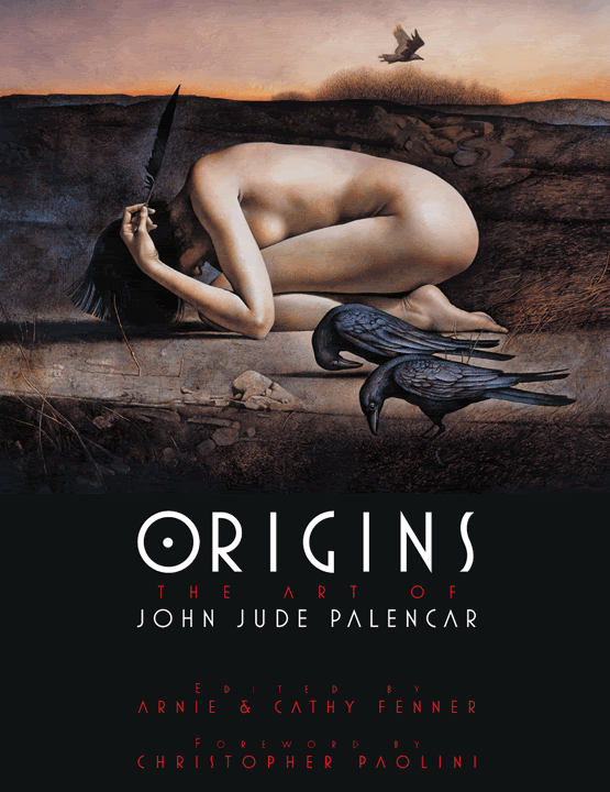
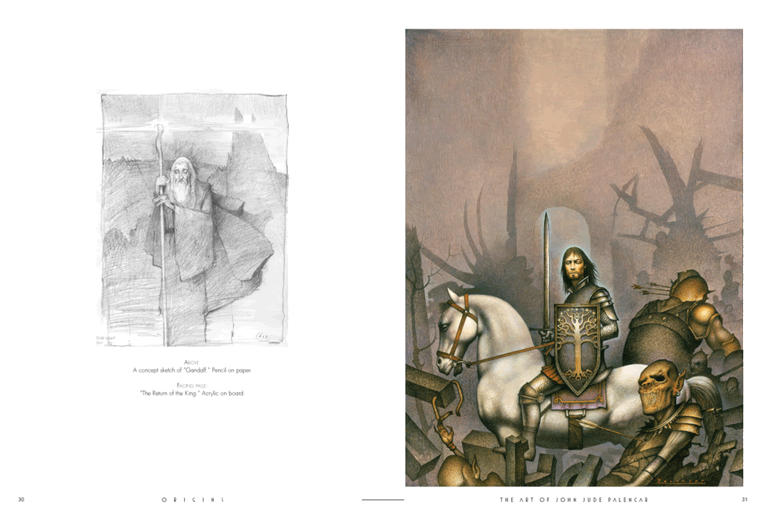
 I asked Arnie Fenner if he could tease us with a few pages from the upcoming John Jude Palencar book, Origins. (I'm proud to see that it’s sporting artwork commissioned for a Charles de Lint Tor cover....particularly one that I never thought I’d get approved!) I believe it will release in late November. John is one of our masters in the field. He has a truly unique voice that can be haunting, ethereal, sensual, and disturbing...often at the same time. I know he is one of our in-house favorites. Whenever a new Palencar painting comes in everyone wants to get a look.He’ll be the guest of honor at the upcoming World Fantasy Convention. I’m looking forward to that trip for a number of reasons, not least of all for the opportunity to see more of his work in the flesh.
[Click on the images to get larger views.]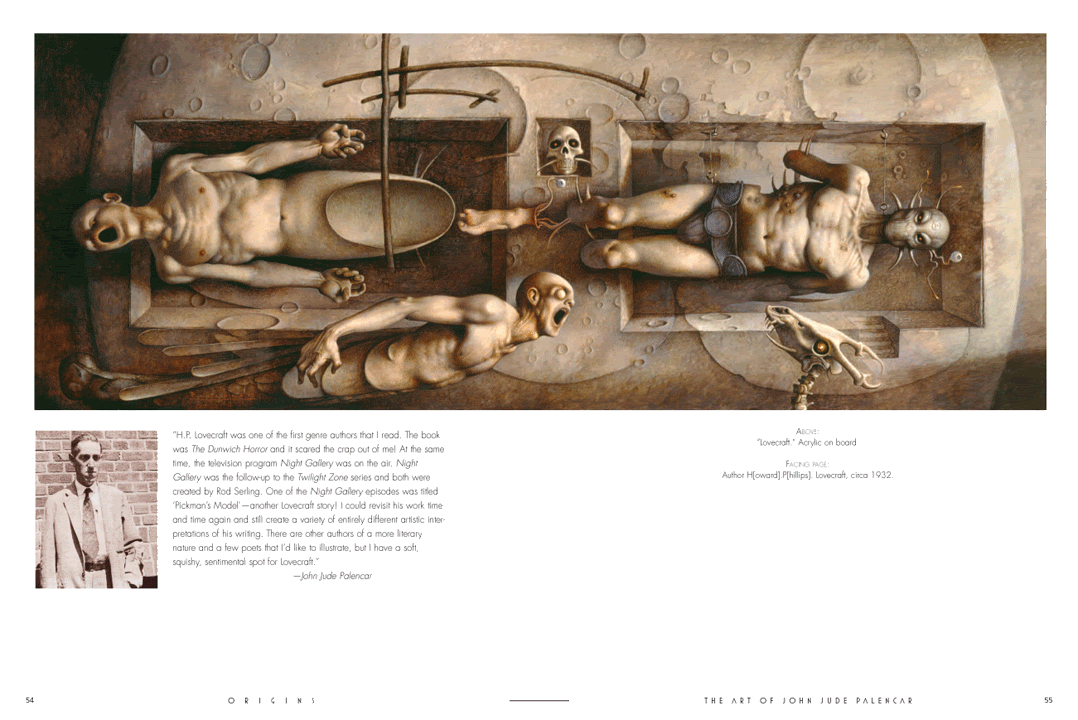
Thursday, August 31, 2006
John Jude Palencar Art Book
Wednesday, August 30, 2006
Thumbnails: Todd Lockwood
 Thumbnails: 30 Second Interviews
Todd Lockwood is an extremely gifted and prolific artist, working as much in the gaming field as in the book publishing world. His art book, Transitions, is available from Paper Tiger Press and, I’m thrilled to say, he will be doing a painting demo at the Society of Illustrators along with Donato Giancola on October 7th. (Click here for more information on that event.)
What is your favorite painting you did in the past year?
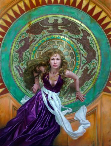
Drizzt and Gwynn, a cover for the compended issues of the Legends of Drizzt comic book. Or the cover for Midnight Tides [seen above] by Steven Erikson, from Tor Books. Can't make up my mind.
What is your dream assignment?
Coming up in September: Bullseye Tattoo is paying me to paint them a poster of anything I want. Paying me? To paint anything I want? That's a dream job.
Your first break in the business?
Asimov's, in 1993
Name a career highlight?
Designing the Dragons for 3rd Edition D&D!
What are you working on now?
A six pack of Amber Bock
Who are some of your biggest influences?
Whelan, Frazetta, NC Wyeth, Norman Rockwell, Maxfield Parrish, Remington, Russell, Tedema, Disney
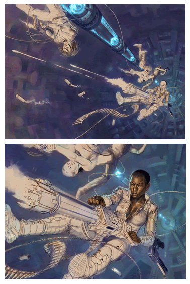
Seen here is a progression from thumbnail to final on the upcoming Tobias Buckell novel, Ragamuffin, sequel to Crystal Rain. (Click on image for larger view)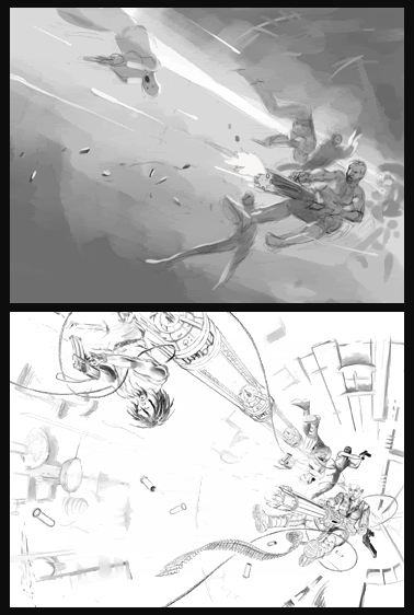

Room with a View
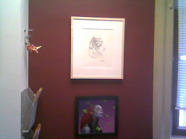 This is a crappy cell phone picture of a great David Grove drawing. But, that's OK since I’ve already posted it here. The difference in this picture is that the drawing is framed and on my wall. My good friend, Gregory Manchess, conspired and traded with Grove in order to give me this drawing. It's just now back from the framer and I can't tell you how happy it makes me each time I pass by.
Tuesday, August 29, 2006
Donato Wins the Hugo!
 A huge congratulations to Donato Giancola
 Donato is one of the best and most influential artists to have entered the field in the last fifteen years. He attacks each and every assignment to the fullest of his capabilities, often working much harder than the commissioned project requires. Right from the beginning of his career he was pushing his own abilities and pushing the standards of the field along with him. He never shies away from unusual perspectives, multiple characters, or potentially difficult problems to solve. I remember him calling me a few years ago and asking if it was okay to paint one of our covers all in white just to set up a new challenge for himself. He did and its a beautiful painting.
Not only are his artistic abilities unquestionable, he is always open to share is approach and help others. For as long as I've known him, he has given many helpful demos and slide lectures -- often focusing, not just on his own artwork but, on his methods and people that influence him. And trust me when I say he's been a remarkable influence on the field. I get tons of samples from young artists every day. It is clear that most of the new generation of artists are studying his work and are struggling to make it part of their own language.
I've often said that the best part of my job is getting to work with the people involved. Over the years, Donato has become a good friend. It was a great professional and personal joy for me to hear his name called out as the winner. Normally I take a more neutral stance on these things since I tend to work with many of the nominees. This years list was strong, all of them deserving...but some have won it many times in the past while others are still fairly new to the field. I was thrilled to see John Picacio and Stephan Martiniere on the list of nominees -- I belive that their time will come soon. But for this year, this award for Donato was long overdue and well deserved! Congrats, again, Donato!
----
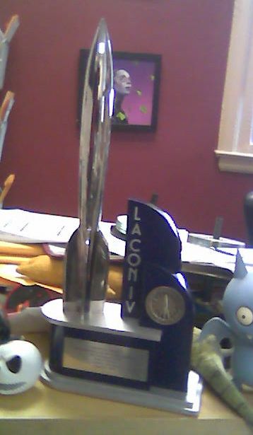
Donato's Hugo on my messy desk! I had the great honor to accept it for him, more on that once I can get down a few words about the convention as a whole.
Friday, August 25, 2006
The Chesleys
It is late but I want to mention the Chesley Awards tonight. It was a great honor to be involved. I suspect the entire event happens because a few dedicated volunteers do a ton of work. We all thank you for making sure that the contributions of the field's artists is honored.
It is too late for me to create links to all the winning works but you would do better to go to the ASFA site and browse all of the nominated works.
And the winners are....
Hardcover: Stephan Martiniere for Elantris by Brandon Sanderson
Paperback: Tom Kidd for The Enchanter Completed edited by Harry Turtledove
Magazine: Donato Giancola for Prometheus on Asimov's
Interior: Brom for The Plucker by Brom
3D: James Christensen for Sleeper Lost in Dreams
Unpublished Color: Charles Vess for Companions to the Moon
Unpublished Monochromatic: Paul Bielaczyc for Nightmare
Product: Justin Sweet production design for The Lion, the Witch, and the Wardrobe
Gaming Related: Gabor Szikszai & Zoltan Boros for Blazing Archon, Magic The Gathering card for Ravnica: City of Guilds
Art Director: Your’s truly.
Contribution to ASFA: Julie Faith Rigby
Artistic Achievement: John Picacio
Congratulations to all of you and to all the nominees. I was a presenter for the hardcover award - I’ll post my intro here since I feel it applies to everyone.
Again, congrats to everyone!
It’s the job of the Illustrator to meet all of the concerns and needs of the art director, sales and marketing departments, editors, authors, publicity departments, booksellers, and book buyers. To be able to do that at all is an accomplishment. To be able to do that and create art...that is remarkable. I am honored to read this list of nominees who have all created such wonderful artwork while jumping through a ring of fire.
Norman Rockwell Museum
Here is the last of my vacation posts. I’m afraid that not having reliable internet access for a week has put me behind schedule. While I post this I am actually at the World Science Fiction Convention (more on that latter) but I did write it on a wonderful breezy afternoon...far away from wireless connections.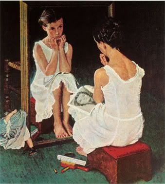
As I write this, I am sitting on a park bench in the shadow of Norman Rockwell’s studio. A friend of mine, Gregory Manchess, has been teaching a class at the Rockwell Museum all week. I’ve been to the museum a number of times and it is always a thrill to see. Like the Brandywine, it has a very human scale...it’s easy to spend hours and see the entire exhibit without feeling overwhelmed.
The work is, of course, wonderful. Thankfully, it is no longer trendy to consider Rockwell trite. I can’t imagine looking at the hope, concern, relief, and yearning for goodness that Rockwell so poignantly portrays into his pictures without being deeply touched. His depictions of life’s passages, whether it be from pre-pubescence into quickly oncoming adulthood or veteran that has returned home from war, are always hopeful but they are never trite.
One of the interesting things about spending so much time here (besides the work) is eavesdropping -- I keep hearing people talk about their parents’ experiences with Rockwell, or their own experiences knowing or modeling for him. Today I heard a woman complain that he never paid his phone bill on time. I also saw an African-American man explain to a small girl that his famil members, being only one of two African-American families in the area, were used as the models on the civil rights themed paintings Rockwell did. It’s sad to realize that these first-hand accounts will soon be gone.
I was also able to see the exhibit on the “fake” Rockwell. If you haven't heard the story of the forgery, click here. Interestingly, I heard from one of the museum curators that the forgery was nearly taken off the walls just a week or so before the original was found -- there was just too much evidence mounting against it. When compared to the original, the forgery does pale...but I have to admit that I loved this painting on earlier visits.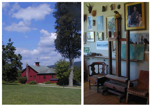
Monday, August 21, 2006
Scott Van Foschessantos
Okay, so I’m just gloating here but, Scott M. Fischer and his wife, Teresa, invited us up to a barbeque since we were in their neigborhood. It turned into a great gathering of artists and their (more sensible) significant others, with tons of amazing food and lots of show-and-tell:
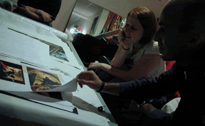
Tiffany Prothero and Dan Dos Santos looking at proofs of Jon Foster’s upcoming art book.
 Melissa Ferreira, Jon Foster, and Dave Seeley looking at Greg Manchess’ paintings.
 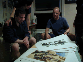 Tiffany and Christina Dos Santos looking at Scott Fischer’s Peter Pan drawings.
  Get more than three artists in one room, then someone is bound to pick up a brush. Here is the impromptu collaboration of: Cyril Van Der Hagen, Scott Fischer, Greg Manchess, Jon Foster, and Dan Dos Santos. AKA: Scott Van Foschessantos.
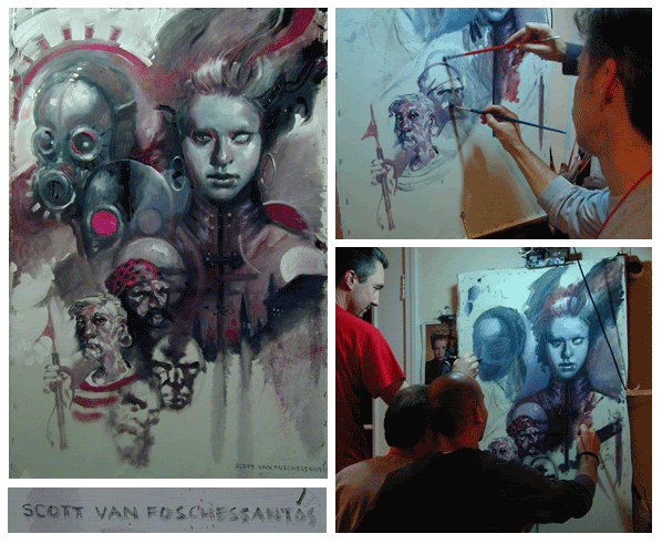
Thursday, August 17, 2006
Text Fidelity
A couple people have emailed me asking about whether or not the artists read the books and why doesn't the cover imagery always match the text. It’s a question that I get at every convention so...
I think, to some extent, we currently get blamed for sins of the past. I know that “back in the day” it was fairly standard practice to place any painting on a book cover but that rarely happens at this point. What we do, occasionally, have is lack of information at the time that you need it. As the big bookstore chains asked for sales material earlier and earlier, we were required to start creating the covers earlier and earlier. At this point, I need to be working on a title at least a year in advance of the publication date.
Still, most of the time we do have the manuscript, or a least a first draft that we can use. While most artists do read them, I cannot. Too many books need to be worked on at the same time to meet a catalog due date. I rely on the editors to give me a detailed synopsis and descriptions. We have a form that I ask them to fill out that describes the book, the characters, the plot, the tone. We don’t always want the jackets to be literal scenes from the book (what I call “chapter and verse” covers) sometimes we want more of a “mood” cover or a cover that evokes the story rather than gives an specific example from it. Which approach we take for a particular book is usually decided on in a fuzzy equation between the editor, myself, and how the Sales and Marketing departments want to position the book. In either case, these forms offer a springboard that lets me begin to think about the book and ask the editors more in-depth questions as I go.
Our main objective, of course, is to sell books. An author’s fan base will already buy the book. We need to catch the eye of a casual browser and turn them into a reader. That only gives us a few seconds to make a big impression. My goal is to do that without going so far as to contradict the book. In other words, reading between the lines should be fair game. For the most part, people understand and welcome that interpretation, there is, however, a segment of the sf/f community that does ask for one hundred percent fidelity to the text. We once had a cityscape on a cover. The editor and author loved the artwork....but the fact that one stairway in the art was not described in the book kept eating away at the editor. In the end, he had the author write it into the book. This was inexplicable to me. I don’t imagine that the book described every brick and window that the artwork showed, but, that staircase had to have some textual origin for him.
I don’t require that an artist read the manuscript. Remember, they are often juggling many projects at once -- an author may work on one novel and a few short stories throughout a year, an illustrator will often work on a few hundred covers, gaming cards, and various other projects in that same time. Still, many artists will read, or at least skim, the books. Even so, you’d be amazed how different people perceive the same words. On a number of occasions I've had the author, editor, and artist all have three very different ideas on what something/someone looked like. You'd think the author is the authority, except, if the other two readers both have completely different ideas, than clearly there is a discrepancy between what the author has written and what others are perceiving...Given ten readers, you may well end up with ten different interpretations on what a character looks like. If those readers were intrigued enough to pick up and buy the book, then the first and most important part of our job is done.
“A cover needs to capture the potential of the book as well as give a spring board to the imagination. If we are not careful, we can box in the reader -- give them too much and thus take away their own participation in the read.” Jon Foster
“I do want a cover that people can look back at as they're reading and appreciate...I prefer to create a painting that evokes the book accurately. That's a nice vague way of saying, sometimes a literal scene is preferable, other times you have to be more interpretive, usually because the book has too little visual crunchiness to make a good cover.” Todd Lockwood
“Personally, I think we are responsible for the audience's first and strongest impression of what the characters and their world look like. I feel we owe it to the readers for that depiction to be an accurate one. So, whenever possible, I read the manuscript and attempt to be faithful. However, ultimately it comes down to this: An illustrator's first goal is to make a good cover. His second goal is to make an accurate cover, though never at the expense of the first.” Daniel Dos Santos
Wednesday, August 16, 2006
Boston
A day and a half in Boston...
We went to the Boston Public Library to see a series of John Singer Sargent murals. We quickly forgot all about Sargent when we unexpectedly ran into these murals by Edwin Austin Abbey, Quest for the Holy Grail. These were just spectacular! It was a sunny day so the longer we stayed the more we saw the sun make different panels jump alive. Unfortunately I didn’t bring my binoculars to get a closer look. We were about to run to the hotel and get them but the library was closing. I plan to make this my first sto