
 FLICKR SET HERE.
World Con came and went in a near-sleepless blur, but a fun blur to be sure.
It was great to see Tom Doherty in the spotlight, Neil Gaiman created a wake of excitement everywhere he went, and David Hartwell wore his infamous ties and jackets with extra pride. I was sorry not to see a Pro Artist Guest of Honor (but excited to hear Boris Vallejo will be the guest in Reno, 2011.)
I landed in Montreal early Thursday. The Intercontinental Hotel ("The IC", as the cool kids were calling it) was very, very nice...enough so that leaving it Thursday morning was almost difficult. (You know, like the Buffy episode when Dawn forces everyone to stay at home.)
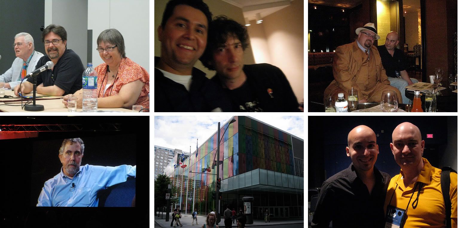
Eventually I got into the convention center, with a little help from Doselle Young, in time to watch the "History of Tor" panel with Tom Doherty, Beth Meacham, Patrick Neilsen Hayden, and David Hartwell. In that group I am a newbie, which is funny since I've been at Tor nearly half its lifetime. (Says a lot about Tom that so many have stayed for decades.) Tom spoke a bit about his life in books pre -Tor (including selling the Lord of the Rings) and the founding of Tor. Our editorial gang talked about life in the start-up days when the office was six people in a room. Conversation turned to the current daily life at Tor -- dealing with slush piles, marketing, etc. There are some video clips here. Whenever I’m asked about the best part of my job I always say it’s the people I work with, both in and outside of the office, because that is the truth.
John Picacio and his panel suggestions. Artistic spheres of influence. And the future of cover art:
It's always a pleasure to catch up with John Picacio. He talked about raising the awareness of artists in the field. The thing to love about John, he never complains about something without offering suggestions and soliciting ideas. He had some concrete talks with various SF media folks and spearheaded what was arguably to the two best art panels I've ever been been to. Unfortunately being a panelist means it’s impossible to take notes but roughly:
"Vanguard Artists" panel: This came from his debate with Adam Roberts on whether SF art is overly conservative. John came prepared with a number of slides from artists (both young and not-so) that create works outside of the pre-raphaelite traditional so popular in fantasy illustration. Rest assured, there is an astonishing amount of exciting and vibrant work out there. Even without having seen what John brought before it was being shown on the panel, we could not have planed it better. Each artist was someone that either Dan Dos Santos, John, or I had some direct experience with and we had a blast talking about them. I hope the audience did as well.
Whether or not these artists will ever be recognized by Hugo voters is not really much of a concern to me. A good book cover can be on the edge of the curve of what is commercially effective but its first purpose is to connect to readers and sell a book. That said, my main point of the hour was that I believe the spheres of influences are reducing radically. There is more stylistic variety on the bookshelves now than ever before. When Michael Whelan came along publishers spent the next 15-20 years wanting their books to look like Whelan. Then Donato came along and publishers spent 10 years trying to echo Donato. In there you have the Hale/Berry influence leading into Jon Foster and others. Stephan Martiniere's covers laid down a precedence for concept art style illustration. James Jean rapidly became an influence on the industry and I’m already seeing Sam Weber infused work. With the expansion of SF into the mainstream plus the access to so many artists from various fields throughout the world, the time any one style can completely dominate is collapsing much quicker than it ever did.
The other panel John organized was “Where is the book cover going in an eBook future.” Between Pablo Defendini, Lou Anders, Karen Haber, John, and I we all agreed there will be book covers as we currently know them for a while yet. Still, we are very aware of increasing print sales through internet stores and the rise of eBooks. These books will always require marketing images, although the formatting may contribute to stylistic changes.
The demise of illustration to sell music when the CD market hit, and shrunk, record covers was brought up. I agree the formatting played a integral role but looking at the mainstream aesthetic in books covers throughout that same time period also shows a dramatic movement from illustration to photography. I think sf/f is becoming more encompassing of various styles, including photographic, but it is part of an aesthetic growth not just prevalence of viewing books online.
It is exciting to think about how "value added" eBooks can expand the visual material offered in a book -- background sketches, character designs, etc. But I wonder to what degree publishers will be willing, or able, to pay for this material. I'm often asked why there isn't more interior art in books outside of the young adult market. It's something we can do occasionally, but generally speaking it's expensive without having a clear sales benefit in the adult market. On the other hand our own online magazine, Tor.com, has lead to many more commissions from Tor than in the past. And if "DVD-extras" style eBooks come into vogue and create a richer environments for readers, then perhaps there will be some exciting projects for artists in the future.
The Hugos and Chesleys:
Donato won the Hugo! Well deserved. Fellow nominee, Dan Dos Santos, accepted for him -- Dan was gracious and looked damn sharp being so. (BTW, props to Dave Howell for one of the nicest looking Hugos I've seen.)
I have not confirmed this but it is rumoured that Donato wants to bow out of consideration from now on. I applaud his desire to see the Hugo awarded to others but I hope that he does not do so in this fashion. While ultimately the Hugo award has a much greater impact on an author's career than an artist's, it does serve as a spotlight for the rest of the field to recognize its artists. I want that spotlight to shine on as strong a field as possible. Currently that includes Donato.
In fact, I, for one, was very happy to be beat by Lou Anders this year at the Chesley awards. The work being done by Lou at Pyr, Jeremy Lassen at Night Shade, the folks at Orbit is fantastic. We all push each other to do better and any reminder not be complacent is welcome. So, congrats to Lou! (My only regret is he got one of the new shiny light-up Chesleys. Curses!) A full list of Chesley winners and links on SF Signal.
What else happened?
Lots of hanging out and talking.
Tor threw a crazy crowded party. Guests included Neil Gaiman and Nobel prize laureate Paul Krugman. Can it get cooler than that? Seriously.
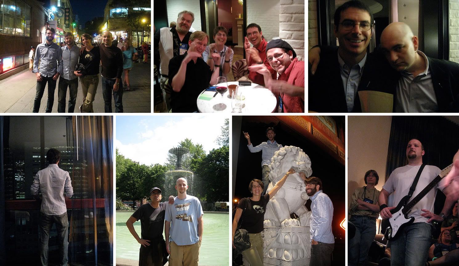
Rock Band obssesives banded and rocked at the Tor.com party the following day.
I had a great meeting with Brandon Sanderson about some upcoming projects.
There was the odd realization that I see some NY friends more when we are hundreds, if not thousands, of miles away from New York. And promises to rectify that.
Chinatown with the artboys, Dan Dos Santos, Dave Palumbo, and Marc Sheff.
Everyone clamoured to be in Dave Palumbo’s next Living Dead zombie cover for John Joseph Adams. (Dave, I think you can leverage that into a whole lot of free drinks next time.) You can see my one and only stint as a cover girl The Living Dead
The new Hugo logo was unveiled at he Hugo ceremony. Neil Gaiman, Geri Sullivan, Chip Kidd and I were asked to jury a contest to pick the logo. There were nearly 400 entries. Choosing was tough but I believe we arrived at something that is simple and elegant, something that will clearly mark a book as a Hugo winner without blending into, or distracting from, the the cover itself. I hope the committee decides to showcase some of the runner-ups, there were a number of fine designs on the shortlist. Congrats to Jeremy Kratz.
Dan Dos Santos and I stumbled into the backstage of the masquerade. Two words: Klingon Batman. Cheryl Morgan showed us a around and answered a million questions. I regret not having seen some of the costumes in action, especially the multi-person ones, but being surrounded by all the nervous energy while the contestants awaited the judges’ results use a unique treat. (Thank you, Cheryl, for inviting us in.)
And.....
Nirvana was played on an accordion.
Marc Sheff climbed a Foo dog statue.
Rob Bland nearly climbed a large wire hand.
After discovering all of Night Shade's inventory was lost for the weekend, Jeremy Lassen climbed on his table top and try to sell himself.
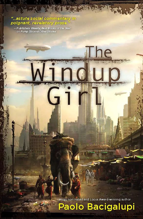
 Eventually Night Shade’s books were found and sold out. There was a tremendous amount of buzz for Paolo Bacigalupi’s The Windup Girl
Speaking of Paolo, he and Annalee Newitz managed to scare off bar company with their ideas on cloning (or was it genetic engineering?)
All in all, a typical World Con. Between this and Comic Con, it's time to remind myself what eight hours of sleep feels like. And its time for me to get back to work. For reals.


14 comments:
I can see where Donato is coming from. Let's face it, as long as he is in the nominations list, no one, not even his friend Stephan (who bowed out this year), stands a chance of winning. He's just so darned good!
Donato is amazing. But there are a some equally accomplished artists out there. I just think it's better to try to raise awareness of the rest of the field rather than pick-off worthy contenders.
I say this while also admiring Donato's dedication to expanding the award. He's a good friend and he was the one that initiated our attempt to clarify the Art Hugo rules a few years back.
This is a great post Irene. Another reason we love you so much.
Thanks, Bill. I was a little worried that the art stuff would get overlooked in such a long post. They are issues I have been meaning to write about fo a while. I might regret not making them two separate posts.
There are many many many artists whose work deserves attention. Perhaps if these conventions, whose purpose is to highlight & promote science fiction/fantasy books/novellas/stories, would advertise/promote the art aspect more, the attendees/voters/public would pay more attention to the art, & the field of contenders would be broadened.
I admire Donato's, & Stephan's, work on raising the public's consciousness of science fiction/fantasy art. Perhaps if more "name" artists would take a stand, the art aspect would receive "deservedly" wider recognition.
Fabulous post, thank you Irene!
Yes, what a terrific wrap up. Thanks Irene.
And speaking of books with interior illustrations oh publishing goddess - be they for YA or older markets - is there a *name* or categorization for this sort of illustrated novel? Mike Mignola's "Baltimore: Or, The Steadfast Tin Soldier and the Vampire" comes to mind. NOT the same format as a graphic novel by any means, but lots of yummy yummy interior illustrations... It is my favorite type of publication, but I am hampered a bit trying to talk about it since I don't know what to call it concretely...
Can you help?
tara- I dont think there is a name for that. I wish there was. I think if it had a label people would know how to market it better. It seems to need a "Sales language", doesn;t it.
When I was a kid, they were simply called "illustrated books."
Irene, I think we should come up with a name! Tweet or facebook or talk about it with publishing people enough for it to become a 'thing'. There's no reason why it shouldn't have a name/category. This is a whole sub-genre of books feeling nameless and completely left out. This should be remedied. :-)
thanks for the info Irene! very informative.
As someone who is working towards being a cover artist. This is the kind of article that makes me feel like the kid in "A Christmas Story" reading the letter he got with his secret decoder ring from the Orphan Annie Show.
Thanks again.
It must have been a riveting talk - thanks so much for sharing.
I wonder about the ebook format a lot. It sounds like it has kinks which have prevented more widespread popularity, but I think it's just a matter of time before an iPod equivalent (not necessarily by Mac) pops up.
As for publishers paying for sketches to be included, in my limited experience it seems as though work-for-exposure is generally on the rise (not from Tor, I gather). Is it tougher to be a paid professional now, I wonder? An artist can cast a wide net online, but the downside seems to be more expectations of free work by up and comers.
I thought the graphic element for the new Hugo logo was well done. But the typography with it... does not work. Sorry.
My thought on the Hugo logo contest when it was first announced was that something that could multitask for letterheads, book cover stickers, etc, would need to be contained within a space that was either circular, square or rectangular (at or close to Golden Rectangle proportions).
Combining a long, skinny element like the Hugo rocket with type that could be plain enough and large enough to work 1) together, and 2) at a variety of sizes within those shapes was, always, I thought, going to be a bitch.
Some of the other entries linked to in comments to the winning-logo announcement worked, I thought, better than what was actually chosen.
Post a Comment