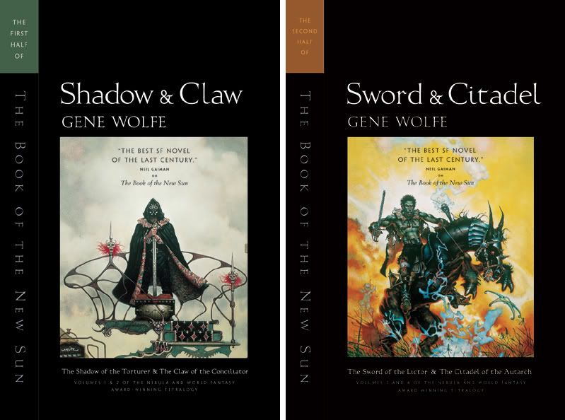
 I'm trying to sneak in and redesign some of the paperbacks that we keep reprinting over the years. (Don't mention all the new covers we should be working on...We just couldn't help ourselves.) Here is what Jamie Stafford-Hill did with the Gene Wolfe New Sun books using the original Don Maitz art. The first is reprinting now, the second will have to wait until we are out of stock of the current edition.
Wednesday, November 22, 2006
Facelifts
Labels: Facelifts, Jamie Stafford-Hill, Tor Books
Subscribe to:
Post Comments (Atom)


10 comments:
Those new versions are beautiful, and I like how the artwork is not as cropped. These books were highly influential during my college years, and it's nice to see them with a new coat of paint, so to speak.
I'm afraid the illustrations clash with the new style. Seems to me they'd be happier with a retro pulp style with a modern sheen. These look almost academic.
Very nice work.
I agree with Jack that there is a bit of a clash between the pulpy illustrations with the more austere surround, but it doesn't bother me too much - and I do like seeing the books packaged as "literature" (question begging term, I know) because, well, they are.
I think it's a great repackage, and Don Maitz work can't be topped. It's nice to see them presented so well - Jeff Doten
I like the redesigned covers - after all, these books have become classics. Very nice.
It might be interesting: a completely different approach to Gene Wolfe's Shadow of the Torturer:
http://www.deviantart.com/deviation/32542029/?qo=15&q=by%3Awhoisnot&qh=sort%3Atime+-in%3Ascraps
Also with black (and a lot of white) :)
Thanks gang.
For you Wolfees, you might be interested to know that we just got a new manuscript called PIRATES FREEDOM. I'm very excited to work on this -- a true blue pirate story. I'm hoping to get some time this weekend to read through a lot of it. It is scheduled to publish next Fall.
Dammit. I already have both of these in the old editions.
It's nice that the art was respected, though. If I were "joe book designer," I would have done a bright, kind of ironic but admiring pulp fiction treatment a bit like what the McSweeney's crowd did with their "Amazing Stories" anthology, or whatever it was called. Or maybe something resembling an old Eerie magazine cover with drippy lettering, but the art still framed and left alone.
Even so, as an artist (but not at these people's levels,) I don't mind lettering over my illustration. If I'm doing it for something like this, it completes it.
I love that you kept the old art. I tried to read the first one two or three times just because I liked the cover. (Yes, I did say "tried"! Sorry, Wolfe fans.)
I'm really happy with new crop of the art work, especially with the the 2nd half, though I've always felt that the art from the UK editions evoked more granduer and adventure than these. I think the type is far better on these editions, but the Neil Gaiman quote floating above the art has a kind of supermarket feel to it. Bottom of the book maybe?
Post a Comment