Friday, September 29, 2006

Fantagraphics Exhibit

I had a great time at the Fantagraphics exhibit opening last night. The place was packed but, since I don't know the comics field too well, I have no idea who all was there. The work looks great...but definitely needs a look when the gallery is quiet and you can actually read everything.

FANTAGRAPHICS 1976 - 2006
Museum of American Illustration at the Society of Illustrators, September 27–October 21, 2006

This massive art exhibition features over 100 original pieces by dozens of authors published by Fantagraphics over the last 30 years, including Daniel Clowes, Gilbert Hernandez, Jaime Hernandez, Chris Ware, Peter Bagge, Jim Woodring, Joe Sacco, Carol Tyler, Ivan Brunetti, Tony Millionaire, Roberta Gregory, Bill Griffith, Richard Sala, Bob Fingerman, Steve Brodner, David B., Kim Deitch, Al Columbia, Drew Friedman, Kaz, Frank Frazetta and many others.
I did get to spend some time with Anita Kunz, Steve Brodner, Brian Cronin, Yuko Shimizu, David Hollenbach, Arkady Roytman, and others. A real treat was getting to meet Marcos Chin, who seems like a sweetheart. Apparently he and Yuko share a studio -- both do such amazing work, it must be a sight to see them working together.

More details on the Fantagraphics blog.
Update: A more knowledgeable report at The Beat.

Sorry about the cell phone pictures. Top: Everyone. Bottom: Anita Kunz and Steve Brodner.

Thursday, September 28, 2006

Last Man Standing 2

ConceptArt.org is an international community of artists, tens of thousands strong -- everything from high school students to seasoned professionals. One of the more entertaining features is the Thunderdome. These are competitions where artists "battle" each other by drawing and painting -- a topic is chosen, a deadline set, and then...they are off to see who can top the other. No blood is spilled (usually) and no prizes are won, it's just a fun way for young artists to motivate themselves and hone their skills.

About a year ago, Cody Tilson (aka Strych9ine), organized a massive battle, calling to arms anyone in the ConceptArt.org community that wanted to draw until The Last Man Standing.It started with 144 artists and took the better part of a year to complete. In the first few rounds the results were understandably mixed -- in fact, part of the fun is watching students play along with professionals --but as the competition moved on most of the work was solid! In the end, the insanely talented Jason Chan was the last man standing. (The final round taking place during his senior year college finals.) Images created for "the Dome" have been accepted into Spectrum, England's Imagine FX, China's Fantasy Art Magazine, Australia's Expose....and no doubt, many other places.


Unfortunately the links are spread out all over the place, but here is a link to a round where the topic was "A child meets their imaginary friend."

Now, Last Man Standing 2 is in progress: 271 artists will create 396 paintings to come up with 1 winner.

I asked Cody, what on earth were you thinking?

Before I started Last Man Standing on conceptart.org, the forum was peppered with smaller, member-run Thunderdome art battles, but there hadn't been a massive competition for a while. It was born out of my own need to get off my then-lazy ass and work towards my own artistic development, and an opportunity to include hundreds of other artists in the process. It was a total shocker that I had to actually cut off admission into the first dome at 144 people, but it showed me that many artists, professionals and budding artists alike, were excited about the dome.

With LMSTD2 I wanted to take the dome to the next level, make it somewhat of a recognizable force in the community, and with a role call of 271 people currently participating in the event, it's happening. When you have some of the most talented artists any online community has to offer participating and top industry professionals lending a hand to judge, it's hard to go wrong.

The best part about running the dome is seeing pieces created by community members specifically for this thunderdome being printed in annuals and magazines worldwide. I love to see the friends I've made getting the recognition they deserve, and it's nice to know that the Dome has provided the right circumstances for those pieces to be created.

There is no worst part...I've stayed up for hours getting final entry threads created and sifted through hundreds of emails to organize all of the art being entered, but I'd do it again any day. I'm not the only person putting in the time to make this thing float. Every artist involved is donating their free time to create works just for this Dome, and many are required to continue to do so as they advance through the rounds. That's hundreds of new pieces of artwork being generated over the course of the Dome, for no prize other than to know you fought your way through almost 300 people and came out the sole winner of the massive event. That's a contest with balls if you ask me.
Artwork from top to bottom: Jason Chan, Pandoras Box; Shelley Wan, Begining of the End; Dan Milligan, Boys vs. Girls: Tiffany Prothero, The Escape

Wednesday, September 27, 2006

Cowan and the Gramstand

This morning I was thinking that it’s been too many days since I’ve been the best tea shop ever, the Gramstand. I went in today and was pleasantly surprised to see that they are exhibiting the work of Doug Cowan. Doug was the recipient of an Art Out Loud Scholarship from last year’s Society of Illustrators Student Scholarship Competition. Art Out Loud is a series of science fiction and fantasy painting demo fundraisers that Dan Dos Santos and I host at the Society. Through the efforts of a number of sf/f artists, we have raised quite a bit of money for the Society’s scholarship fund.

Congrats, Doug!
(If you ever happen to see this!) Nice work. It’s great to see it out in the world so soon after college.

Tuesday, September 26, 2006

Gary Ruddell Exhibit

Readers here may know Gary Ruddell for his science fiction and fantasy book covers. He did the cover art for Dan Simmons’ Hyperion books, among many, many others. In the past six or seven years he’s been turning his attention to gallery work. His latest exhibit:

Gary Ruddell “Small Changes”
Dolby Chadwick Gallery, San Francisco
October 5 - 29th


In the late 90s a friend of mine and I took a bike ride down the west coast of America — Vancouver to Tijuana. When we got to San Francisco we called Gary. He and his wife, Nora, invited us to stay for a couple of nights.

He picked us up in an old truck and politely asked if we would be offended by nude paintings in the house. He explained that he had a lot of his personal work hanging and was worried we might find it off-putting. Well, of course I would not be offended...but he did start me thinking that it might be some real tacky stuff, since he was asking. Not at all. He was doing some drop-dead gorgeous paintings..loose, contemplative...large scale and beautiful.

It was a time when he was really trying to focus more on that than his illustration work...his enthusiasm was infectious and it really set the mood for the whole weekend. We had offered to take them out to dinner but instead they had arranged an amazing dinner party. Good times. A real highlight of the trip.

I’ve haven’t worked with Gary much since his switch to the gallery world but I am always tickled to get a new exhibit announcement from him each year or so.

Monday, September 25, 2006

Mathematicians in Love

I’ve often enjoyed the covers to Rudy Rucker novels. This one was designed by our fantabulous Jamie Stafford-Hill. It should hit the stands in December. The book is about two mathematicians in love with the same woman — they use cutting edge mathematics to alter reality and get the girl.

The first one is the final. The other two are slight variations on it. The warm colors were thought too feminine, and therefore limiting the audience too much. I loved the idea of the italic “N” in the earlier comp, but I liked the overall design of the final better. The geometry of the author and title type against the nautilus really seemed to go a long way in adding a sense of alternate and intersecting realities. I’m surprised that we got it approved but between the typeface, color shift, and the intersection of the title into the author, Jamie was able to maintain readability. (Oddly, the final “all bold” version is more readable than the earlier version that shifts weights at the +/- point.) I also like that the nautilus looks like a storm is on its way!

From Jamie:

I had a great time with this one...I wanted to capture some of the chaos of Rucker’s universe(s)—where graduate students exploit the fundamental connections between abstract math and the nature of reality in order to get a date—and the nautilus spiral really seemed to get that. I still prefer the original hot pink nebula chaos but I do like how it turned out, especially with the double-rotated type.

In the first comp the word “Mathematicians” uses an italic “n,” which, based
on what I remember from high school algebra, often stands in for an unknown number. I think. Anyway, it looked good.

Saturday, September 23, 2006

David Apatoff has written a lovely tribute to unknown illustrators on his blog, Illustration Art.

Gray wrote that in the absence of trophies and grand memorials, those who came before us at least deserve “the passing tribute of a sigh.” I agree, and this is my sigh for these and other commercial artists who labored so hard in the name of excellence.

Happy Fall!

Happy autumn equinox!

This Christoph Niemann New Yorker cover is a year old...It made a huge impression on me. It’s such a sweet ode to urban fall.

Friday, September 22, 2006

More Stephan

Shall we continue the Stephan Martiniere love fest?


Here is the cover to his upcoming art book, Quantumscapes, due out in December from Design Studio Press.

(Has anyone else noticed that the covers to Stephan’s, Jon Foster’s, and JJ Palencar’s art books all use Tor covers on their cover? I’m just sayin’.)


And, here is the cover to Daniel Abraham’s Betrayal in Winter. (It is the sequel to A Shadow in Summer.)The art was done ages ago, but the book is just going into our catalog now. We just got in enough information to begin the “Autumn” installment of this quartet. As much as I’ve loved what Stephan has done with Summer and Winter, Fall is my favorite season, I can’t wait to see what he comes up with for that. (No pressure, Stephan!)

Thursday, September 21, 2006

James Jean: Space Race

James Jean is a remarkable young artist. Anyone not checking out his blog from time to time is missing out. Here is a piece he just did for Nike: “I wondered what a sci-fi rivalry between Red Riding Hood and the Big Bad Wolf would look like.”

Wednesday, September 20, 2006

Call For Entries

UPDATE: DEADLINE EXTENDED TO OCTOBER 20th.

Just a few weeks left to enter the Society of Illustrators’ annual!

(Cool poster art by Jonathan Weiner.)


I’ll be on the Sequential jury this year. I'm very much looking forward to it. I’ve never judged this category before...I imagine it will be both inspiring and exhausting. (Judging a few thousand single images is exhausting.) I am also really looking forward to spending some time with the other jurors. They are all amazing talents.


Bill Frake
Tony DiTerlizzi John Hendrix James Jean Michael Kaluta M.K. Perker George Pratt Mark Alan Stamaty

For a full list of categories, juries, and submission guidelines, click
here.

The judging process is a simple pass/fail for most of the day. You sit with each piece and make your own judgments. It’s an anonymous check-mark on the back to vote Yay. If youre like me, you spend the entire day second-guessing yourself. “Was I too tough on that set? Maybe I’m being too lenient?...Sure this is good, but is it good enough?” Then I remind myself that that's why we have 9 judges, and I follow my gut.

Then the staff clears everything away and does some quick addition while we have lunch. After lunch, all of the work with with near unanimous votes are debated on for medal-winners. Sometimes it gets heated but, oddly, I
Ive only seen real tension in judging the student exhibit. (Perhaps because you are judging potential as much as the actual work in the student show.)

The Spectrum annual works similarly, except that Spectrum has a power vote, which is something I wish the Society would adopt. One juror can tag a piece for possible medal consideration. That piece may never make it into the show, if it only has that one vote, but it does mean that work that falls outside of the “common dominator” gets a second look.

I’ve been a juror for the Society, Spectrum, and Communication Arts. There are only minor differences in their processes. While there is no perfect system, they each manage to create a great resource. When the annuals come out and all that exciting work is displayed, it’s almost enough to make me wished we published more books...almost.

Monday, September 18, 2006

Society of Illustrators Events

For those of you in the New York area:

Syd Mead, production designer for such classics as Tron, Bladerunner, and Aliens, will be giving a lecture at the Society. Ballistic Publishing has a quick interview with Mead here. Of which, my favorite line is. “Honestly, I get scared shitless every time I start a new, big job.” Something for students to know: It never gets easy.

Society of Illustrators
: 128 East 63rd Street, New York, NY 10021
Thursday, October 19th / 6:30PM / $20.00
/ For tickets call: 212.838.2560


Jazz-and-Sketch
[Drawing courtesy of Arkady Roytman.]
Every Tuesday night the Society hosts a life drawing sessions with live jazz. This is always fun and mellow night. All levels of artists are attened. These are not classes so no one is judging the work. There is also a bar, for those that want to “loosen up” their drawing...or if, like me, you don’t want to draw at all. Most weeks, the models are nude, but every now and then it’s a theme night — French Revolution costumes, lavishly tattooed people, etc.

Every third Thursday of the month they throw in another jazz-and-sketch, except this one comes with a light buffet. I’m almost always at that, since the board meetings are conveniently scheduled for the third Thursday of each month.

Every Tuesday: 6:30-9:30PM
$7.00 Students with ID. $12.00: non-drawing attendees. $15.00 all others.

Third Thursdays: 7:00-10.00PM
$10.00 Students with ID. $20.00 all others.

Friday, September 15, 2006

Via: Science Fiction Book Club:
Diana Gill talks about cover art on the Eos blog.

And, via SF Signal:
Lou Anders talks about covers on his blog.

And, Andrew Wheeler talks about covers at the Science Fiction Book Club blog. (Inlcuding a promise to see a new Todd Lockwood painting on Monday. Yay!)


Thursday, September 14, 2006

Cheyenne Medicine Hat

Greg Manchess has a new childrens’ book out this month, Cheyenne Medicine Hat. A sweet and sad story of the dwindling herds of wild mustangs in western America. For research, Greg visited the Black Hills Wild Horse Sanctuary in South Dakota.The book is written by Brian Heinz. The two teamed up on Nanuk in 1998. Nanuk garnered Greg the prestigious Hamilton King Award.

Vess and a Storm

Charles Vess seems equal parts proud and relieved to be done with 70 black and white drawings plus color paintings for the limited editions of George R. R. Martin’s A Storm of Swords. I’ve seen a few of these drawings at various conventions— fantastic work! Check out what Charles has to say on his blog.

And “cheers” to Subterranean Press for doing illustrated books for grown-up folks.

Wednesday, September 13, 2006

Masters of American Comics

I don't know too much about comics but I do know that if there is a chance to see a Winsor McCay drawing, I'll take it.

Masters of American Comics:
Exhibition on view September 15, 2006 – January 28, 2007.

“Throughout the twentieth century and into the twenty-first, comic strips and comic books have been a tremendously influential form of mass media. Masters of American Comics brings together the work of fourteen artists, from Winsor McCay to Chris Ware, who have defined and expanded the possibilities of a vastly popular art form. Masters of American Comics is a two-part exhibition at The Jewish Museum and The Newark Museum.”

Monday, September 11, 2006

Thumbnails: Tom Kidd

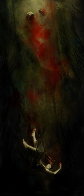
Thumbnails: 30 Second Interviews

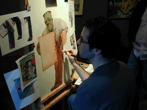
The wonderful thing about looking at Tom Kidd’s work is that you feel that he is portraying the world that he somehow actually inhabits...a world that many wish they inhabited. His book, Kiddography, is available from Paper Tiger. You should also stop by his brand new blog, also titled Kiddography.

What is your favorite painting you did in the past year?
I recently put three of the paintings I liked most from this year back on my easel and I’ve been reworking them. So far I successfully ruined one (but I may be able to un-ruin it), I left one a third changed and the other really doesn’t look that different — yet. It’s all for the sake of science or caprice. I seem to be looking for new ways to paint or to have a deeper understanding nature by alternately studying it and then painting it from memory and back. It’s possible that I’m more interested in problem solving even if I have to create them myself than finding a working formula. Your question, that I haven’t answered, has given me an idea though, I’ll put up the work I’ve done in the past year on my website with all their permutations and let other people judge them for me. I’m already cringing at the anticipated comment “I liked it before you made the changes.”

Dream assignment?

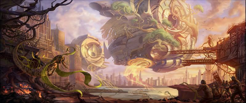
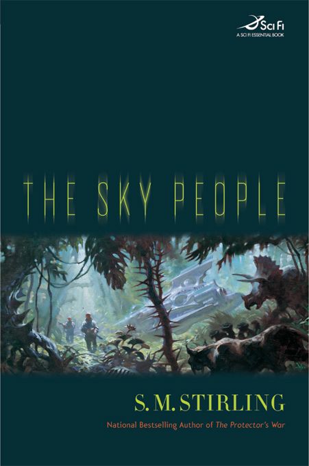
The activity I like the most is making things. I’m not as fond of copying things but I do enjoy working from nature. The process I like
most is pretty simple, I study all the aspects of the visual world, work out through observation the properties that make the world look the way it does, memorize and mentally catalog details and then apply all of that information into pictures of things that I’ve never seen but that I’d like to see. This is the essence of science fiction. My favorite thing to do by far is to use my imagination fully. I’m not asked to often enough. That’s the main reason, among many others, that I created “Gnemo: Airships, Adventure, Exploration.” My hope with this book is to give myself a number of challenges. I’ve written into it difficult things to resolve easily with an illustration. Right now Gnemo is still all mine, I’m the boss but I have offers. The dream job will always be the one you’ve given yourself. Although I’ve had a few assigned to me that were fairly dreamy.

Speaking of illustration, in our present world with many types of moving pictures full of story, sound and fury, the simple still picture has to have more life than ever. Like the few words of the poet an illustration has to say more with less. I’ve always loved the idea of communicating with pictures. Narrative art is the greatest art. It’s always had the most affect on me so I naturally gravitate towards it in my work. Some people see it as less sophisticated but that doesn’t both
er me. It’s not good to be blinded by the need to appear sophisticated however other might perceive you.

Painting you wished you painted?

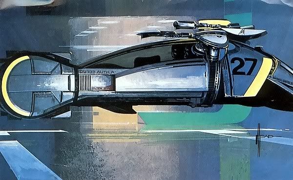
The first paintings I remember being in awe of were by Chesley Bonestell. I was four or five when I first saw them. They were in a set of encyclopedias that my parents bought when my brother was born. One was of Saturn as seen from its satellite Titan. I’d never thought of viewing the universe from that perspective. My view was earthbound. Here, the artist had traveled 800 hundred million miles to pai
nt a picture. This artist had imagination and his paintings sparked mine. I’ve done few astronomical paintings but I’ve taken with me the feeling I got from Bonestell’s paintings. If I can do pictures that open up someone else’s imagination, make paintings that evoke a sense of awe, I’ll have done well. That is the key purpose of the fantasy illustrator – elicit a strong emotion and hint at some mysterious tale that fires up the mind. If I’m allowed to reach for the stars like Bonestell, I hope my work will inspire some young person to future greatness. That’s my intention with Gnemo, if not just yet, with some paintings in the works.

Most embarrassing illustration related moment?

When I decided to do a book of my art I wanted it to lay bare my art and my life without pretension. Now that it’s published, much of it makes me blush. I still wake up in the middle of the night mortified by my own words. Nothing in the world causes me sustained embarrassment more than I do. I should learn to stay quiet.


Your biggest influences?

Speaking of staying quiet here’s my controversial opinions: It seems to me that the illustrators of the 10’s through the 50’s broke a mold, especially the Brandywine School. Before that, with the exception of the
Pre-Raphaelites and a few turn-of-the-century painters, paintings were pretty stodgy (not bad, just stodgy and I’m only talking about how paint was handled). I even think a lot of the work of European impressionists missed its intended mark. American impressionists got it right and American illustrators took a freer and more subtle form of painting to its highest potential by making it narrative. When I stand in front of those original paintings, as I did at a recent show of the Kelly Collection, they affect me profoundly more than any other paintings. I also think that the 19th Century artist’s view of the future, especially in respect to the melding of technology and architecture, to be a much more beautiful and appealing future than ours. It’s time we change our present course. All of my reasoning here is based on my emotional reaction to this work and therefore isn’t reasoning at all. No logical argument will change my mind.
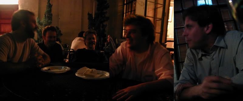
Mainspring


Stephan Martiniere’s latest for Tor — the cover to Jay Lakes Mainspring, due out next summer. I’ve long said that Stephan is one of the most exciting digital artists working in the field. He uses digital in a way that is truly unique to the medium rather than using it to mimic traditional mediums. Few can create a entire world within the confines of an 5x8 book cover the way Stephan can.

Update: Jay Lake’s LJ post about the art here.


Museum of Natural History

The American Museum of Natural History is one of my favorite places on Earth. At some point I’d like to take a bunch of pictures and create a visual essay about why that is so...But for now, here was a quick trip that Greg Manchess and I took today. (One of the rare times that we were not kicked out at closing time.)

We went to see the “Lizards & Snakes Alive” exhibit. I was surprised how active the animals were. Lots of fun...especially the film of flying tree snakes. The whole idea of flying snakes is just fascinating
and horrifying to me. One draw back of the exhibit was that the museum had a simple video game that let kids play a rattle snake hunting for food. There was a large crowd of kids all jockeying for position to play ending with one child having a C-O-M-P-L-E-T-E meltdown. You’d think this is one place where parents can get their kids away from video games.

This gecko was beautiful and typographically interesting, having formed itself into a question mark. This python is named, I kid you not, Irene.


The museum is full of amazing artwork. Here is one of Charles R. Knight’s drawings. On the right is a detail from Carl Rungius’ background painting for the Alaskan Moose diorama. This painting is a bit controversial amongst museum peeps — some love how expressive it is, others feel that it detracts from the illusion of “being there.” (Tip: Bring binoculars! It’s fascinating to see the paintings close up and see how expressive all the background paintings are. Of course, people do tend to look at you oddly...as if they’d hate to break it to you, but, “You know it isn’t real, right?”) Click here for a great little animation on basic principles of a painting using Rungius’ work.

Yes, I am part of that publishing cliché that adores cats in all shapes and sizes...and besides, the sculpture that goes into these animals is amazing. And, last but not least, Greg!

Sunday, September 10, 2006

Colleagues

My new office mates! (Who wont stay still for a good shot.) I bought a twenty gallon fish tank about a year ago and I’m only just getting it up and running now. Sadly, I’m told that the first few fish in a new tank aren’t fish at all, they are sacrificial lambs giving their lives to stabilize a new tank for the fish to follow. So, for now, just these few danios...I do hope they make it.

Friday, September 08, 2006

Society Nights

Last night the Society of Illustrators kicked off the fall season with an opening for an exhibit curated by Murray Tinkleman, “You Must Have Been a Beautiful Baby.” I must admit, I was kinda down on the idea of this exhibit—illustrators doing portraits of themselves at some point between birth and teenagerdom. I thought it was too much of an inside joke...I still think that but, from what little of the show that I could see through the crowd, it is clear that good artists do good work, even if it is baby pictures. I’ll need to go back when it's quiet to get a real look at it. Last night, it was packed elbow to elblow. The crowd included Vin Di Fate, Ted and Betsy Lewin, John Cuneo, Nancy Stahl, Tim Bower, Tim O’Brien, Cathie Bleck (who had a copy of her art book, Open Spaces), Donato Giancola, Scott Bakal, Peter de Seve, and many, many others. Lots of young faces as well, it’s always encouraging to see students at the Society.
The party continued up in the Hall of Fame gallery with the all-illustrators band, The Half-Tones: Barry Blitt, Joe Ciardiello, Richard A. Goldberg, Hal Mayforth, Robert Saunders, Michael Sloan, and James Steinberg. These guys are great illustrators and a great jazz/blues bad. Seeing artists of this caliber playing jazz in front of N. C. Wyeth, Mead Schaeffer, and everyone else on the walls...what gets better than that.

Here’s my POV at our table on the terrace: Donato Giancola, Arkady Roytman, Greg Manchess, Mark Korsak, Peter De Seve.The next exhibit will be a 30 year retrospective of Fantagraphics. It will run from September 27 - October 21.

Lines and Colors has a nice profile on Dan Dos Santos.

Thursday, September 07, 2006

Nightmare Before Christmas 3D

Via Drawn!, via Cartoon Brew.

Releasing October 20th. I can't wait! I've made it a tradition to wrap presents while watching “Nightmare”. It'll be great to see it on the big screen again....and in 3D!

Tuesday, September 05, 2006

The Sky People and Greg Manchess

Here’s a recent favorite of mine, S. M. Stirling’s The Sky People, due out in November. This is a book that benefitted from me being able to read, and pass on, a nicely detailed explanation of the world in which it and it’s sequel take place in. The story posits a serious scientific reason (within the confines of an SF story, of course) that Venus and Mars has evolved to be the Venus and Mars of the pulps - one a teaming jungle with primitive humans, dinos, and prehistoric mammals walking about, the other as a dusty dying planet with ancient dying civilizations.
I think Greg Manchess’ painting goes a long way to be pulpy-and-not, which is just the right tone. (But, boy, was it tempting to go over the top with this.) For the design, I just wanted to stay out of the way of the art. We kept the art in a panel since it helped to tone down the pulp aspect a bit further without hiding what a fun world the book would take place in. I am very excited to see what Greg will do with the sequel set on Mars.

I asked Greg to say a word or two on this project:

When I was a kid I spent countless hours staring at the art on science fiction book covers. I couldn't wait for the “space race” to get beyond the moon so we could do some real traveling to the outer limits. The Sky People gave me the chance to capture one of those far-flung frontiers I used to daydream about.

To get a better feel for the cover painting I was inspired by Vincent DiFate's book, Infinite Worlds, and went immediately to studying shots of steamy jungles. It was fun making up bizarre flora and placing a crippled spaceship amongst it. I have this thing for seeing stranded astronauts in unending landscapes and getting that feeling of dread that comes with the struggle to survive. I've painted spaceships that are crashed on the horizon while we see the hapless spaceman living in a camp of broken ship parts. Much like the stranded seafaring travelers of long past.

The movie, “Robinson Crusoe On Mars” fascinated me as a kid. All alone in a barren landscape. And now the second book in this series is coming up and it's about Mars! My inner child is about to eat dessert.

Charles Vess Blog

Charles Vess has a new blog! He has kicked it off with a report from the set of the Stardust movie.

Monday, September 04, 2006

Frankenstein Makes a Sandwich

I just read Adam Rex’s new children’s book, Frankenstein Makes a Sandwich —a collection of poems and paintings about the classic movie monsters facing everyday issues like “The Creature From the Black Lagoon: Doesn’t Wait an Hour Before Swimming” or “The Phantom of the Opera: Can’t Get ‘It’s a Small World After All’ Out of His head.” It is hilarious! It made me laugh out loud, I swear, I have witnesses. It’s also a book that rewards a careful reader — the words and imagery hold more laughs within them than you’d realize at a quick glance. The artwork has Adam’s usual mastery and he’s done many of the paintings in various styles to match the tone of the monsters — some in color, some black and white, one in a Charles Dana Gibson-esque line drawings, another in a Golden Books-style cartooning, it goes on. The whole thing is a delightful experience.

I asked Adam how the book came about:

I was getting more and more interested in writing funny rhyming stories for kids, and I thought it would be fun to do a whole book of them around one basic theme. When I hit on monsters as a ripe subject for illustrations, the title suddenly popped in my head. I think I was going through this phase when I thought that “sandwich” was a really funny word, and the idea of this fantastic character doing this mundane thing seemed funny all by itself to me. So that’s how the theme came about — monsters with really run-of-the-mill problems. It took months before I figured out what the titular poem was about, though.
Below is Adam painting a promotion piece for Sandwich at the Society of Illustrators’ Art Out Loud painting demo series.
Thankfully, Adam is well entrenched in a new project. He is currently writing and illustrating a young adult science fiction novel, complete with prose, sequential pages, and illustration.

Saturday, September 02, 2006

Deadlines

Just to prove that it's not all fun and games, I spent most of yesterday emailing a number of artists and asking about "that piece that was due today." Nearly none of them were done...or even particularly close to being done in a few cases.

I love artists, I really do...Some days it’s just harder to remember why.

Many artists don't understand book publishing schedules and it’s no wonder. In magazine or newspaper publishing, if a job is due at 3:00pm Thursday then it gets done by 3:00pm Thursday. Period. If not, the story runs without the art, you never get another job from that AD, and it’s likely that you don't get much work from anyone that knows that AD. In book publishing...well, we have these odd cumulative deadlines. Three times a year I need to get four month’s worth of covers designed and ready for meetings, a black and white catalog, a color presentation, proofing deadlines, more meetings...all leading up to the actual printed book. I often hear artists complain, “I was working like crazy to meet the deadline and now, suddenly, there is tons time in the schedule!?” More often then not, missing that first deadline has caused some quiet havoc behind the scenes. It means that the AD has found a way to make-do for a while with a sketch or a shot of the painting in-progress, or they begged the patience of various Sales and Marketing peoples, or were willing to stay up very late the night before a deadline trying to wrestle out a quick design. None of this is seen by the artist so it seems that the first deadline was rather arbitrary. But those deadlines really were there for the good of the book, not to mention the mental health of the art director. (Artists - You want the books sporting your artwork to do well. If a book does well, the company will want to try and copy that success, which includes working with that cover artist again.)

If artwork is going to be late, communicating with the AD is key. We may have lots of time in the schedule and we may not. If asked, there may be easy ways to work it out so that both the AD and the artist is happy. Tom O’Brien created the artwork for our Starscape edition of Prince Umbra. In the middle he got a call from Time Magazine to do a cover. He asked if there was any way that he could squeeze an extra week from us. (Mind you, he did stress that he was prepared too turn Time down so that he could meet his prior commitment to us.) We had the time. He did both covers. Everyone was happy.

I should say that there are many reasons a cover can be late that is not the artist's fault. I screw up, the editor might not be forthcoming with information at the time I need it, a book is added to the schedule late, etc., but since yesterday was “Prod the Artist Day”....