

 In May we will be publishing Cory Doctorow’s young adult novel, Little Brother.
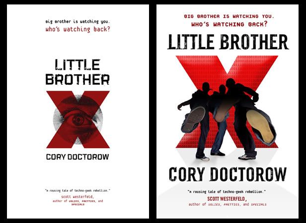
This was a fun, if a little scary, cover for us. We always smile when to comes to Cory but this book, in particular, really caught everyone’s fancy. The whole company just fell in love with it and there was a lot of pressure to do right by it.
Peter Lutjen came up with a bunch of different designs that eventually evolved into the final. The penultimate version used a photo-realistic illustration that everyone almost loved. One last tweak of the design was to have the imagery re-drawn in a freer more organic style by Yuko Shimizu -- that seemed to unify everything to everyone’s liking.
Big thanks to Peter for staying enthused by the project through a number of iterations. I asked him if he had any thoughts on the process:
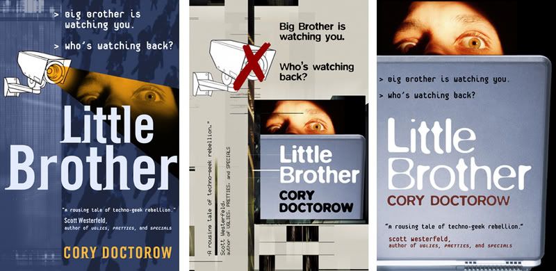
"This was a case where having an opportunity to read the manuscript was a huge help. My initial comps were based on a synopsis and some catalog copy and focused on elements of surveillance and captivity. After quite a few of these didn’t work out, I made time to read the book (which was terrific) and set off in a completely different direction. The editor came by my office to speak to me about playing up the resistance aspects of the story at the same moment that I was working on an image of kids kicking out towards the viewer. He liked it the idea immediately, and it came together pretty quickly from there." -- Peter Lutjen
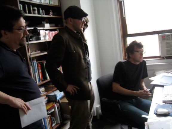
PHOTO: Editor Patrick Nielsen Hayden, author Cory Doctorow, designer Peter Lutjen..
UPDATE: Kudos from Cory on BoingBoing.
Friday, November 30, 2007
Little Brother
Subscribe to:
Post Comments (Atom)

9 comments:
great final solution! i especially love that illustration was used instead of stock photography-but i'm biased. :)
i've never heard of Yuko Shimizu before, but i'll have to check their stuff out now.
when i saw the thumbnail i initially thought Tomer Hanuka.
-mwillustration
I believe what the editor--me--said to Peter was "This is a story about resistance, not oppression." I'd just been in a sales meeting where it appeared that several people (people who hadn't yet read the book) had taken the Orwell reference in the title in combination with the Great Big Eye version of the "red X" cover (depicted in Irene's collection of comps), and jumped to an incorrect conclusion about what sort of book it was. Saying "Resistance, not oppression" got right through to them.
Being a book's in-house editor is in essence a one-to-two-year process of refining your explanations and re-testing them, hopefully well enough that you train everyone around you to sell the book the way it needs to be sold. Of course, it helps when the book is as good as LITTLE BROTHER in the first place!
Listened to this one in Podcast, and can't wait to get a copy for someone else. Cory's one of the most intelligent, socially conscious Tech/SciFi writers I've read, and after doing a B&W illo for him long ago, I can empathize in trying to suit the look and feel to his specific style... difficult.
Here's to more and more in the Doctorow line!
Namaste',
Chuck Lukacs
www.ChuckLukacs.com
Awesome cover. Thanks for sharing some of the earlier versions, as well. Interesting to see various stages of the process.
I like the penultimate version better. It's darker and more intriguing.
I usually dismiss cartoonish illustrations; they influence my perception of the material as being lighter and less serious than it may actual be.
Looking at the cover makes me think the title is 'Little Brother X'. That's what I thought when I first saw the cover on Boing Boing and it wasn't until I read the text in the blog that I realized the title was just 'Little Brother'.
never heard of them but will have a look further now ive seen these
One of the better YA covers. Love how it telegraphs the character of the story from 10ft away.
Girls get ready to make style statement with a pair of this Ugg Boots Rockstars. cheap ugg boots has brought for you this pair of studded boots to revamp your looks and appear stylish.
" polo shirts should look crisp and neat, and not baggy," comments Haarbauer. "A bright color will work well in the office and can easily transition to the golf course." A ralph lauren polo shirts can be one of the best investment pieces in a guy's wardrobe since they are so versatile;
Post a Comment