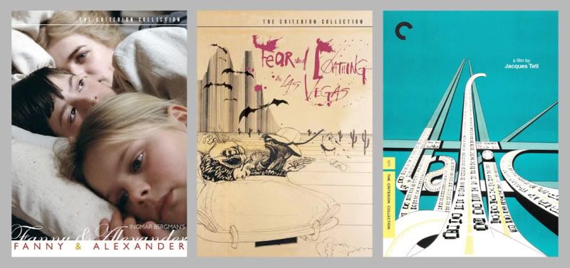
 This is being linked to everywhere so, why not here. Criterion DVD packaging makes me lament modern movie posters.
Thursday, December 11, 2008
What Movie Posters Should Look Like
Subscribe to:
Post Comments (Atom)
 This is being linked to everywhere so, why not here. Criterion DVD packaging makes me lament modern movie posters.
6 comments:
You are 100% correct! Their images are absolutely beautiful!
these are great. i especially love the Fear and Loathing one!
movie posters need to use more illustration again!!!
i for one am sick of the photo montage thing.
i'm absolutely with you about movie poster lamentation. for me it hit home when i saw Neubecker's poster for Sideways a couple of years ago and was simply giddy over how cool it was. it was a contrast reaction to a great poster among so many mediocre and bad posters.
for my money i could see a lot more of Ralph Steadman on movie posters. might even make me want to see a movie now and then.
Not defending modern movie posters, but these all look like books I don't read.
Venusain - Funny -- I nearly titled the post, "Making Movie Posters Look Like Book covers"
Once I played Archlord, I did not know how to get strong, someone told me that you must have [url=http://www.gameim.com/product/Archlord_Online_gold.html]Archlord gold[/url]. He gave me some [url=http://www.gameim.com/product/Archlord_Online_gold.html]Archlord money[/url], he said that I could [url=http://www.gameim.com/product/Archlord_Online_gold.html]buy Archlord gold[/url], but I did not have money, then I played it all my spare time. From then on, I got some [url=http://www.gameim.com/product/Archlord_Online_gold.html]archlord online Gold[/url], if I did not continue to play it, I can sell [url=http://www.gameim.com/product/Archlord_Online_gold.html]cheap Archlord gold[/url] to anyone who want.
Post a Comment