
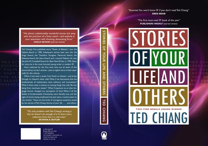
 We’re doing a reprint of Stories of Your Life by Ted Chiang. The process of reprints is supposed to be somewhat automated -- we are not re-soliciting the books to bookstores so no one asks us to revisit the packaging. Occasionally, I can’t resist. It does, however, mean that we need to come up with something without spending any money on it. In this case, Peter Lutjen rose to the challenge. Honestly, I like all four but the top version is the one that kept being pinned as a favorite.
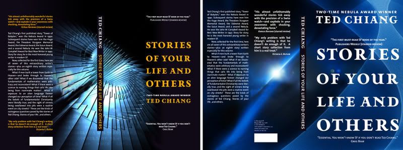
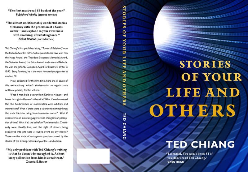
Thursday, January 31, 2008
Facelifts vol.7
Subscribe to:
Post Comments (Atom)

6 comments:
The top one definitely!
In the others, the type just gets lost in the background. Plus in the top one the title definitely takes centre stage - the different colours make the difference.
If I saw the book in a bookstore, I'd definitely pick up the top one to see what it was about - I wouldn't bother with the others.
Covers, especially their colour (can you guess that I am really attracted to colour?) make a difference to me on whether or not I pick up a book.
The top one is my favorite too. Clean, colorful and bold. Great job Peter.
Love your sneaker/leaves banner.
I'd go for the top on too!
Thanks for sharing.
gav.
Thanks, All.
Henry -- Praise from you means we really must be doing something right. Thanks for stopping by.
Any of them are incredibly better than the current cover. No matter what the book is about or how good it is, this cover can only help it.
The top one was my favourite too. (And that's even before I got to the end of the post.) The colours are bold and the typography is just smooth.
Post a Comment