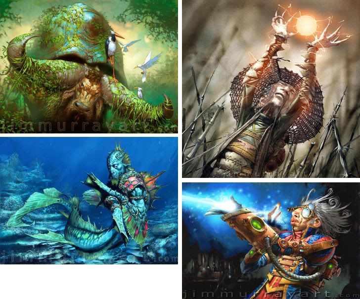
 Jim Murray
Can’t we commission cover paintings and then have the books written around them?
I saw this top image on Spectrum and just loved it. His site is full of amazing work. Great action, truly exotic creature designs, and of course that amazing color. It looks like the surfaces would be amazing in person.
I will, however, take this opportunity to point out one my my biggest pet peeves: Watermarks make art look schmutzy. You don’t want your art to look schumtzy. Value is one of the most important things about a painting and, by definition, a watermark screws up the values.
Tuesday, February 05, 2008
Wish List: Jim Murray
Labels: Jim Murray, Wish List
Subscribe to:
Post Comments (Atom)


9 comments:
I saw this (and it's partner in Spectrum) on the short-term display wall at Wizards a while back. I'd never seen anything like them. Truly astounding work. Thanks for the peek.
lee moyer
I saw that top image in Spectrum as well and really liked it. He has some really great images on his site. And I agree about the Watermarks. I realize folks don't want there art stolen. At the same time I think people should want as much exposure to their stuff as possible, especially if they are selling prints, art books, etc.
I agree @ watermarks. It's also annoying to see unidentified art copied and pasted on DeviantArt&Facebook pages, etc. So frustrating if you don't recognize the artist. Some genious should come up with a way to embed a signature/watermark that only appears when an image is copied & pasted. Until then, what to do...
"Can’t we commission cover paintings and then have the books written around them?"
I say lay down this gauntlet for Scalzi.
And wouldn't it be fun for a change to have an artist complain that the story got the cover art all wrong?
Nice job on featuring Jim here, Irene! I've always been puzzled why his name doesn't come up in coversations more- his draftmanship is outstanding. Be sure to check out the downloads section on his website to see larger pics. I've been a fan for awhile of this guy - glad to see him get a little profile!
(love the banner on top btw :) )
Shimmer just commissioned short stories based on art:
http://www.maryrobinettekowal.com/journal/shimmer/
Those colors are amazing. I was actually disappointed when I got my copy of Spectrum and saw his work... because mine was on the same page! I can't believe how gray my piece looked next to his incredibly saturated and lovely work. I'm glad it forced me to go look at the rest of his work.
At least he puts his watermark on the bottom edge of the image, and at a pretty transparent setting (5%, at a guess), rather than smack in the middle like some I've seen.
This seems like a reasonable compromise between marring the image, and leaving it completely unprotected to casual copiers and/or pirates.
Ther have been some websites where I'
ve tried to do a click-and-print to show an image to my wife, and I've found that the printer churns away and prints... an empty page.
I -think- the way this works is that there are actually TWO images on the website, the actual image you see, and then a layer set to 100% transparency, superimposed over the first image. So when you do the click-and-print (or click-and-save), what you end up printing or saving is only that transparent layer. There are probably ways a good computer geek could figure around that system, but I'm not a good computer geek. ("Semi-competent user" is about as far as I'd go.) No watermarks, but still a good measure of protection, especially against the casual copier.
Those are some amazing paintings, and the colors are incredibly radiant. I almost thought they were digital.
Thanks for sharing.
Post a Comment