

 This was a lot of fun to watch come together. Long time AD readers will remember that I couldn’t praise Brian Francis Slattery’s first novel, Spaceman Blues
, enough. To be honest, hat made me a little nervous when Brian’s scend novel, Liberation
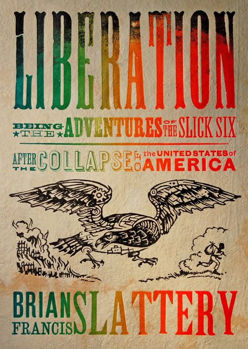
, came up in the schedule. Like Spaceman, Liberation is nearly impossible to describe and defies category, but essentially it is about America after a sudden and catastrophic economic collapse -- from there it gets both scary and trippy.
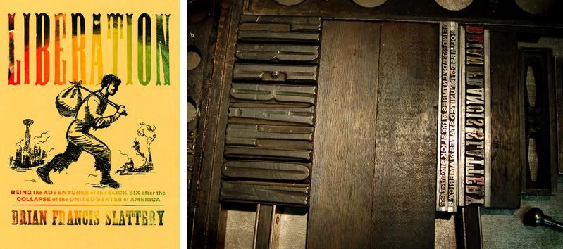
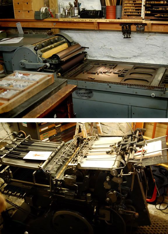
The author had the idea of referencing 19th Century runaway salve posters. Once I heard that, I immediately remembered a great lecture I saw by letterpress artist, Ross MacDonald, years earlier. I’ve always loved his work but knew it would take a long time to find just the right project. After a couple of emails back and forth, I realized that Ross wasn’t just the right aesthetic for the job, he really seemed to get the essence of the book. Below are a series of photos and excerpts of emails from him throughout the process:
“When I'm giving a talk about letterpress -- 'true' letterpress, with actual wood and metal type -- I like to use the phrase 'ditch typography'. In other words, you could literally do it in a muddy ditch if you needed to. If civilization collapses, letterpress printers would still be able to function, and that's the back story I had in mind when I was working on this cover -- to make it look as if it was printed in the time and setting of the book, by someone working in a burnt-out factory using 19th century technology.”
And......
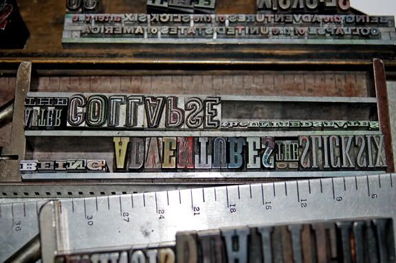
“Although I love a lot of historic periods of printing and design, I'm really inspired by one of the most reviled periods of design - the early 19th century. All of the fonts used on your cover were designed and manufactured before 1854. The two fonts on the bottom (the sans, which was called gothic and the slab serif, or antique) date to before 1820. Although it was not a perfect time (slavery, manifest destiny, votes for white guys only) it is a period when so much innovation was going on in many fields, including printing and type design.
The technology and the typography were really rugged. Americans were building cylinder 'country' presses that could survive travel in the backs of wagons. they were brought into frontier towns, where there were no roads, and could be easily run, operated, and repaired. If something broke, the local blacksmith could fix it. He had to, because it might take months to get spare parts. The presses could be run by either steam power, water power, mule power, or cranked by hand. Often times the printer would crank the flywheel and his wife would feed the press. I remember seeing an ad from the 1870's that boasted that 'a small boy could print over 2000 copies an hour'. Ah, the good old days!”
It's impossible not to enjoy the day at work when others so clearly display their passion for the job.
Tuesday, March 04, 2008
Ross MacDonald and Liberation
Subscribe to:
Post Comments (Atom)

6 comments:
Wonderful! This really entices me to buy this book. I suppose one could call it a gimmick but I felt instantly that I love the sense of craftmanship and pride fostered in the production of this title. Bravo. BTW: I recently saw this piece on a Letter Press on youtube. If you get a chance it's only about 6 minutes long and quite beautiful. If you've already seen it please forgive me: http://youtube.com/watch?v=Iv69kB_e9KY
Cheers:)
this is way too cool!!!
I love old-school printmaking. Plus this cover looks like it can hold it's own on a modern book store shelf, and even stand out.
And the story sounds pretty interesting (especially given the modern economic times).
When does the book come out?
P.S. I tried stumbling the cover image on StumbleUpon to go along with my review but it was too big. Any way you can Save for Web to get the file size under 250kb?
Brilliant, beautiful, and incredibly, amazingly appropriate to the book. Please tell me he pulled an edition of the plate, aside from the art for reproduction, and that there's, say, a hundred or so multiples floating around, maybe available for purchase. Please. Please.
That is so awesome! I love letterpress work. We have a company that does that here in KC and I really need to go take a tour just to see it all in action. Love that image he created. Certainly would make me want to buy the book.
Beautiful to hear you like post industrial craft Irene! In fact, the first two promotionals I sent you had a tipped in woodengraving on my hand-made paper, and were hand printed on my C&P letterpress. :)
Can't wait to read this one.
Namaste',
chuck
Post a Comment