
 The latest from designer Peter Lutjen.
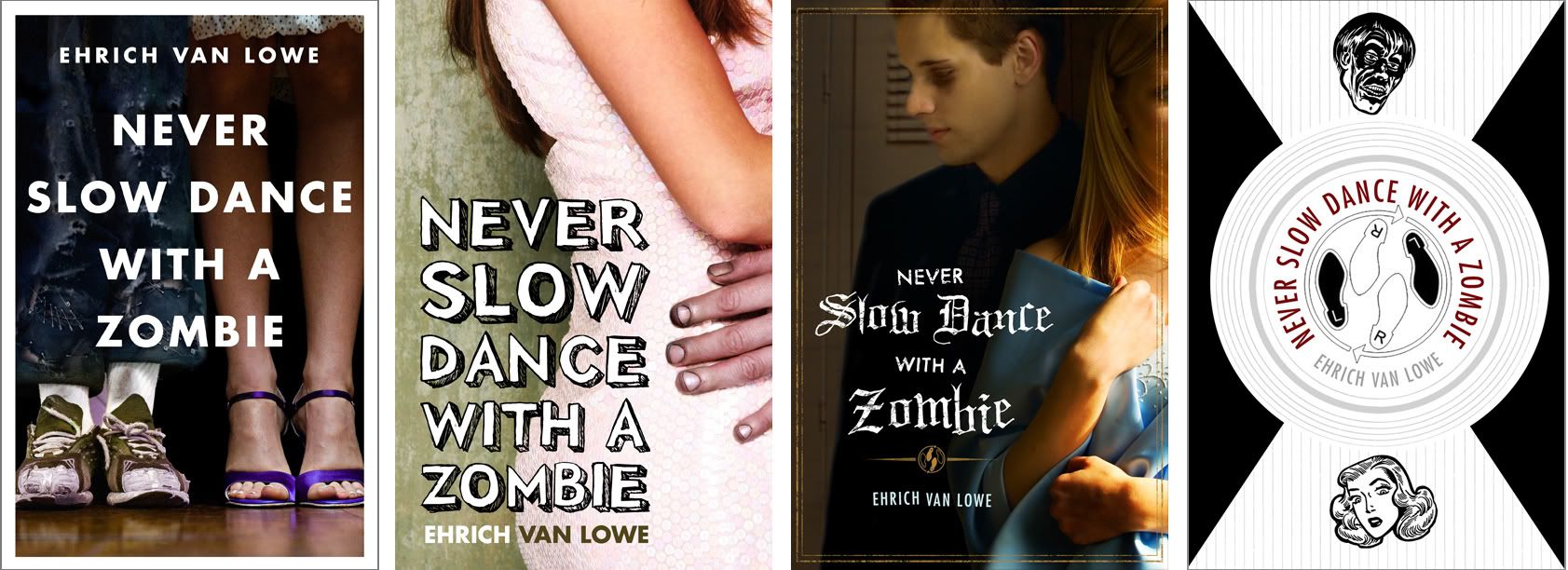
Never Slow Dance with a Zombie by E. Van Lowe, is a young adult book about the trials and tribulations of dealing with zombie boys.
Peter has a lot of warm playfulness in his design work, just perfect for this project. But the heartache of working with Peter is, often there are too many great options to chose from.
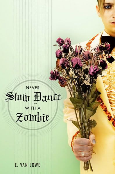
I love each of these for different reasons. But in the end, I came strongly on the side of the "flowers" version, which, thankfully,was the one approved. Although it was touch and go for a while...
I love each of these for different reasons. But in the end, I came strongly on the side of the "flowers" version, which, thankfully,was the one approved. Although it was touch and go for a while...
My second favorite was "feet". I know, there are tons of covers that just show legs, but it was so easy to imagine the girl trying to stand tall and look sophisticated next to the disheveled zombie sneakered boy. Sales nixed it right off the bat. I never really got a sense why.
For a while "pink dress" was in the lead - they liked seeing the girl. I liked this a lot and would have championed it...except there was something so funny-yet-sweet-yet-sad-and-cute-but-mostly-funny about the zombie suitor.
"Locker" is cool looking but better for a vampire book. It was briefly held up as a favorite but I'm glad we were able to steer everyone away from Twilight-fever. I actually didn't show it the first time around, for fear of said Twilight-fever, but at one point people were asking about it being more romantic, so I threw it into the mix.
Black and white "Dance" version is full of awesome, but better for an older crowd.
In the end, the editor and I were rooting for Flowers, while others were backing Pink Dress. At that point it came down to a "focus group" of four or five kids someone knew, all of which went with the flowers...Proving what I always suspected: My taste have not risen since I was 14.

11 comments:
Thanks for this- seeing these ideas raised a lot of questions about the process.
I'm impressed that you were submitted such finished designs for the book. I've never really seen a selection process like this, but I'm assuming all of the photos were originals that were taken specifically for the book design?
Is it normal for a designer to basically do 5 finished designs for the client? And after the submissions, does the publisher retain the rights to those finished designs or do you just buy the rights for the piece you choose?
I don't know if these have obvious answers, but I'm kind of taken back by the level of finish that was put into designs that my not even be used. Thanks again for generating food for thought..
Those kids were right on!
Of course teenagers, when thinking of a "dance" (the only time when they would probably slow dance traditionally) They think of a prom. And proms = flowers + tuxes.
I am curious as to the reason why photos were used instead of a illustration was this a marketing and editorial decision?
Thanks for Sharing your process and 'thoughts' on the pieces. Great images and fun typography.
I like the cover you chose the best of the five.
I like the concept of the feet cover, but I think a quirky line drawing would be more eye-catching than that photograph. Also the typeface could be a little livelier. On the pink dress version, the letters could almost be dancing themselves.
I love the guitar metaphor! Or is that just me reading too much into it?
And I really like the pink dress one too. Using that 3d, handwritten font is not easy, especially getting to to look natural and not over kerned, and justified too. Well done!
Thanks for sharing.
Hi Tim,
In this case we were working with various bits of stock images - messed with to greater or lesser degrees. That's why they are so "done" looking. If we were working with an illustration, we'd get sketches and only bring one to final.
That there are so many great options, is the joy of working with Peter.
We will, however, fairly often go to our Sales people with a number of options. Even if it's commissioned illustration, there are many ways to layout the design that will change the feel of the book.
Dwight: There's no cut and dry reason why we went with photography on this. Our YA department seems to like photo more than illustration...It's trends.
Jeanie - that would have been fun to do. We had an earlier book with a bunch of kids shown in photos...it just wasn't cutting it. We had something very similar drawn out and it worked out really well.
Terrific piece. Thanks for your inside look at a process that is very often utterly opaque.
And of course you chose the right one. :)
Hi Irene,
I am E. Van Lowe, the author of Never Slow Dance With A Zombie. While I wasn't in on the process at all, I have to tell you I LOVE, LOVE, LOVE, the final cover. Interesting you would mention Twilight fever. I had a fear that the art department might want to go in that direction, so you can imagine how delighted I was when I saw the pastels and flowers. This cover, I feel, most aptly captures the fun in the book, and steers us away from the clutter of Twilight clones on book shelves. Irene, I am going to put a link to your blog in my next post, so my followers can see the publisher's process. If you'd like to check out my blog go here: http://vanlowe.blogspot.com/ And thanks for picking the flowers. Having the mind of a fourteen year-old might be a good thing ;)
I really do like the final cover the best. It's interesting with the dead flowers, but it looks a bit light and fun at the same time b/c of the color of the suit and whatnot. And I'm a fan of the boy on the cover, just looks cool.
So way to be!!!
-Lauren
Post a Comment